Get ready for a total art history nerd post! The Rokeby Museum has given me access to their archive and I have been digging through the letters and images of Rachael Robinson (a 19th century illustrator).
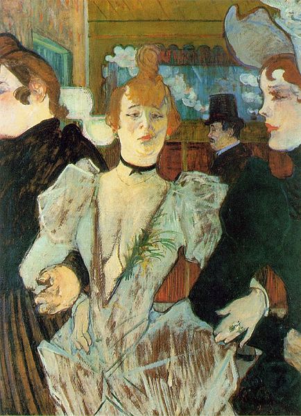
The Sweetest Story Ever Told, C. 1910, Charles Dana Gibson, Public Domain Image from Library of Congress Prints and Photographs Division Washington, D.C.
As a teenager Rachael studied drawing in New York with her teacher Ernest Knaufft. In one of her letters back home she writes about seeing an exhibition of work by Charles Dana Gibson (image 2). From her letter we know that his work had a big impact on her art!
There is a new exhibition of Gibson’s pen drawing a little way from Mr. Knaufft. I have been twice, they are grand. I wish thee could have seen them. Some of them sell for $2.00. They are very large. Some 3 by 2 feet. I should think he is a young man yet. Some of his lines, on faces especially, are so fine you can scarcely see them. They have to be sent to Paris to be reproduced.
— Rachael Robinson Elmer to Robinson Family, March 5, 1893
Gibson was famous for his images of ‘modern womanhood’. At the turn of the century American women had better access to education and work possibilities than they had in the past. The role of the woman was changing and Gibson captured this evolution in his art.
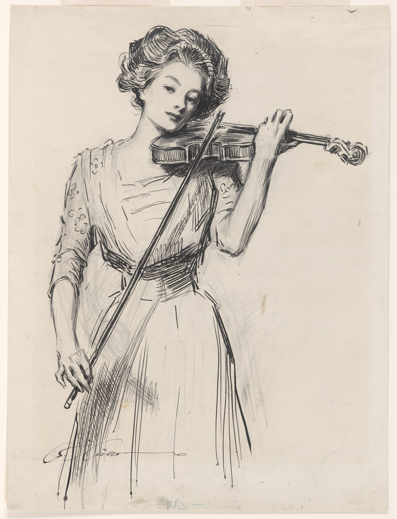
Portrait of Ann Stevens Robinson Reading, c. 1891–1900, Pen and Ink, Rachael Robinson Elmer (1878–1919)
As an art student Elmer student and drew sketches of her relatives. The above image shows her mother Ann reading the pages of her father’s manuscript. Her author father was nearly blind at this point and her mother played a central role in his writing process. She corrected and re-transcribed his writing and corresponded with his editors.
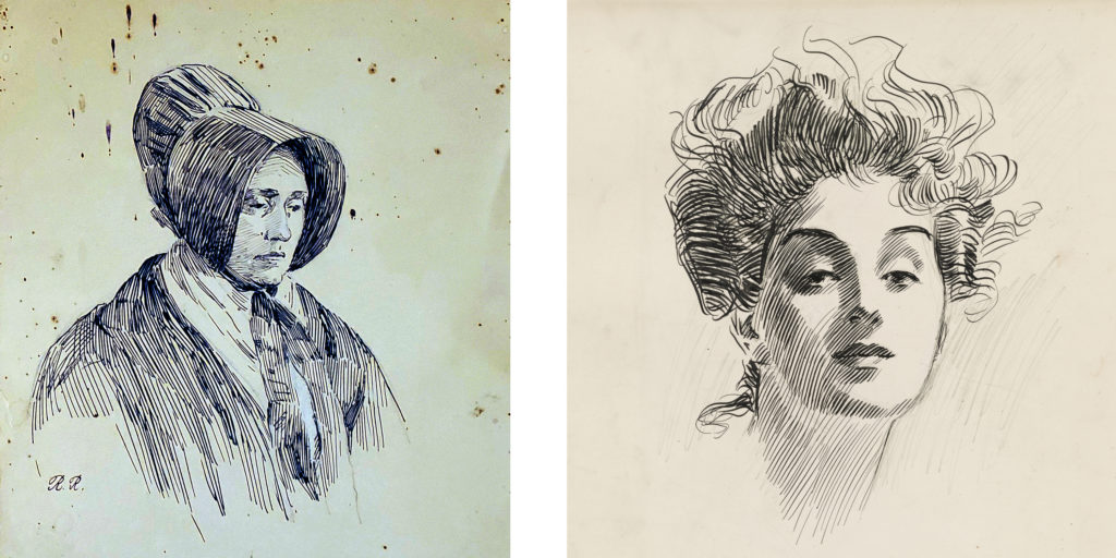
L to R: Portrait of Rachel Byrd Stevens, c. 1893–1903, Rachael Robinson Elmer (1878–1919), Box 19, Image 3357; Head of a Girl, c. 1882–1935, Charles Dana Gibson, Public Domain Image from Library of Congress
In a sense both artists recorded a modern image of womanhood. Yet they couldn’t feel more different. Elmer’s women feel old fashion compared to the “Gibson Girls”. But given a little context, her image of Ann is a much truer example of a woman at work.
Gibson’s depiction of 20th century womanhood isn’t necessarily wrong, but it’s limited. He depicts the women he saw and knew in his affluent New York circle. Elmer’s art helps broaden our understanding of what social change meant for a different part of the country. Of course neither artist tells us much about the condition of BIPOC from this period. For me this comparison highlights the importance of seeking out new voices from history.
Bill Reid was my first engagement with art. I can still remember seeing his Raven and the First Men sculpture and the sense of awe that I felt. The launch of the new toonie with his design brought me back to those memories.
It’s interesting to think about Reid’s work and my own practice all these years later. What stands out to me now when I look at his work is the quality of his craft and the narrative clarity.
Looking at a Reid sculpture, I have the same “how did a person make that” response that I did all those years ago. His work is beautiful. The composition, the detail and his carving technique are all incredible.
As a kid I remember getting pulled into the story of Raven. In a single still image we understand the story that Reid is trying to communicate.
As an artist I strive for these same artistic qualities. I want my art to be beautiful and I want it to communicate clearly.
Reid might not seem like an obvious influence on my work. We are working in different cultural traditions. For me what connects our work is craft. Reid apparently rejected the title of artist and called himself a ‘maker of things’. I get that. Like him it’s this process of making that drives and defines my practice.
My knowledge of craft acts as an entry point for me to engage with different fine art traditions. When I look at something like sculpture (which I don’t do myself). I look for clues to how the artist made the object. When I start to understand their process the intention of the artist starts to reveal itself organically. There is always a connection between how something is made and what it is trying to communicate.
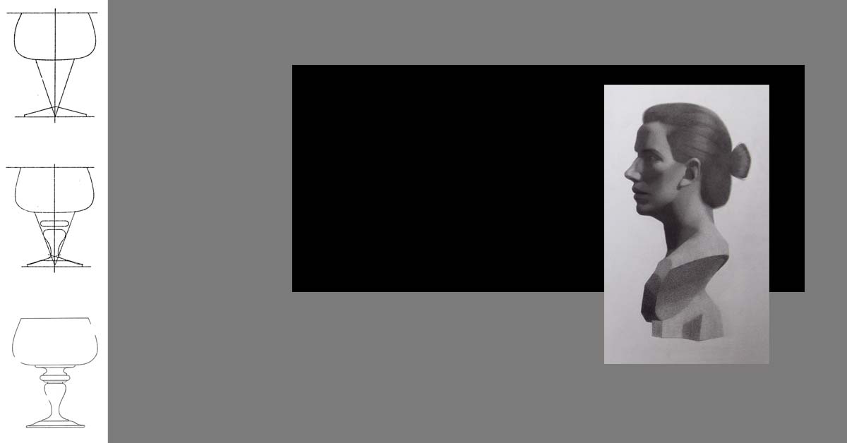
Light and shade is pretty exciting. We use light and shadow to communicate form, atmosphere and texture. For a lot of young artists it’s tempting to skip over some of the fundamentals and go right to light and shade.
What I hope to show with this week’s challenge is just how important those fundamentals are to our understanding of light and shade.
This week’s challenge
Pen and Ink Drawing, Arthur Guptill, Rendering In Pen and Ink
For this week’s challenge we are going to explore light and shade. To do this we are going to build on last week’s challenge. I recommend that you work through last week’s lesson before you start the one from this week.
For this week’s challenge you will need two colored pens and a slightly thicker marker. I would recommend a blue and a red ballpoint pen and a sharpie marker. If you also have a thin black felt pen that’s great (but not essential).
We are going to use a drawing by the artist and teacher Arthur L. Guptill. He wrote an excellent book called Rendering In Pen and Ink. I highly recommend his book to anyone looking to deepen their knowledge.
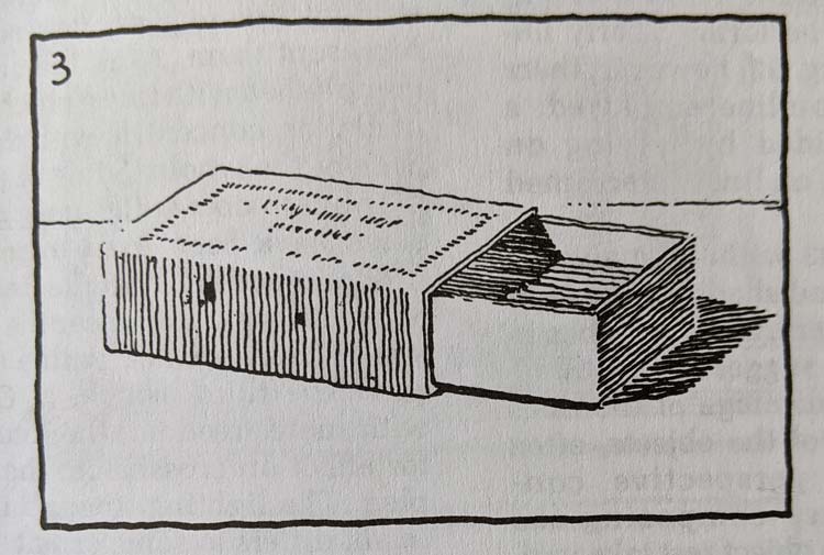
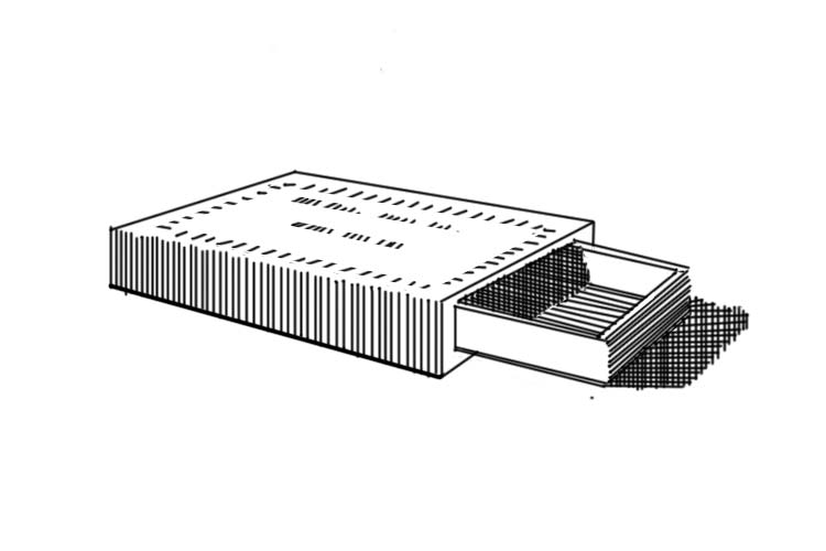
Start with a box
Before we even think about light and shade we need to understand the structure of our matchbox. If we had to describe our matchbox in simple geometric terms what would those be?
I see two thin boxes. The first box represents the main structure of our matchbox. The second box is slightly smaller. It comes out the right side of our main box.
Now that we have simplified our shapes we can start our drawing using our knowledge from the last challenge.
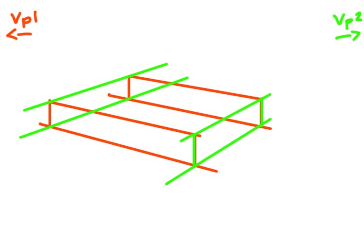
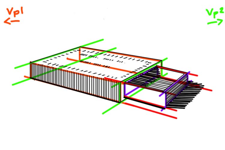
Draw the main box in perspective
Our first step is drawing the main box in two point perspective.
In two point perspective the only parallel lines are the vertical height lines. The width and length lines of our box will recede towards two vanishing points (Vp1, Vp2).
Our first step is to draw a horizon line. When we look at the box we can see a lot of its top side. This tells us that the horizon line is significantly above our box. Let’s imagine a horizon line just beyond our picture plane.
To find our two vanishing points we are going to take the angle of the front two bottom edges of our box. Line a pencil up against the bottom right edge. Now imagine that your pen extended all the way until it met the horizon line. Where would that point be?
Do the same thing with the bottom left edge. In both cases that point where the line extending from the bottom line and the horizon line meet is outside our picture plane (the rectangle that defines our drawing). If it’s helpful draw a thumbnail version of your box with the horizon line and the vanishing points.
In our case it’s important to note that the vanishing point on the right is much closer to the picture plane than the left vanishing point.
Using your knowledge of perspective draw a box that represents the main section that makes our matchbox.
If you need a refresher on how to build your box check out our challenge rotating a cube.
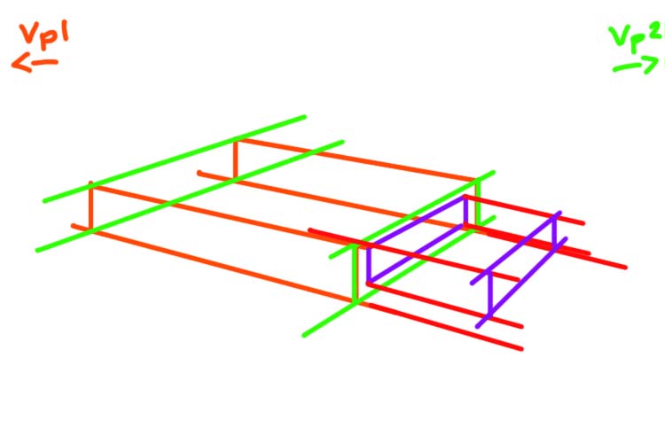
Build a second box
The matchbox provides a really excellent metaphor for how we can use perspective to build complex objects. Think about the mechanics of our matchbox. There is a main box and inside that box is a slightly smaller box that can be pulled out. In this drawing we see the second box pulled halfway out of the main box.
To start drawing this second box we need to think about its relationship to our main box. Using the right front side of our main box let’s define the main proportions of our second box.
On that front right side draw a slightly smaller rectangle (in perspective) that fits into this main box (purple lines). This new rectangle tells us the height and length of our smaller second box.
Using this information let’s draw the base of our new box. The length lines that define this second box must recede to the same vanishing points that defined our main box. Once you have your base, build out the rest of your smaller box.
Again for a more detailed description of this process, check out the step 2 of the “Add a Cylinder” section of the Building Blocks challenge.
An important stage
Before we move on, take a moment to consider how much time we spent on that first step of thinking through the structure of our drawing. This first stage is so essential to making a good drawing. Make you sure you give this first stage the time it deserves.
Light and shade
Now we can move on to the fun part: adding a sense of light and shade!
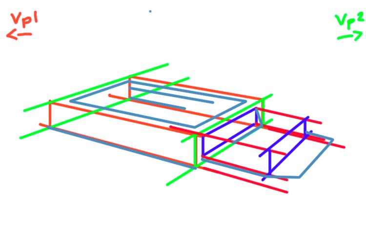
Value Scale
When we start a line drawing we always start by analyzing our shapes and proportions. In the same way, the first step in a light and shade drawing is to define and think about our shadow shapes.
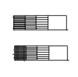
First block out your shadow shapes. I see four shadow shapes
The front left side of our matchbox
The inside of smaller box
The right front side of the smaller box
The cast shadow of our match box on the right side
Now let’s rank the values of these four shadow shapes.
Let’s start with the darkest shape. The darkest shadow shape is the cast shadow. The artist has used thick lines that are very close together to define this shape. In a small box let’s mimic this same approach.
These same thick close lines are used in the left part of the shadow that makes up the inside smaller box.
If you only have one black pen. Another way to represent this darkest value is with cross hatching. Instead of using a thicker pen we will use two sets of lines (horizontal and vertical).
To the right of the tick lines inside the smaller box we see a value that is described by thin lines that are close together. We see this same pattern on the right front side of the smaller box.
Let’s expand our value scale by adding a second box. In the second box lay down a series of lines that mimic this approach.
Finally on the front left side of our main box we see a value that is represented by a series of vertical lines that are slightly more spaced apart.
Let’s expand our value scale by adding a third box. In the third box lay down a series of lines that mimic this approach.
Add a fourth and final box to your scale. Leave this one blank to represent the lightest value in our drawing : the whites.
Before you start any drawing with light and shade. It is useful to make this kind of value scale.
Adding value
Ok now we can start to ink our drawing. Let’s start by indicating our outlines. In some sections the artist has omitted the outline (look at the top edge of the front left side of our main box). This is an artistic choice – and should be noted). Try and be really exact and copy exactly the lines that the artist has used.
Once we have drawn the outline we can start adding the shade.
It’s useful to work from our darkest values to our lightest values. Let’s start with the front right side of the smaller box and the cast shadow. Make sure to note not only the value but the direction of the lines. The lines on the front right side of the box follow the perspective lines. The lines defining the cast shadow are right leaning diagonals.
Now add the value for the inside of the box. Again the lines follow the perspective lines that define the base of this box.
Crosshatching approach for darkest shadows
If you are using the cross hatching approach, add a series of vertical lines to the two darkest sections of the cast shadow and the inside of the box.
Next, let’s add a series of vertical lines on the front left side of the main box. Make sure that these lines have more space between themselves than the darker section.
Finally we can add the detail to the top side of the main box. Make sure these small dash lines follow the perspective lines of the main box. To help guide you, draw guidelines in perspective where you will be making the dashes.
In the late 19th century, artists who had the chance to study in the cosmopolitan French system started to discuss the idea of painting and realism in terms of a universal pictorial language.
Ai Xuan and Andrew Wyeth
A beautiful example of the kind of cross cultural dialogue is the work of the contemporary Chinese painter Ai Xuan which is inspired and aims to respond to the work of the American artist Andrew Wyeth.
Andrew Wyeth, Up in the Studio, Part of the MET Collection
Xuan and many other Chinese realists were compelled by the relationship Wyeth built between his figures and the landscape. In both his landscapes and his portraits Wyeth shows his subject as subordinate to the grandeur of nature. Seated next to a window the subject of these portraits is not the sitter but the light. The light gives these images both a narrative and an emotional presence.
Ai Xuan, Girl in Cottage Window, 1993, Oil on canvas
Cultural Identity
Wyeth was the son of one of the most important American illustrators, NC Wyeth (image 5). NC Wyeth helped define the myth of the cowboy at the heart of America’s cultural identity. Andrew Wyeth strips his country scenes of all the grandeur and the myth of his father’s work. His work is a humbling image of America and more generally our place as humans in the natural world.
Xuan came out of the Socialist Realist tradition. He trained and started his career making art that propagated a nationalist view of the communist state. This shifted with his fine art that looks at the Tibetan community and their close relationship to the land. Like Wyeth he is quietly deconstructing the myths of human self importance that defines his country’s culture.
NC Wyeth, Poems of American Patriotism, Oil on Canvas
Seeing the work of these two artists together gives a western audience a window into Chinese culture. It helps us see a shared humanity. It also gives us a way to step back and look at our own culture from a different angle. We can easily identify propaganda from other cultures but we are not great at recognising the archetypes and images that have influenced our own cultural identity.
Composition is the link between abstract and realist art! By taking a deep dive into composition, I want to show what these two genres have in common!
Illustration and AbEx
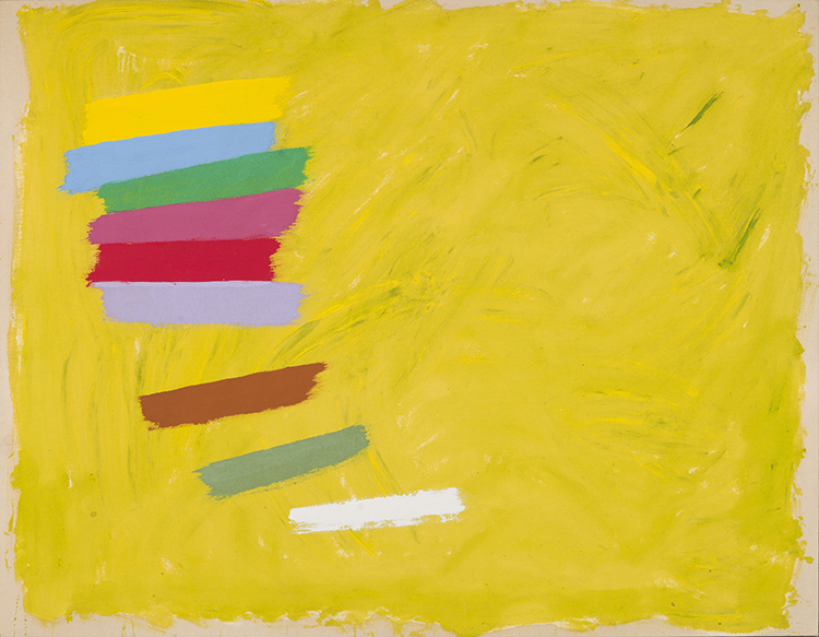
Jack Bush, Crescendo, 1974, 28 1/2 x 36 5/8 in (part of Heffel Spring Auction)
To illustrate the link, I’ve chosen two works by the great Canadian artist Jack Bush. By day he was an illustrator. By night he was an abstract painter.
These two genres look very different but what unifies them is a really strong composition or design. At it’s most basic, composition is about thinking through the placement of the different elements that make up the picture.
In Bush’s abstract work he places color in a way that conveys a sense of motion. In this painting the color tiles seem to be falling in space.
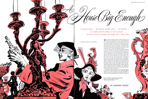
In his illustration he uses proportion to create a sense of atmosphere. The antique candlestick is much larger than the main figure. It creates a sense that the figure is surrounded by antique objects. There is only one object but we understand that she is in some kind of antique store. This information is communicated through composition.
Composition Strategies
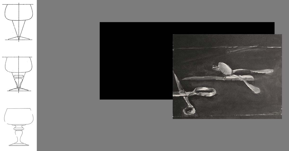
Good composition gives an artwork an emotional quality. It elevates a picture of a pair of scissors from an industrial design sketch to something we call fine art!
Composition is a tough concept to pin down. There are no set rules for what makes a great composition. But there are strategies you can learn to approach composition from a more analytical point of view.
Diebenkorn’s Scissors
The American painter Richard Diebenkorn was a master of composition. A contemporary of the Abstract Expressionist movement, Diebenkorn experimented with both abstract and realist painting throughout his career.
Drawing from life was a big part of his practice. He produced a prolific number of pen and ink wash drawings of still life subjects and life models. He would often turn these into more abstract paintings. In this way he used his realist drawing as a kind of composition strategy.
Placement
One of his most famous motifs was of a pair of opened scissors.
There is sooo much we can learn about composition by studying these works. Notice how the subject never changes: it is always the same opened scissors.
What changes is the orientation or size of the scissors and their placement. By making these simple changes the narrative and emotive quality of the scissors changes with each image.
In this way the first principal of composition is placement.
So with social distancing taking effect it is time to get a hobby! Why not learn to draw? For anyone with time, paper and a pen copying old master drawings is a great way to learn to draw. Below you will find a list of high res drawings that are great drawings to learn from.
Join our growing community of art lovers! Thanks to the CBC for sharing this drawing challenge!
Choose a drawing
Set up Art Exercise:
Grab a pen and paper and a large book (9 x 12) that you can lean against the table. You never want to draw on a flat surface. Tape your paper to the book and lean it against the table, resting on your lap. Now you can look at the paper head on. When the paper is lying on a flat table you are seeing everything in perspective and making your job twice as hard.
Choose one of the below drawings. You can print it out and tape it to a wall or you can use the image from your screen. Make sure the drawing is far enough away. You want a least one arms length between you and your subject.
How to start
Never start with the eye. We are going to work big to small. First try and block out the big shape of your drawing. Imagine if you only had 4 to 5 big lines. How would you represent this drawing?
Get the right measurements
Now you want to take some measurements. What’s the middle point of the drawing? If it’s a portrait draw a dash line to indicate where you would place the eyes, the base of the nose and he middle of the mouth.
To make measurements stick your arm out so it’s straight and close one of your eyes. Use your pen as a kind of ruler. Measure the space from the chin to the eyes and than from the eyes to the top of the head. They should be pretty close. Now check those same measurements on your drawing. Keep measuring different sections and compare the measurements of the drawing with your copy. Try and do this for at least 15 minutes.
How to add shadow & detail
Now you can start to ad detail to your outlines. show the roundness of the line outline and started adding the features (eyes, nose, mouth).
When you are feeling really good about placement, it’s time to start looking for shadow shapes. In all of these drawings the artists have used line to show shadow. Before we copy the lines lets try and outline the shapes of the different shadows. Draw lines that represent the boarder between the light area (no lines) and the dark areas (groups of lines).
How to get feedback
If you want to get feedback on your drawing tag me to your copy on instagram @clinton.courtney
So with social distancing taking effect it is time to get a hobby! Why not learn to draw?
Join our growing community of art lovers! Thanks to the CBC for sharing this drawing challenge!
How to participate in the challenge
Drawing challenge materials
To take part in the drawing challenge you will need:
Pen (any household pen)
Paper
A drawing board
You don’t need fancy artist supplies to participate. Find any old pen lying around your house. For paper you can use any smooth paper. A great choice is printer paper. You will need something that you can lean against a table so that you can draw on an inclined surface. I like to use a coffee table book.
New challenge every Tuesday
Every Tuesday, I will post a weekly drawing challenge to my blog, Graphic Traffic. The blog will outline the challenge and give you step by step instructions. This challenge is aimed at artists of all levels. So there are lots of resources to help you succeed!
Thursday Instagram Live drawing session
Every Thursday at 5pm (Eastern Daylight Time) I will host a live drawing class on my Instagram Live. You can find me on Instagram at @clinton.courtney. The Drawing sessions will last approximately one hour.
The live drawing session is structured like a class. The audience is encouraged to have their pen and paper and to draw along!
Live drawing schedule
5 pm to 5:30 pm : Intro and warm up exercise
5:30 pm to 6 pm : Weekly challenge exercise
6pm : Q & A with the Artist
How to get feedback on your art
If you want to get feedback on your drawing tag me to your copy on Instagram @clinton.courtney
How to find the weekly challenge
You can find all of the Corona Virus drawing challenges on my blog, Graphic Traffic.
Here is a list of all the past challenges
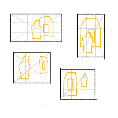
Week 1: Copying – Learn to do a professional artist block-in using old master drawings
Week 2: Still Life – Using measuring and the block-in technique learn to draw a still life
Week 3: Composition – Learn the fundamentals of composition and the thumbnail technique
Week 4: Line – Improve the line quality of your work with tricks to make beautiful curves.
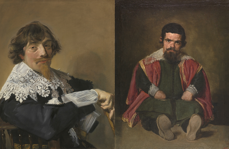
Velazquez, Rembrandt, Vemeer: Parallel Vision at the Museo Del Prado is my top pick for a museum show in 2019. Man I would do anything to go see this show!
For those of us not able to jet over to Madrid for a weekend there is a great interview with the show’s curator Alejandro Vergara on the Art Newspaper podcast. The show challenges the popular narrative around nationalism and art and invites the viewer to reflect on the shared traits of 16th and 17th c. Dutch and Spanish art.
What is especially interesting about the argument is that during this period the two regions were at war. Starting in 1568 now Holland and Belgium (then part of Spain) revolted against the Spanish monarch. The result was an 80 year conflict that ended with the creation of the two new nations.
Art history tends to celebrate Hollands independence by fixating on what made their art unique and “Dutch”.
Shared Style in Dutch and Spanish Art
Izquierda: Portrait of a Man, Frans Hall, Oil on Canvas, c. 1635 ; Derecha: The Buffoon el Primo, Diego Velazquez, Oil on Canvas, 1644 (Image Credit Museo del Prado)
This show challenges the national flavour of both the Dutch and Spanish school. Instead it tells how both were influenced by 16th c. Venetian art.
It argues that artists like Rembrandt and Velazquez interpreted this shared legacy in a similar fashion and simultaneous developed a new artistic aesthetic that departed from the idealism of the renaissance creating a humanistic realist style.
What I love about this argument is it reminds us of the universal nature of knowledge. Something as personal as artistic style is not limited to a nation or an individual. Given access to past knowledge we are all capable of artistic breakthrough.
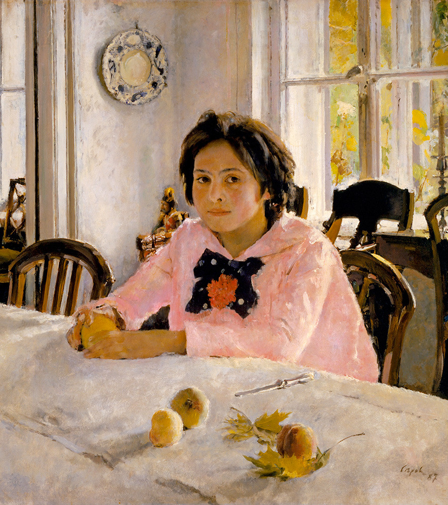
Brushy Art in Russia and United States
Portrait of Vernon Lee, John Singer Sargent, Oil on Canvas, 1881 (Image Credit Tate)
A fantasy curation project: I think it would be a real hoot to build on the thesis of the Museo del Prado show and explore the shared traits of other national schools of painting.
A pretty epic example is the portrait art of the late 19th c. in the United States and Russia. American artists like John Singer Sargent and Cecilia Beaux both painted in a brushy modern aesthetic that parallels the work of Russian artists like Ilia Repin and Valentin Serov.
Girl with Peaches, Valentin Serov, Oil on Canvas, 1881
These artists were all heavily influenced by French art – both the academic system and the impressionist style. Interestingly you can also see a lot of Rembrandt and Velazquez in their loose brushy approach to painting.
Sita et Sarita, Cecilia Beaux, Oil on Canvas, 1881 (Image Credit Musee d’Orsay)
Conceptually their work brought ideas of modern psychology into portrait art. These portraits are oozing with attitude and feeling. I find this image by Beaux particularly radical. She juxtaposes innocence (the white doll like costume and the cat) with the girls cool self confidant expression and pose.
Throughout art history we can find countless examples of overlap and cross pollination between different national schools. The message over and over seems to be that we can achieve more collectively than we can in isolation.
I’ve been told so many times that art technique doesn’t matter. It’s all about ideas. I would like to argue that ideas can come from the knowledge acquired in art training. An interesting case study for this hypothesis is the work of the 19th century artist Charles Bargues.
Bargues’ Drawing Course
Bargues is best known as the print artist who did the images for the Drawing Course. The idea of the book is that you copy a series of about 100 drawings by master artists. The book is brilliant in that each drawing introduces a new concept building on ideas presented in the one before.
Bargues did not do the initial drawings but he copied them to make lithograph prints. He’s considered the first student of the course.
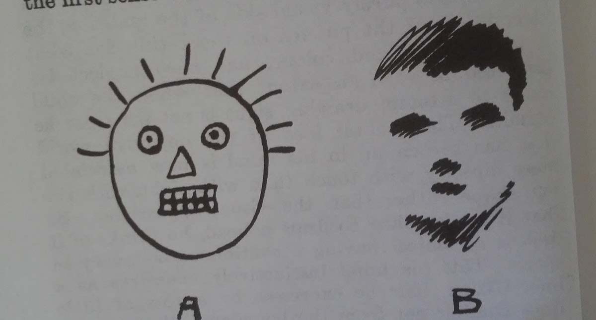
How Bargues Art Changed
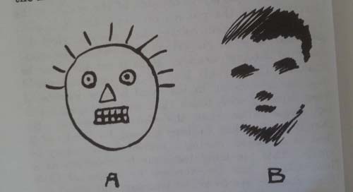
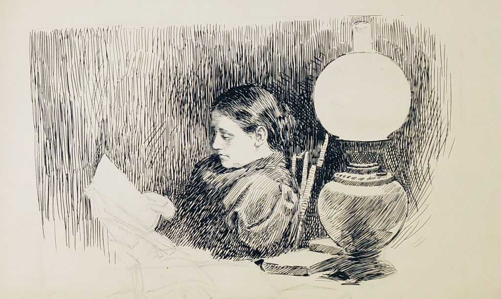
The image above is from the Harold Speed book, The Practice and Science of Drawing. It illustrates drawing what we know (A) verses what we see (B). Beginner artists always struggle to let go of their conceptual understanding of the world and to actually look at the subject.
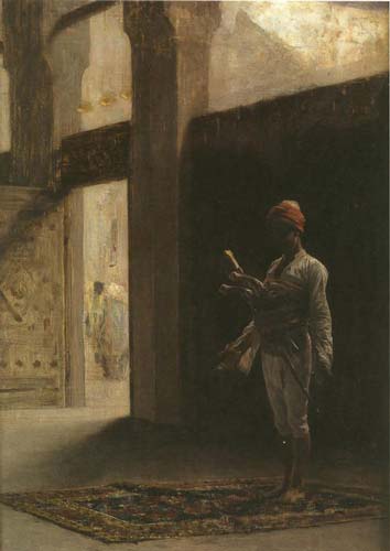
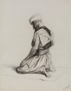
If we look at Bargues’ early work we see an artist who is producing the worst kind of orientalist art (large sense). Here is a First Nations women clearly not drawn from life presented as object of desire.
She is an idea, or a crude fantasy. After completing the Drawing Course project (which took over a year). The artist’s work changed dramatically.
Not only is his work technically more interesting but he’s now presenting a much more complex image of beauty and other cultures. Unlike his fantasy girl these images are done from life. He has seen a Mosque and seen men in the act of praying. From this lived experience he gives us a beautiful image of a spiritual moment.
Art’s biggest lesson is that we are naturally bad at observing. So much of how we see the world is based on preconceived ideas. Art forces us to challenge those ideas by really looking at the world.
I came to Richard Thomson’s Art of the Actual looking to explore a theory. As a figurative artist, I’m fascinated by the 20th century rivalry between Modernism and classical realism.
I’m somewhat obsessed by Clement Greenberg’s manifesto, The Avant-Garde and Kitsch, because it reveals an important political link between the two schools central to his thesis. In his essay Greenberg defines the Avant-Garde as Modern art that emerges under Pablo Picasso and Kitsch as the art of communism developed under Ilya Repin.
In my rereading of his text I was struck by an idea. How would his argument change if we redefined Kitsch not as the art of the Russian Wanderers but that of the French Naturalists?
The Naturalists and the Wanderers are two 19th century artistic movements that have much in common. Both are offshoots of the French Academy and both were influenced by French impressionism and plein air painting. Moreover, both emerged during a time of social upheaval. The Wanderers emerged after the Emancipation Reforms of 1861 that effectively abolished serfdom throughout the Russian Empire. The Naturalists came to prominence under France’s Third Republic in the 1880’s which established a stable democratic republic. With this context both schools explore themes of equality, folk culture, and national fraternity.
What separates the two movements is the link between the Wanderers and communism and the Russian movement’s place outside of “Western Culture.” By thinking about Modernism in relation to the Naturalist movement we remove the element of “otherness” that Greenberg attached to the Kitsch (or realist) art.
A Book About the Naturalist Movement
Thomson’s book is based off a series of lectures he did as Slade Professor of Fine Art at Oxford University. Focusing on French art during the 1880’s and 1890’s, the book’s assertion is that Naturalism (not Post-Impressionism) was the dominant art of this period. He argues that the movement flourished because it suited the ideology of the Third Republic in its drive to establish a collective, modern and centralized France.
Although his focus is the Naturalist movement, Thomson gives much attention to early Modernists or Avant-Garde of this period known as the Post-Impressionists. He builds on his thesis of the central importance of Naturalism (in this period) by arguing that the Post-Impressionists of this period were very much in conversation with the dominant movement either as offshoots or critics.
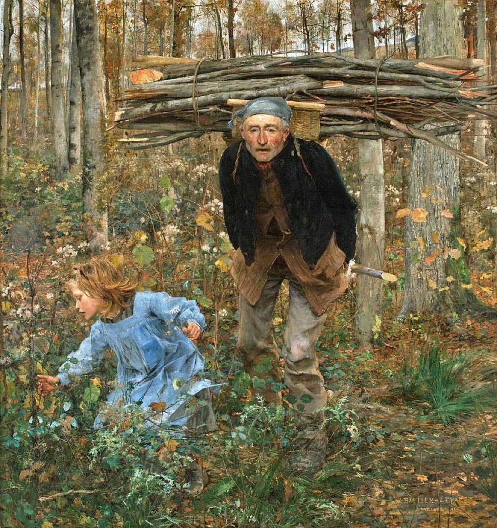
Defining Naturalist Art
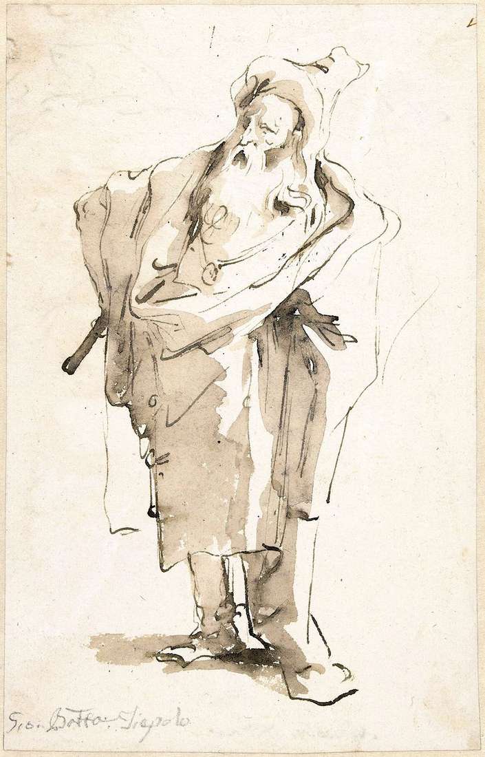
The Wood Gatherer (Father Jacques), 1881, Jules Bastien-Lepage
Thomson defines Naturalism as a kind of painting that sought to be clear, modern, descriptive and inclusive. Most of the Naturalist painters came from the French academic system, but distinguished themselves from the classical system by choosing to portray scenes of modern life. Their work celebrated anything from the labour of rural farmers to the latest advances in science.
Their choice and depiction of modern France was influenced by the state who sponsored the movement through commissions and concours for public art to decorate government buildings. In this way artists were not working directly for the state; however, given that the state was the largest purchaser of art at the time, artists did well to create art that would be met with approval by the government.
Avant-Garde Art
Throughout his exploration of the Avant-Garde, Thomson makes a compelling case that in many occasions the movement was actually aligned with the Naturalist aesthetic. He shows a plethora of works by Post-Impressionist artists which adhere to the conventions and subject of Naturalism. In so doing he suggests that the Post-Impressionism was not so much a radical break with the mainstream but a collection of divergent voices still within the culture.
Thomson explores how the Avant-Garde diverges from Naturalism over three chapters. He outlines how the Avant-Garde used caricature, popular culture and what he coins as “organicism” (ideas around flux) to disengage with the dominant movement.
I found his description of the Avant-Garde illuminating, but found myself wanting to group his argument differently. For me what seemed to surface again and again was the influence of “Café Théatre ” culture on Avant-Garde art.
Café Théatres were dinner theatres specializing in popular culture. As Thomson explains, by the 1880s these establishments had been professionalised and were extremely profitable. They became so popular that artists from more “serious” theatre were performing in these venues.
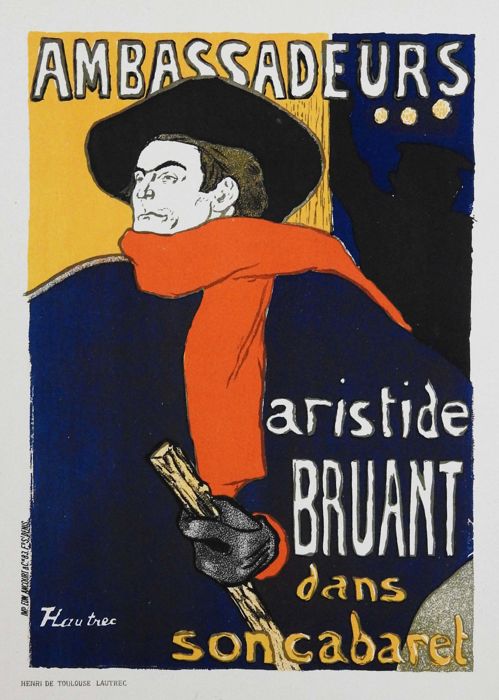
Avant-Garde art from this period uses the Café Théatre as its main subject. So much so that I remember being shocked the first time I saw the austere attire of a woman in a Henri Fantin-Latour painting. I realised, having grown up on Modern art, I had always kind of assumed that French women of the periode dressed in flamboyant colours with a generous décolleté. I’ve come to understand that the woman of a Toulouse-Lautrec painting is not your average French citizen but someone working in one of these Café Théatre.
Subject was not the only way in which the Avant-Garde was influenced by the Café Théatre. Beyond theatre, these venues contributed to visual culture through poster art (that is now considered fine art) and the publication of satirical revues which helped popularise caricature art.
Naturalism favoured exacting description over style. Unlike past movements like Rococo or Neo-Classicism, Naturalism did not have a distinctive style. Even in its time critics often lamented its photographic nature.
Thomson writes that one way the Avant-Garde could distance itself from Naturalism was through style. Although each artist strove to create a unique style, Thomson shows how the group took many ideas from caricature and popular culture of the time – which was part of the Café Théatre culture.
Adding my own interpretation to Thomson’s work, I would argue that their choice of stylistic influence was part of the Avant-Garde’s larger exploration of the Café Théatre culture.
Public vs. Private in Art
Interestingly, Café Théatres were a meeting place for both the proletariat and the bourgeois. A rare space in the society where the different social classes met on equal terms. These spaces embodied the values of the Republic, égalité, fraternité, liberté. While the Cafe Theatre does not challenge the state’s definition of itself, it shows a very different image of the culture.
Naturalism focused on the public or civic life of its citizens and showed a hopeful image of modern French culture: productive labour, technological progress and social progress. In contrast, the work by the Avant-Garde showed a kind of private life and depicts a more decadent scene: sex workers, drinking, and gambling.
For me, thinking about Naturalism and Modernism in terms of the Public and Private space is an important way to situate the two movements before embarking on the 20th century rivalry that would split the two movements. On a superficial level, Modernism seems to break with its predecessors on stylistic terms. I would argue that what really separates Modernism from previous generations is this shift in focus from public to private life.
Café Théatre was a space where every citizen (at least the male ones) could escape their social identity and ‘be themselves’.
Naturalist paintings reflect images that are representative of how the state wants civilians to look and what it wants them to see. Whereas Café Théatre is private not because people are in the shelter of their homes, but because they are acting in a way that gratifies their own desires – and not those of the state.
This represents a move away from arts traditional role of representing and speaking for the state (whether it be a democracy, a monarchy or theocracy).
Yet Thomson makes an important critique of this so called popular art. He notes that many of the artists adopting this popular style and subject matter were themselves from upper class society. So although the viewer is granted access to these socially open spaces, it is only from the vantage point of the upper class.
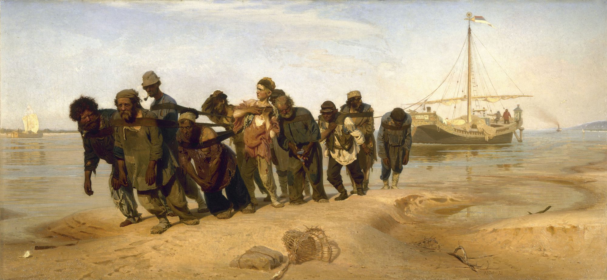
Russian Art compared to Naturalist Painting
Although the Wanderers and the Naturalists painted similar subjects, the work was conceptually very different.
Interestingly, the Wanderers were not supported by the state. In fact the group originally formed in protest of the state-sponsored academy, which they felt stifled artistic freedom. After the lifetime of the group, their art was adopted by the new communist government and their legacy was twisted to align with the values of the new ideology.
The group was supported by private collectors, mostly from the emerging industrial class. They sold their work through travelling exhibitions – hence their name.
Naturalism, aligned with state interests, worked to define a new archetype: the modern french citizen. Pastoral scenes of workers in the field were meant to highlight the idealised public contributions of every citizen working to build the third republic.
Especially in the beginning, the art of the Wanderers was less idealistic. Instead of presenting the working poor as a type, the Russian artists aimed for an authentic depiction of the individual life of their subject. The work celebrated the progressive change in the country but it could also be critical of the state, depicting the hardship of peasant life.
I would argue that 19th century Russian art, like early Modernism, was interested in the private concerns of the individual. Unlike the Modernists, several of the group’s members were from the same humble origins as their subjects.
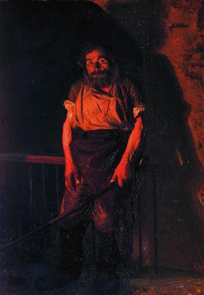
For the Wanderers this effort to show the internal world of the sitter was about humanizing the subject. Like Alexandrovich Yaroshenko who invites the viewer into the internal universe of his subject in The Stoker as a way to arouse compassion for oppressed people.
The Stoker, 1878, Mykola Yaroshenko
I’m not sure that I see the same kind of compassion for the subject in the work of the French Avant-Garde.
Toulouse-Lautrec , 1892, La Goulue arrivant au Moulin Rouge
Greenber’s Rejection of Russian Art
What frustrates me about the Greenberg essay is that it rejects Russian art without actually engaging with it.
In a footnote, added to Greenberg’s essay when it was reprinted as part of a book in 1961, the author notes that he misattributed a painting of a heroic war scene to Repin. He explains that only after printing the essay did he learn that Repin had never painted a battle scene. This error highlights the author’s lack of understanding of Russian art.
My aim is to point out that our original perception of art can be manipulated. The meaning of art is malleable depending on the context in which it is seen.
When we consider post-war art, it’s important to recognise the political alignment of different schools of art. In the same way that Naturalism and Social Realism were sponsored by the French and Russian state, Modernism was supported by the American government. When Norman Rockwell presented his Four Freedoms series to the American government he was initially turned down because it wasn’t in the Modern aesthetic. It makes sense, Modernism with its commitment to freedom of self expression suited the ideology of the American government – just like Naturalism aligned itself with France’s Liberté, Égalité, Fraternité.
My point isn’t to disparage the Avant-Garde. I think Thomson’s book does an excellent job of showing how Post-Impressionism was an important critical voice in the face of the hegemony of Naturalism.
Naturalism covered a vast array of subject matter in a highly detailed style. Seen in isolation, one would think it an encyclopedic portrait of France during the late 19th century. Post-Impressionism exposes the idealised nature of the work and challenges the communal vision it portrays. In turn the art of the Wanderers reveals the voyeuristic gaze of Modernism.
After reading Thomson and Greenberg, I’m left thinking about the importance of questioning the dominance of any one school of painting (or thought). No image can be a full account of truth. Looking at works of a similar subject across genre and culture is one way to expose bias and build an understanding of truth.
Sources:
Richard Thomson, Art of the Actual: Naturalism and Style in Early Third Republic France. (2012). Yale Books
Elizabeth Kridl Valkeiner, The Wanderers: Masters of Nineteenth-Century Russian Painting: An Exhibition from the Soviet Union. (1991). Dallas Museum of Art
Clement Greenber, Art and Culture: Critical Essays. Avant-Garde and Kitsch (1961) pg 1-33. Beacon Press Boston


.jpg)