How did a young woman from a rural town become an important book illustrator at the beginning of the 20th century? Join me as I chart Rachael’s artistic journey and share a drawing exercise from the course she took in the 1890s. The Rokeby Distance Drawing Course is available now on the Rokeby Museum Website.
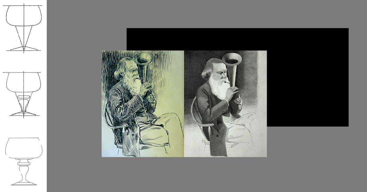
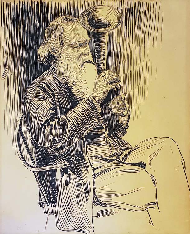
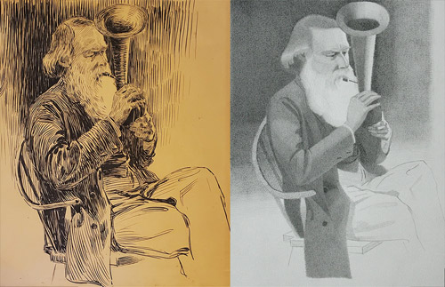
In this week’s lesson I invite students to make a copy of a drawing by Rachael, a portrait of her father, Rowland. Through archival material from the museum’s collection we also explore Rachael’s relationship with her father- a prominent illustrator and author.
Rowland was a major influence on Rachael’s professional career. An active author he would often get Rachael to illustrate his articles and books. Before the age of 18 Rachael had a dozen published illustrations thanks to this collaboration.
Understanding Rowland’s role in Rachael’s story, forces us to think more critically about the role of distance education in Rachael’s success. Rachael studied art with an important New York illustrator through a correspondence course. Having access to this education gave Rachael the tools to pursue her career. But seeing how hands on her father (and mother) were in her education and her early career reminds us that access doesn’t equal success. Rachael was able to take advantage of distance education because she had a stable and supportive home life.
By sharing Rachael’s story I want to pull back the curtain on the modern conception of an artist as a genius. Generally when an artist has early success it is because there is a support system around them.
I don’t think you need an author father to get your start as an illustrator. But I think it suggests that beyond education, artists need to think about finding some kind of apprenticeship to learn the business side of their trade.
Bill Reid was my first engagement with art. I can still remember seeing his Raven and the First Men sculpture and the sense of awe that I felt. The launch of the new toonie with his design brought me back to those memories.
It’s interesting to think about Reid’s work and my own practice all these years later. What stands out to me now when I look at his work is the quality of his craft and the narrative clarity.
Looking at a Reid sculpture, I have the same “how did a person make that” response that I did all those years ago. His work is beautiful. The composition, the detail and his carving technique are all incredible.
As a kid I remember getting pulled into the story of Raven. In a single still image we understand the story that Reid is trying to communicate.
As an artist I strive for these same artistic qualities. I want my art to be beautiful and I want it to communicate clearly.
Reid might not seem like an obvious influence on my work. We are working in different cultural traditions. For me what connects our work is craft. Reid apparently rejected the title of artist and called himself a ‘maker of things’. I get that. Like him it’s this process of making that drives and defines my practice.
My knowledge of craft acts as an entry point for me to engage with different fine art traditions. When I look at something like sculpture (which I don’t do myself). I look for clues to how the artist made the object. When I start to understand their process the intention of the artist starts to reveal itself organically. There is always a connection between how something is made and what it is trying to communicate.
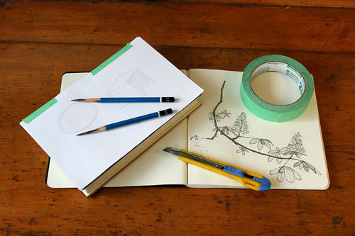
I’m so thrilled to announce the launch of a new project, The Rokeby Distance Drawing Course! At once a digital exposition and an interactive piece, the project plays with rather than fights against the limitations of interactive artistic creation in the age of COVID-19.
As Artist and Residence at the Rokeby Museum, I am developing a new series of work that explores, activates, and shares the letters from a 19th century drawing course and the artistic journey of its student – a young woman who went on to become a pioneering female illustrator. The work is a meditation on knowledge and sharing as driving forces for connectivity and overcoming isolation.
In September, 2019, I was invited to the Rokeby Museum to engage with their archive as part of a four day artist lab. From 1793 to 1961, Rokeby was home to four generations of the Robinson Family.
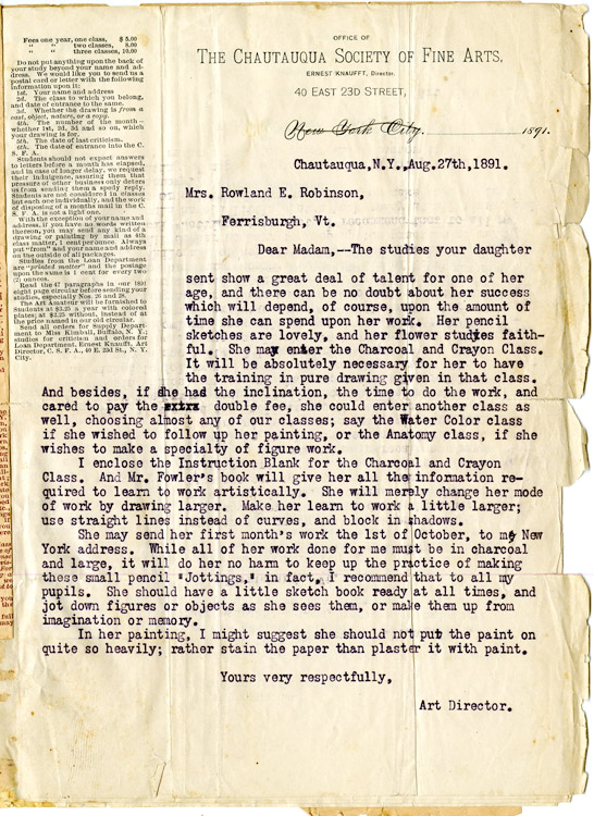
In the museum’s archive of the family’s letters and artifacts I discovered the original letters (dated 1891-93) from a correspondence drawing course that one of the daughters, Rachael Robsinson Elmer, took as an adolescent.
In March and April of 2020, I ran a series of instructional drawing demos from my Instagram Live as a way to test and think through different ways of using technology to present this historic material to a contemporary audience.
Research Residency:
As part of the research phase, the Rokeby Museum is supporting my work through digital access residency that is taking place over the summer.
Following COVID-19 guidelines, the residence takes place remotely. Collaborating with their Education Fellow, Allison Gregory (who lives on the property) I have access to the archives (art and letters of my main subject, Elmer). Gregory and I have a weekly meeting to ensure my access to the archive. In a lot of ways our collaboration mimics the form of the historic correspondence course that inspired the project.
Sharing my research:
Catherine Brooks, the Rokeby Director, and I agreed that making this drawing course available now, during the COVID-19 crisis, will serve a real community need. We intend to share this archival drawing course freely on the museum’s website.
From July 27 to October 5, 2020, we will post a new lesson on the website every two weeks.
To make the material more accessible to a contemporary audience, I will supplement the historic material with images. As a Quebec artist, I am conscious of issues of language and accessibility. Adding visual guides to this material is also a way to make the material more accessible to a non-anglophone audience and expand the reach of this project.
How to participate:
The course is meant for self directed learning. Students can join at any time and they can work through the exercises at their own speed. Starting July 27th until October 5th we will publish a new lesson every other week. For students looking for a little extra incentive we encourage them to treat it like a 12 week drawing challenge!
Each lesson includes a little history on the life of Rachael Robinson Elmer. We hope students will take inspiration from her artistic journey. To help students work through the exercise there are step by step drawing examples and a written explanation.
Materials:
To participate you will need a basic drawing kit.
6B, 2B and HB pencil. Recommended brand Mars Lumograph
Kneaded eraser
Pencil sharpener or exacto knife
A pad of 18” x 24” drawing paper. Recommended brand Strathmore
Drawing board
Course Level:
The course is open to anyone curious about learning to draw but is ideal for kids 15 to 17 interested in getting into an animation, illustration or game art program. I have experience working as an admissions advisor for a video game art program and have designed the exercises in a way that these drawings could be used for an art school portfolio.
I’m blown away by the different online initiatives that are being offered by local arts organizations to keep serving our community!
Durham Art Gallery Initiative
Yesterday I took part in a Virtual Studio Visit with the curator Jaclyn Quaresma of the Durham Art Gallery. The initiative gives emerging artists the opportunity to dialogue with curatorial professionals to discuss recent projects! What an opportunity!!!
It was incredible to talk through my current #DrawingChallenge project with Quaresma. She was incredibly generous with her time and gave me some great feedback. .
Pitching my project
We discussed my engagement with a 19th century drawing course (part of the Rokeby Museum archive) and the different ways that I can activate this material for a contemporary audience.
As I described the project, I talked a lot about issues of accessibility for rural artists. I was thinking about the story of Rachael Elmer who took this course while living in rural Vermont in the 1890s.
The Durham Art Gallery’s mission is to bring art to a rural region in Ontario. Discussing my ideas with Quaresma, I realised that I don’t really have an authentic connection to the issues that face rural artists.
Developing my idea
My connection to Elmer’s story is not the specifics of being a rural artist but our shared experience of learning to draw. As we learned our craft both were in situations of isolation and art became our community.
As a realist I often feel outside the main cultural community of Montreal. My own experience with correspondence education was about finding community with other students, teachers and the art.
So the guiding idea of this project is this relationship between knowledge and connectivity (and what that can mean in times of isolation). When I discovered Rachael’s story, I felt an instant kinship. Despite time and place she became a friend. What allows for this seemingly impossible friendship is our shared visual language.
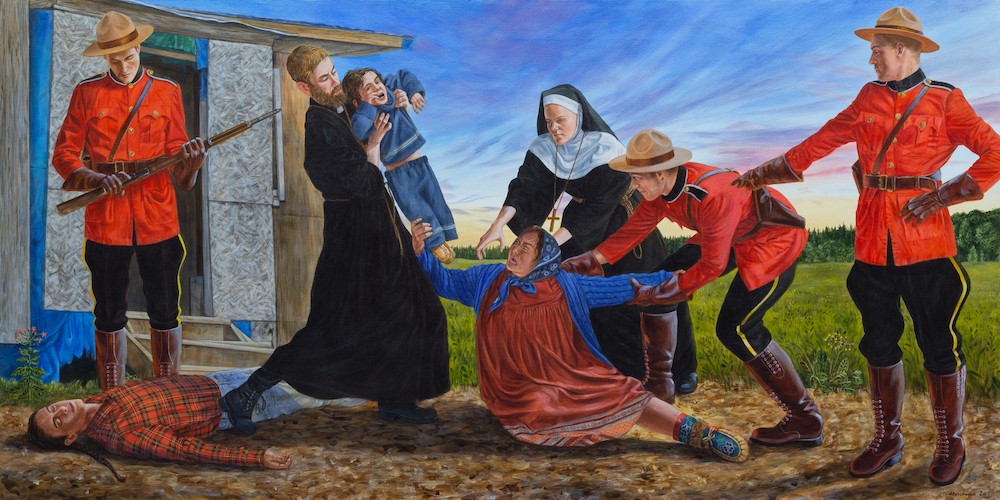
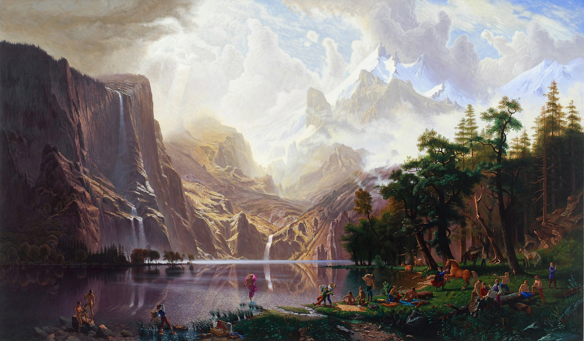
Just listened to a great interview with the artist Kent Monkman on the Art Newspaper Podcast! One thing that has always impressed me about the artist is his ability to clearly articulate his practice. This is someone with a very clear vision of both what he wants to say and how he wants to say it.
Critique of Painting Tradition
In the interview, Monkman explains his relationship with the Western painting tradition. In his early figurative work the medium was the message. His aim was to mimic the historic American landscape tradition as a way to critic that tradition and it’s portrayal (or lack there of) of Indigenous culture.
Trappers of men, Acrylic on Canvas, 2006
Giving Voice to New Stories
In the interview Monkman discusses how his relationship to the medium evolved as he discovered old master artists form other nations (he mentions visiting Prado Museum). Overtime realism became less the target and instead a kind of tool to tell new stories that had not been given voice.
The Madhouse, Acrylic on Canvas, 2019
His use of the painting tradition challenges the idea that painting is an expression of Western culture. The artists ability to use the medium to tell the history of his community shows how malleable the medium can be. In trying to understand the nature of art, we have to consider the difference between culture and knowledge. The images we create through painting make up culture. The process we use to make those images is a kind of knowledge.
May is an exciting month for Canadian Art! At the end of the month is spring auction week in Toronto! Several of the top Canadian auction houses will be hosting live auctions of Canadian art.
About a week before, they open their doors to the public showcasing the work that will go up for auction. I love going to these previews because you get to see a lot of amazing Canadian art that isn’t on display in the museums. It’s a great way to get to know artists outside the the regular cannon.
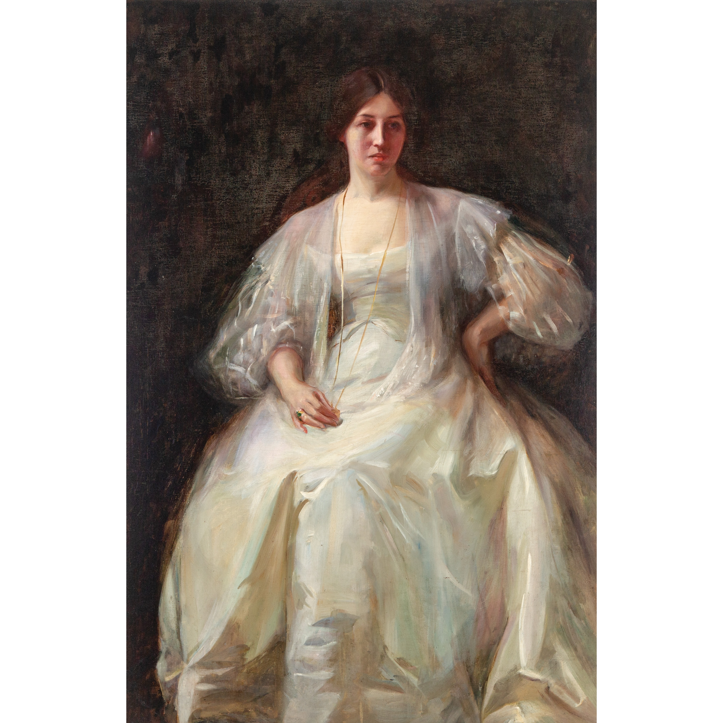
Laura Muntz
One piece I’m particularly excited to see this year is a lovely portrait, Lady in White, by Laura Muntz, up for sale at Waddinton’s Auction House. Muntz is considered part of the Canadian Impressionist movement. I would nuance that and describe her as a Tonalist and place her with artists like Andres Zorn, John Singer Sarger or Cecilia Beaux. Like these artists Muntz is showy with her brush work.
The portrait on view is a great example of this. There is an intriguing debate in the catalogue about the name of the sitter. Apparently the work was sold to the last owners as an official portrait of a Mrs. Reid. But the auction house argues that their is evidence in a book by the renowned scholar Joan Murray that the portrait was actually a former roommate of the artist.
In my own research I came across a secound painting of a woman in the same dress, called ‘Woman Reading’. This would suggest the later story is true as it would be odd that the painter would supply the dress for a formal portrait.
More importantly the repetition of the dress tells us something about the artists focus. This isn’t a portrait this is a fabric study. The dress of the sitter is a playground for the artist to make subtle temperature shifts and bold brush strokes! She’s showing off her technique! I couldn’t help recall the beautiful fabric studies of Leonardo di Vinci.
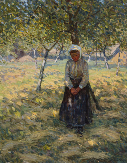
Helen McNicoll: Girl in the Field
Another top pick is Girl in the Field by Helen Galloway McNicoll on view at the Heffel Fine Art Auction House. McNicoll is a turn of the century artist who is classified as part of the Canadian impressionist group. Like the other artist she studied in Europe and her work explores colour and brush work.
She paints women and children outdoors and it would be easy to group her with other ‘women artists’ like Berthe Morisot who painted a similar subject. I believe McNicoll would have wanted us to look beyond subject. I think she painted women and kids because that’s what was respectable for a woman of her time to paint. But I’m going to be bold and argue that she wasn’t really thinking about the kids.
Seeing her work I couldn’t help but think about her in terms of the Group of Seven. Their subject is Northern Ontario but that’s not what the work is about. It’s all about style and self expression.
McNicoll is a bold painter. She plays a lot with strong contrasts of light and dark and cool and warm. In this painting she has her main subject in a cool shadow. Our eye is drawn to the girls face which matches the tree in tone but is set apart with it’s orange hue (she’s playing with the blue-orange complimentary). The larger shadow shape sits on the bright sunlit background. Her master stroke is the girls white headscarf. Although it sits within the large shadow it is about half a step lighter than anything else. It breaks the girl from the tree so that we can read her silhouette more clearly.
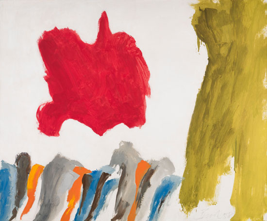
Jack Bush: Red Vision
Jumping ahead to post-war abstract art, Heffel has an intriguing Jack Bush titled Red Vision from 1958 on view. I love this piece because it shows us the artists thinking process.
This work represents the period right before he found his groove. In a work like this he is trying to think abstract. Bush was trained as an illustrator and had his own illustration studio. When he first started painting abstract works he would pencil in his shapes before painting them in.
When the American art critic Clement Greenberg saw his work he told him to lose the pencil. This first generation of Abstract Expressionism was all about the automatic process. No planning just make a mark and than respond with another (and another). It seems easy. But it’s really hard to get yourself into a headspace where you are not planning!
I love the red blob because we can see how he massed it in. He probably started with a mark and than scrubbed his brush outwards to build this organic shape. Look at how the outline of the shape is frayed. These imperfect lines carry over into his later work. It gives his minimalist style a sense of energy and a human touch. This work is all about experimentation!
It is so easy to stick to what you already know. I have such admiration for artists like Jack Bush who spent their whole career pushing beyond their comfort zone and redefining their art.
Frederick Loveroff: Farm Scene
Visiting the auction preview at Consignor Canadian Fine Arts, I was introduced to the work of Frederick Nicholas Loveroff. I was quite taken by this lovely landscape called Farm Scene.
A contemporary of the Group of Seven, Loveroff was a Western Canadian artist with family roots in Russia. His paint handling and colour is similar to the Group of Seven artists but his composition is completely different.
Look how high the horizon line is! Two-thirds of the canvas is white snow! It’s bold and radically different to the Group of Seven approach that favoured a silhouette composition. Artists like Tom Thomson are best known for works like the iconic Jack Pine where the design of the work centers on a dark foreground set on a light background.
What’s so interesting about comparing these two works is that we can see how the landscape has guided the artists design choices. The prairies are defined by a sense that you can see the flat landscape for miles. By keeping the horizon high Loveroff gives his painting that expansive feel of the prairies. A region like Algonquin (where the Group of Seven famously painted) is a thick forest set against a large bright body of water. The comparison reminds us how much our environment influences our ideas!
Key Dates
This years live auction sessions will be held in Toronto on the following days:
Waddington’s Live Auction: Monday, May 27, 7PM, 275 King Street East, 2nd Floor
Consignor Live Auction: Tuesday, May 28, 7PM, 111 Queens Park
Heffel Live Auction: Wednesday, May 29, 4 PM Post-War & Contemporary Art, 7 PM Canadian Impressionist & Modern Art , Design Exchange, Toronto
CBC Arts is doing a great series called Art 101! The series tries to breakdown some basic ideas about art! In their most recent article by Lise Hosein, Why is this Art?, they explain the value of Abstract Expressionism (AbEx).
In the spirit of debate I do want to push back on some of the ideas Hosein presents. Her argument centres on an idea that AbEx is the pictorial embodiment of freedom of expression. I would argue that we should push back against this ideological reading of the movement and instead look to the canvas to understand the value of the work.
Art and the Cold War
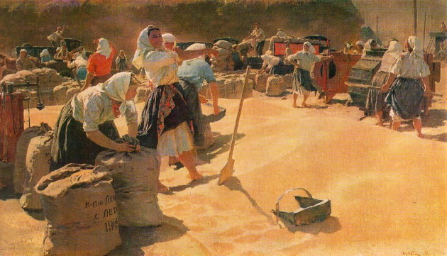
Tetiana Yablonska: Bread (1949)
She rightly points out that the movement developed during the cold war at the same time as the Socialist Realist movement in Russia. The Russian movement was heavily monitored by the state and artists had little freedom over what they could paint.
What the article does not address is that AbEx was also a state sponsored movement. The American government sponsored exhibitions and the production of abstract art. What’s nefarious about the actions of the American government is that they didn’t tell anyone (including the artists). So there is this false belief that the abstract movement developed organically.
Just like in world politics I get really worried when we talk about something as complicated as art in black and white terms : AbEx good, Realism bad.
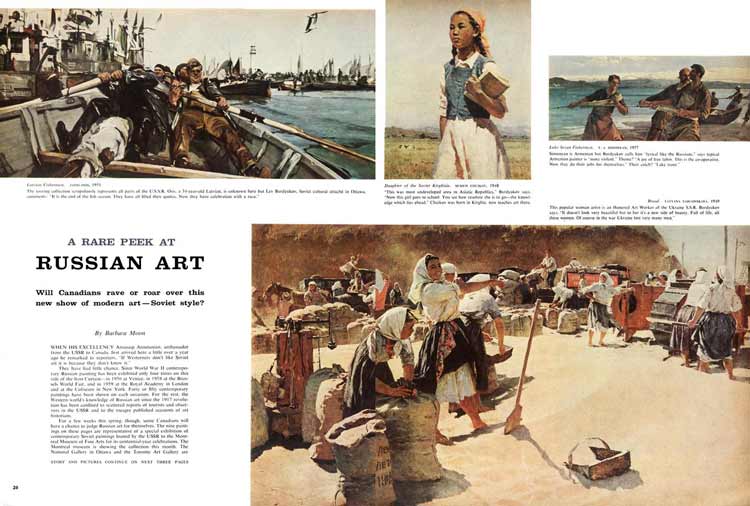
There was actually an exhibition of Socialist Realism here in Montreal in 1960. Maclean’s magazine has the original article up on their online archive. If you actually look at the art it’s fascinating. Despite all of the constraints these artists managed to make something beautiful and meaningful (examining ideas around community and work).
Celebrating abstract art as the art of Freedom of Expression is also problematic because it ignores that AbEx has alway been fairly aggressive in its attack on realism. You have to choose – ‘you are either with us or against us’. Case in point, Canadian critics and curators (all proponents of abstraction) refused to engage with the the Russian work when it visited Montreal.
With US-Chinese trade tensions we are entering into a new cold war. Recognizing that our rejection of realism is linked to cold war politics is important because it reminds us of what we stand to loose if we don’t listening to outside views!
AbEx and the Painting of Jack Bush
What I love about AbEx is that if you separate it from it’s ideology the work holds up.
To understand Abstract art I want to discuss the work of the Toronto painter Jack Bush. He’s arguably Canada’s most important AbEx painter.
The first thing I would say is like any artist you really need to look at their body of work to understand the works value. If you just look at one of Bush’s colour fields it’s reasonable to write off as simple. But if you start to look at a period of an artist work (I’ve chosen his work from the 1960s), you start to understand the artists language and artistic ideas.
In this period, I see the artist using colour shapes and pattern to create a sense of movement or interruption.
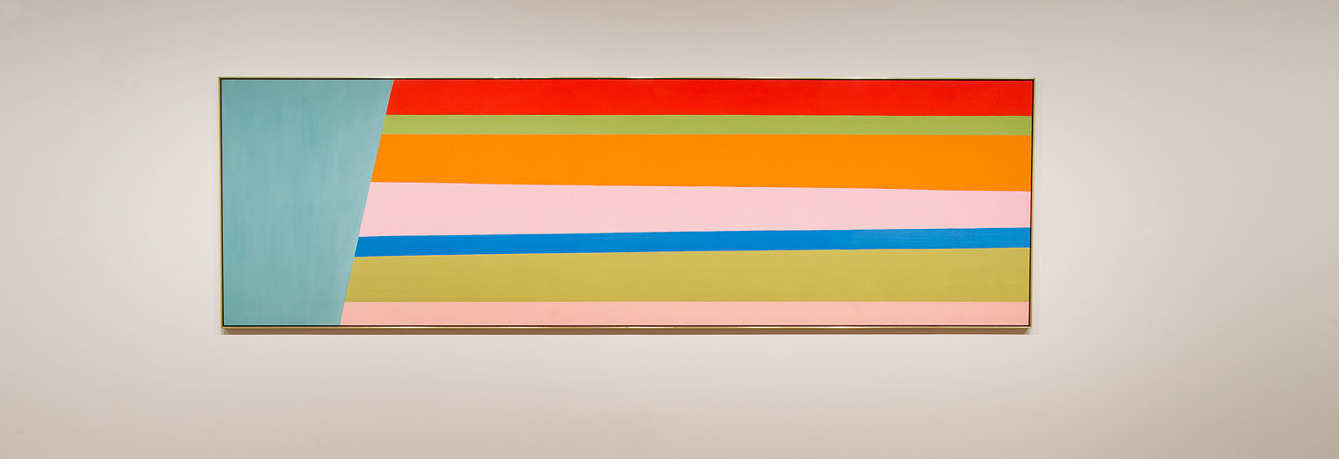
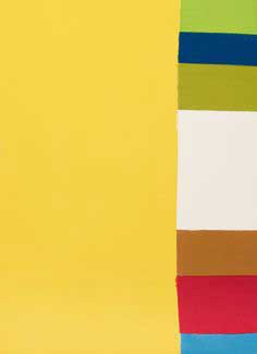
Little Yelow, Jack Bush, C. 1960s
In this first image the dominant shape is a flat yellow rectangle. To the right, this wash of yellow is interrupted by a rainbow pattern of colour. The artist is contrasting both colour and pattern to create a sense of vibration between the two parts.
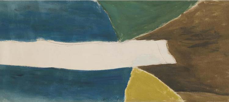
Green Thrust, Jack Bush
In image two we have a a strip of raw canvas running across the dark patterned background. Not quite making it across the canvas the strip feels like it is in motion racing across the canvas. Using a completely abstract language the artist has created a sense of movement (this series was called ‘thrust’).
Purple Thrust, Jack Bush, 1974
In this final example a blue vertical line is invading the horizontal rainbow pattern. We have a similar feeling of contrast (like we did in image one) but this time he is using line direction to create that tension.
Jack Bush was also a prominent illustrator with a good understanding of traditional technique. I can’t help but read his work as a kind of narrative abstraction. His work avoids all references to reality (space, light, form) yet his use of colour and shape still manages to tell a story!
The traveling exhibition, Morrice – The A.K. Prakash Collection in Trust to the Nation, is the story of an artist, a collector, and two kinds of Canadian identity. It offers a contemporary reading of the work of Canadian painter James Wilson Morrice through the eyes of the prominent Canadian art dealer Ash K. Prakash.
The show is built around Prakash’s $20 million collection of the artist’s work that he generously donated to the National Gallery of Canada in 2015. The collection was built up over 3 decades and speaks to the collector’s passion for the artist’s work.
The exhibition is curated by Katerina Atanassova, Senior Curator, Canadian Art, at the National Gallery of Canada. An important curatorial choice was to include a video interview of Prakash talking about his collection and his interpretation of the artist’s paintings. Including this video shifts the exhibition from an artist retrospective to a conversation between artist and collector around national and personal identity.
J.W. Morrice a Canadian Artist
Morrice born in 1865 was the son of a Montreal merchant. Originally he studied law but after graduation abandoned the practice to pursue a painting career. To do so he moved to Paris to further his studies with French masters of the day. Unlike most Canadians who studied abroad, Morrice did not return to Canada after his studies, but only made short visits to the continent at Christmas throughout his adult life.
Morrice did stay connected to his native land on a professional level. Over the years he exhibited in Canada and was part of several artist associations including the Ontario Society of Artists, the Art Association of Montreal and the Royal Canadian Academy.
He also fostered many relationships with Canadian painters in Europe including Maurice Cullen and William Bryamer. Because his work was often shown in Canada, it was an important influence on the modernist style of the Group of Seven and especially to the work of the artist A.Y. Jackson.
“It was through (Maurice) Cullen and Morrice that we in Montreal first became aware of the fresh and invigorating movements going on in the art circles of France,” A.Y. Jackson wrote in 1966. (Larsen, Montreal Gazette)
A.K. Prakash – Canadian Identity
As if mirroring the experience of Morrice, Prakash was born in Ambala, India, and immigrated to Canada in 1968 after completing his studies at the University of Michigan.
For two decades he worked in the Canadian government most notably for the Privy Council Office and the Prime Minister’s Office. In 1979 he discovered a passion for art while working for UNESCO in Paris. In the early 1990’s, he left the civil service to devote himself to collecting and art scholarship. Now considered one of Canada’s most important art dealers, he has also contributed to Canadian art through his scholarship and the publication of several books on Canadian art.
The pair represent two versions of Canadian identity. Morrice was born in Canada but spent his adult life abroad. Prakash grew up abroad but has spent his adult life in Canada. It is not their Canadian identity that unifies these two men but their lived experience as global citizens.
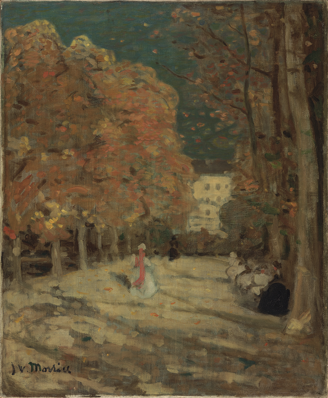
Morrice’s Mood Landscapes
Morrice is considered a Post-Impressionist painter. Like the Group of Seven he is best known for his small oil sketches (or Pochades). His refusal to abandon the figure or his urban setting place Morrice apart from his impressionist contemporaries. On an aesthetic level, Prakash argues that it is the sense of mood in his work that makes him one of the great early modernists.
His work is less interested in descriptive reality and is instead “a search to transform painting from a vehicle of seeing to an aid to feeling.” (National Gallery of Canada) Prakash explains that where the impressionists were directed by light, Morrice employs light to direct the emotional response of his viewer.
“For Morrice a landscape was a composed expression of a mood, of unétat d’âme as he wrote in one of his sketchbooks.” (Hill, Morrice at Montreal)
Morrice’s work expresses the melancholy of an outsider. The existentialism of Camus’ L‘Étranger comes to mind. Constantly traveling he paints the streets and cafes of Europe and Northern Africa. Subjects are seen from a distance and disconnected from the viewer. They are engaged in their own private world and seem unaware of the artist’s gaze. The audience is placed in the position of voyeur or tourist: observing scene without knowing how to engage.
Prakash describes Morrice as “at home nowhere and out of place everywhere” and adds “I relate to that.”
James Wilson Morrice, Luxembourg Gardens, Paris, c. 1905, Photo National Gallery of Canada
Art that Expresses the Eternal
In 1985, the time of his last major retrospective, Morrice was read as a Canadian living abroad. But relating Morrice’s émigré identity to his own experience, Prakash uses Morrice as a bridge between the cultural identity of natural born and naturalized Canadians.
“Morrice has the unique ability to acknowledge his experience of life and, through his paintings, to distill a moment into that which is eternal and does not change”. (National Gallery)
This inclusive look at identity is relevant and important in our age where national identity is evolving and its rhetoric is too often used to divide us. Morrice’s search for the eternal speaks to our shared human experience – one that transcends time, place and creed.
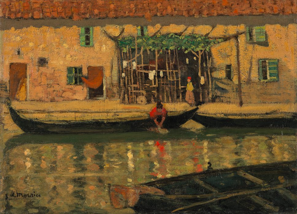
Prakash calls his donation a gift to the nation. The exhibition is accompanied by a beautiful catalogue free to visitors. At the National Gallery until March 18th the show will travel to the Beaverbrook Art Gallery, the Art Gallery of Alberta and the Musee d’art de Joliette.
James Wilson Morrice, Canal San Nicolò, Lido, Venice, 1904, Photo National Gallery of Canada
Hill, Charles C. Morrice at Montreal. Canadian Art Review, Vol. 13, No. 1 (1986), pp. 52-59
“Morrice : The A.K. Prakash Collection in Trust to the Nation Catalogue.” National Gallery of Canada. https://www.gallery.ca/for-professionals/museums/travelling-exhibitions/james-w-morrice