Rokeby Distance Drawing Course : Copy

How did a young woman from a rural town become an important book illustrator at the beginning of the 20th century? Join me as I chart Rachael’s artistic journey and share a drawing exercise from the course she took in the 1890s. The Rokeby Distance Drawing Course is available now on the Rokeby Museum Website.

Rowland Evens Robinson Rokeby Rachael

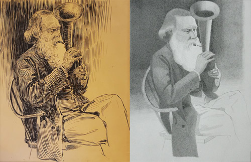
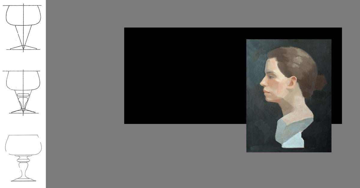
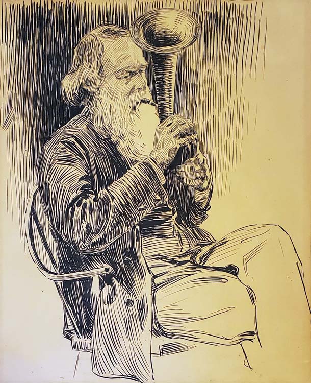
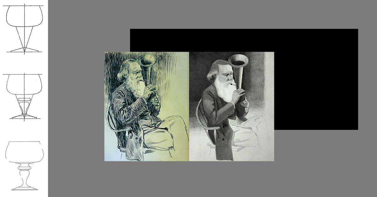
In this week’s lesson I invite students to make a copy of a drawing by Rachael, a portrait of her father, Rowland. Through archival material from the museum’s collection we also explore Rachael’s relationship with her father- a prominent illustrator and author.

Rowland was a major influence on Rachael’s professional career. An active author he would often get Rachael to illustrate his articles and books. Before the age of 18 Rachael had a dozen published illustrations thanks to this collaboration.

Understanding Rowland’s role in Rachael’s story, forces us to think more critically about the role of distance education in Rachael’s success. Rachael studied art with an important New York illustrator through a correspondence course. Having access to this education gave Rachael the tools to pursue her career. But seeing how hands on her father (and mother) were in her education and her early career reminds us that access doesn’t equal success. Rachael was able to take advantage of distance education because she had a stable and supportive home life.

By sharing Rachael’s story I want to pull back the curtain on the modern conception of an artist as a genius. Generally when an artist has early success it is because there is a support system around them.

I don’t think you need an author father to get your start as an illustrator. But I think it suggests that beyond education, artists need to think about finding some kind of apprenticeship to learn the business side of their trade.

Click here to read the full lesson!

Bill Reid: Art & Memory

Bill Reid Inspiration Art craft

Bill Reid was my first engagement with art. I can still remember seeing his Raven and the First Men sculpture and the sense of awe that I felt. The launch of the new toonie with his design brought me back to those memories.

It’s interesting to think about Reid’s work and my own practice all these years later. What stands out to me now when I look at his work is the quality of his craft and the narrative clarity.

Looking at a Reid sculpture, I have the same “how did a person make that” response that I did all those years ago. His work is beautiful. The composition, the detail and his carving technique are all incredible.

As a kid I remember getting pulled into the story of Raven. In a single still image we understand the story that Reid is trying to communicate.

As an artist I strive for these same artistic qualities. I want my art to be beautiful and I want it to communicate clearly.

Bill Reid Toonie

Reid might not seem like an obvious influence on my work. We are working in different cultural traditions. For me what connects our work is craft. Reid apparently rejected the title of artist and called himself a ‘maker of things’. I get that. Like him it’s this process of making that drives and defines my practice.

My knowledge of craft acts as an entry point for me to engage with different fine art traditions. When I look at something like sculpture (which I don’t do myself). I look for clues to how the artist made the object. When I start to understand their process the intention of the artist starts to reveal itself organically. There is always a connection between how something is made and what it is trying to communicate.

Rokeby Distance Drawing : Vision

Courtney Clinton Studio Distance Drawing Course

In my first #RokebyDistanceDrawing lesson I invite students to start a sketchbook and develop a practice of engaged observation. Don’t worry this doesn’t require any deep breathing. 😉

Through this exercise I want to challenge the idea of art as a kind of creative expression and instead present art as a kind of visual research.

Most young artists assume that because they know the world around them they also understand it. When asked to put pen to paper and draw something as simple as a tree most flounder and draw a 🌲 not an actual tree. Many assume that this means they don’t have any artistic talent. With first lesson my aim is to throw out this idea of talent and get students to start thinking about the connection between observation and drawing.

Learning to draw is about training your eye. It means sitting in front of your subject for a sustained period and working out it’s structure and mechanics. Of course the ultimate aim of art is expression but this research into observation will allow a young artist to better articulate and inform their ideas.

courtney clinton rokeby museum vision


For the lion’s share of this course we will focus on training our ability to see. Near the end of the course we will shift our attention to creative expression. I can’t wait for you to see how all of this time spent looking will fuel your creativity!

Lessons are free and materials are kept simple (paper and pencil). Each lesson comes with step by step instructions! The course is hosted on the Rokeby Museum website!

Click here to join the read the first lesson!

Rokeby Distance Drawing Course

I’m so thrilled to announce the launch of a new project, The Rokeby Distance Drawing Course! At once a digital exposition and an interactive piece, the project plays with rather than fights against the limitations of interactive artistic creation in the age of COVID-19.

As Artist and Residence at the Rokeby Museum, I am developing a new series of work that explores, activates, and shares the letters from a 19th century drawing course and the artistic journey of its student – a young woman who went on to become a pioneering female illustrator. The work is a meditation on knowledge and sharing as driving forces for connectivity and overcoming isolation.

You can read the first installment here: Rokeby Distance Drawing Course

Inspiration:

Chautuaqua Movement Fin art society Rachael Robinson Elmer

In September, 2019, I was invited to the Rokeby Museum to engage with their archive as part of a four day artist lab. From 1793 to 1961, Rokeby was home to four generations of the Robinson Family.

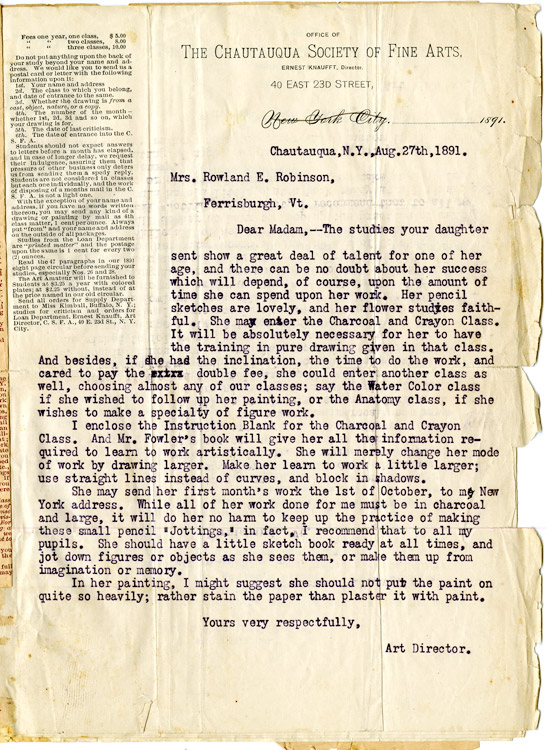
In the museum’s archive of the family’s letters and artifacts I discovered the original letters (dated 1891-93) from a correspondence drawing course that one of the daughters, Rachael Robsinson Elmer, took as an adolescent.

In March and April of 2020, I ran a series of instructional drawing demos from my Instagram Live as a way to test and think through different ways of using technology to present this historic material to a contemporary audience.

Research Residency:

As part of the research phase, the Rokeby Museum is supporting my work through digital access residency that is taking place over the summer.

Following COVID-19 guidelines, the residence takes place remotely. Collaborating with their Education Fellow, Allison Gregory (who lives on the property) I have access to the archives (art and letters of my main subject, Elmer). Gregory and I have a weekly meeting to ensure my access to the archive. In a lot of ways our collaboration mimics the form of the historic correspondence course that inspired the project.

Sharing my research:

Rachael Elmer Courtney Clinton Distance Drawing Course

Catherine Brooks, the Rokeby Director, and I agreed that making this drawing course available now, during the COVID-19 crisis, will serve a real community need. We intend to share this archival drawing course freely on the museum’s website.

From July 27 to October 5, 2020, we will post a new lesson on the website every two weeks.

Lesson Schedule:

July 27: Vision
August 10: Copying
August 24: Mistakes
September 7: From Life
September 21: Self Critique
October 5: Illustration

To make the material more accessible to a contemporary audience, I will supplement the historic material with images. As a Quebec artist, I am conscious of issues of language and accessibility. Adding visual guides to this material is also a way to make the material more accessible to a non-anglophone audience and expand the reach of this project.

How to participate:

Courtney Clinton Studio Distance Drawing Course

The course is meant for self directed learning. Students can join at any time and they can work through the exercises at their own speed. Starting July 27th until October 5th we will publish a new lesson every other week. For students looking for a little extra incentive we encourage them to treat it like a 12 week drawing challenge!

Each lesson includes a little history on the life of Rachael Robinson Elmer. We hope students will take inspiration from her artistic journey. To help students work through the exercise there are step by step drawing examples and a written explanation.

Materials:

To participate you will need a basic drawing kit.

  • 6B, 2B and HB pencil. Recommended brand Mars Lumograph
  • Kneaded eraser
  • Pencil sharpener or exacto knife
  • A pad of 18” x 24” drawing paper. Recommended brand Strathmore
  • Drawing board

Course Level:

The course is open to anyone curious about learning to draw but is ideal for kids 15 to 17 interested in getting into an animation, illustration or game art program. I have experience working as an admissions advisor for a video game art program and have designed the exercises in a way that these drawings could be used for an art school portfolio.

Feedback:

To ask questions or get feedback share your work on instagram and tag @clinton.courtney and @rokebymuseum and use the hashtags #RokebyDistanceDrawing and #DrawingWithRachael.

You can also email questions and images to intern [at] rokeby [dot] org. We want to see your work!

Press

Pandemic art heroes, CBC Arts, March 25, 2021

The Distance Drawing Course, Making the Mark, September 8th, 2020

Rokeby Remote Learning Course, Gurney Journey, August 1st, 2020

Montreal artist teams with Rokeby Museum on art classes, WCAX Channel 3, July 24, 2020

Montreal artist creating remote residency in Ferrisburgh, Sun Community News, July 24, 2020

Support

I graciously acknowledge the support of the Canada Council for the Arts for making this project possible.

Drawing Challenge: Value Composition

There is an interesting debate that runs throughout the art tradition. Many argue that what makes an image truthful is a kind of authenticity – artist who copies directly from nature. There is a second school of thought that argues that truth comes from the representation of experience not material.

This means that an artist who imposes a certain amount of imagination onto their subject (or their idea of the world) actual creates a more truthful image than the artist who operates like a camera and merely captures reality.

There is no fixed answer, artists have gone back and forth on their approach throughout history. So it’s worth learning strategies for both approaches. For most of this challenge we have focused on understanding and replicating the structure of our subject.

This week we are going to switch gears and think about composition. In studying composition we learn tools and strategies for unlocking our imagination and adding our own ideas to art.

This week’s challenge

This week we are going to think about value as a tool for composition and design. Last week we used value to create a sense of light and shade and to give an object a feeling of form.

This week we are going to switch gears completely. We are going to build on what we learned in week 3 when we talked about placement and the thumbnail approach. We are going to use the same thumbnail approach to explore how we can create patterns using value.

The thumbnail approach allows us to make lots of quick studies before we start our final drawing. To learn more about this approach I encourage you to check out our challenge Composition.

Start with a value scale

value scale

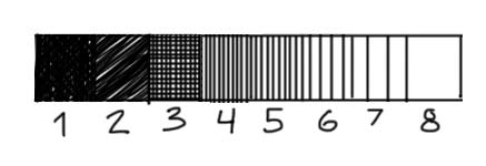
Whenever we are working with value it is helpful to create a value scale. Let’s start with a full value scale of eight values.

Start by drawing a long rectangle and dividing the rectangle into 8 smaller boxes. Each box will represent a box on the scale.

To make an accurate value scale it is helpful to start with the darkest and lightest value (1 and 8). Notice that value 1 is almost (but not completely pure black). It’s always good to keep a few dots of white in your darkest value – this gives the value a lighter feel. Pure black suggests a total absence of light and there are very few instances of this in nature.

Next indicate your two middle values (4 and 5). Try and create values that feel like they are halfway between your darkest and lightest value.

Next put down a value for your second darkest value (2). This can be scribbled in. Allow some of the white of the page to peek through. Next put down a value for number 3. I used cross hatching to make this value. First I put down a series of very close vertical lines and then on top a series of horizontal lines.

Finally you can put down your lights. Space your vertical lines apart to lighten the value of these two values.

Thumbnail studies

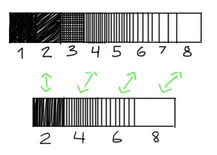
When we are thinking about design and making thumbnail studies we work in simplified terms. This means that we don’t take into account detail or shading in our thumbnail drawings. It also means that we simplify our values. To do this we reduce our value scale from eight steps to four steps.

simplified value scale

Make a second four step value scale. For your four values use steps 2, 4, 6, 8.

Value Plan

andrew loomis creative illustration

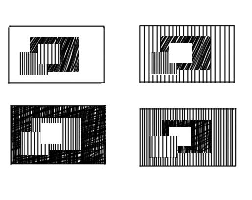
We can use value to create a kind of pattern in our drawings (and eventually paintings). To understand this idea, it is useful to read Andrew Loomis’ chapter on value in his book Creative Illustration. In his book he introduces the idea of a value plan.

A value plan is a way of distributing and ordering value in a drawing. He argues that there are four basic value plans and describes these plans with a series of abstract images of squares. Obviously there are other ways and strategies of designing you composition. But learning Loomis’ approach is a way to start thinking strategically about composition.

For the value plan he uses the same four values that we defined on our 4 point scale. In each of the four plans he alternates the placement of the value.

Looking at these drawings might not make any sense. But I promise you, that copying these four seemingly simple drawings will revolutionize your understanding of art (this is not an overstatement).

Creating Value Composition

andrew loomis value plan composition

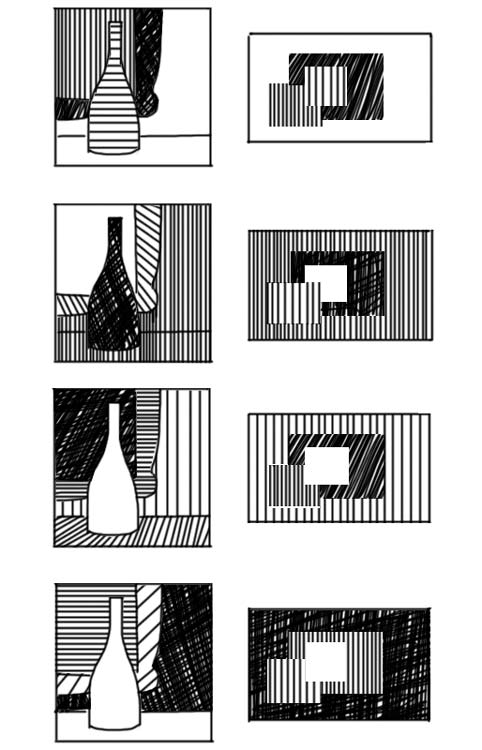
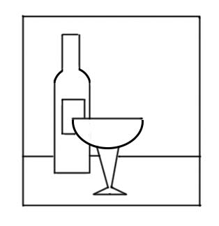
Above is an example of how we can use these four plans in an original compositions. Each drawing uses one of the Loomis value plans as inspiration for the placement of values.

Again copy these sketches to really understand how they work.

Notice how I play around with shapes. I often combine objects to create a larger more interesting value shape. Sometimes I treat the wall and the tabletop as one shape (1,2) and sometimes I treat them as two shapes. In the forth example I treat the wine bottle and the table as one shape. When I do my finished drawing I can use outline and a more nuanced treatment of value to distinguish between my combined shapes. In the design stage I let myself think in abstract terms.

This exercise is all about creativity. So now I encourage you to do your own designs. Use the below drawing as your basic composition and come up with four different value compositions. Use the Loomis value plans to guide you!

drawing challenge week 9

Drawing Challenge: Light and Shade

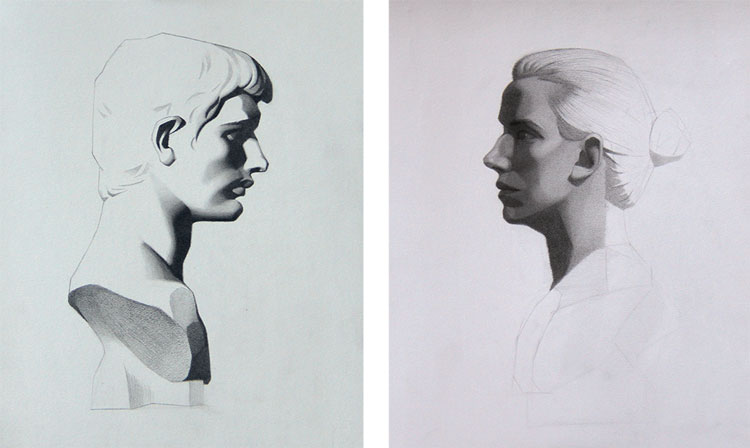
Light and shade is pretty exciting. We use light and shadow to communicate form, atmosphere and texture. For a lot of young artists it’s tempting to skip over some of the fundamentals and go right to light and shade.

What I hope to show with this week’s challenge is just how important those fundamentals are to our understanding of light and shade.

This week’s challenge

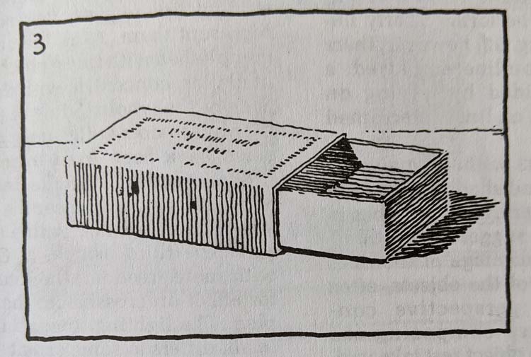
matchbox guptil courtney clinton
Pen and Ink Drawing, Arthur Guptill, Rendering In Pen and Ink

For this week’s challenge we are going to explore light and shade. To do this we are going to build on last week’s challenge. I recommend that you work through last week’s lesson before you start the one from this week.

For this week’s challenge you will need two colored pens and a slightly thicker marker. I would recommend a blue and a red ballpoint pen and a sharpie marker. If you also have a thin black felt pen that’s great (but not essential).

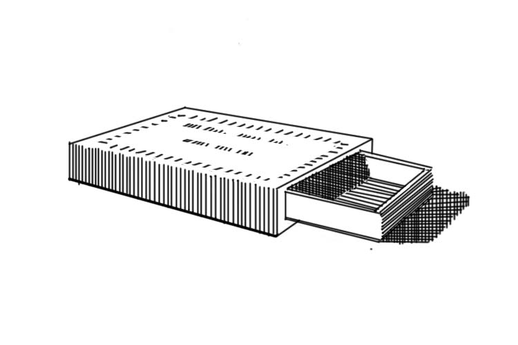
We are going to use a drawing by the artist and teacher Arthur L. Guptill. He wrote an excellent book called Rendering In Pen and Ink. I highly recommend his book to anyone looking to deepen their knowledge.

Start with a box

Before we even think about light and shade we need to understand the structure of our matchbox. If we had to describe our matchbox in simple geometric terms what would those be?

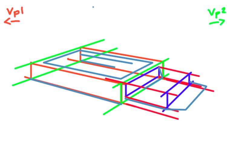
I see two thin boxes. The first box represents the main structure of our matchbox. The second box is slightly smaller. It comes out the right side of our main box.

Now that we have simplified our shapes we can start our drawing using our knowledge from the last challenge.

Draw the main box in perspective

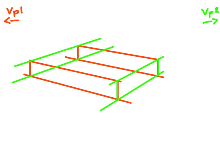
Our first step is drawing the main box in two point perspective.

In two point perspective the only parallel lines are the vertical height lines. The width and length lines of our box will recede towards two vanishing points (Vp1, Vp2).

Our first step is to draw a horizon line. When we look at the box we can see a lot of its top side. This tells us that the horizon line is significantly above our box. Let’s imagine a horizon line just beyond our picture plane.

To find our two vanishing points we are going to take the angle of the front two bottom edges of our box. Line a pencil up against the bottom right edge. Now imagine that your pen extended all the way until it met the horizon line. Where would that point be?

Do the same thing with the bottom left edge. In both cases that point where the line extending from the bottom line and the horizon line meet is outside our picture plane (the rectangle that defines our drawing). If it’s helpful draw a thumbnail version of your box with the horizon line and the vanishing points.

In our case it’s important to note that the vanishing point on the right is much closer to the picture plane than the left vanishing point.

Using your knowledge of perspective draw a box that represents the main section that makes our matchbox.

If you need a refresher on how to build your box check out our challenge rotating a cube.

Build a second box

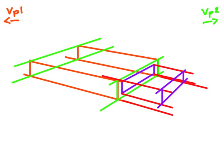
The matchbox provides a really excellent metaphor for how we can use perspective to build complex objects. Think about the mechanics of our matchbox. There is a main box and inside that box is a slightly smaller box that can be pulled out. In this drawing we see the second box pulled halfway out of the main box.

To start drawing this second box we need to think about its relationship to our main box. Using the right front side of our main box let’s define the main proportions of our second box.

On that front right side draw a slightly smaller rectangle (in perspective) that fits into this main box (purple lines). This new rectangle tells us the height and length of our smaller second box.

Using this information let’s draw the base of our new box. The length lines that define this second box must recede to the same vanishing points that defined our main box. Once you have your base, build out the rest of your smaller box.

Again for a more detailed description of this process, check out the step 2 of the “Add a Cylinder” section of the Building Blocks challenge.

An important stage

Before we move on, take a moment to consider how much time we spent on that first step of thinking through the structure of our drawing. This first stage is so essential to making a good drawing. Make you sure you give this first stage the time it deserves.

Light and shade

Now we can move on to the fun part: adding a sense of light and shade!

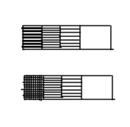
Value Scale

When we start a line drawing we always start by analyzing our shapes and proportions. In the same way, the first step in a light and shade drawing is to define and think about our shadow shapes.

First block out your shadow shapes. I see four shadow shapes

  1. The front left side of our matchbox
  2. The inside of smaller box
  3. The right front side of the smaller box
  4. The cast shadow of our match box on the right side

Now let’s rank the values of these four shadow shapes.

Let’s start with the darkest shape. The darkest shadow shape is the cast shadow. The artist has used thick lines that are very close together to define this shape. In a small box let’s mimic this same approach.

These same thick close lines are used in the left part of the shadow that makes up the inside smaller box.

If you only have one black pen. Another way to represent this darkest value is with cross hatching. Instead of using a thicker pen we will use two sets of lines (horizontal and vertical).

To the right of the tick lines inside the smaller box we see a value that is described by thin lines that are close together. We see this same pattern on the right front side of the smaller box.

Let’s expand our value scale by adding a second box. In the second box lay down a series of lines that mimic this approach.

Finally on the front left side of our main box we see a value that is represented by a series of vertical lines that are slightly more spaced apart.

Let’s expand our value scale by adding a third box. In the third box lay down a series of lines that mimic this approach.

Add a fourth and final box to your scale. Leave this one blank to represent the lightest value in our drawing : the whites.

Before you start any drawing with light and shade. It is useful to make this kind of value scale.

Adding value

Ok now we can start to ink our drawing. Let’s start by indicating our outlines. In some sections the artist has omitted the outline (look at the top edge of the front left side of our main box). This is an artistic choice – and should be noted). Try and be really exact and copy exactly the lines that the artist has used.

Once we have drawn the outline we can start adding the shade.

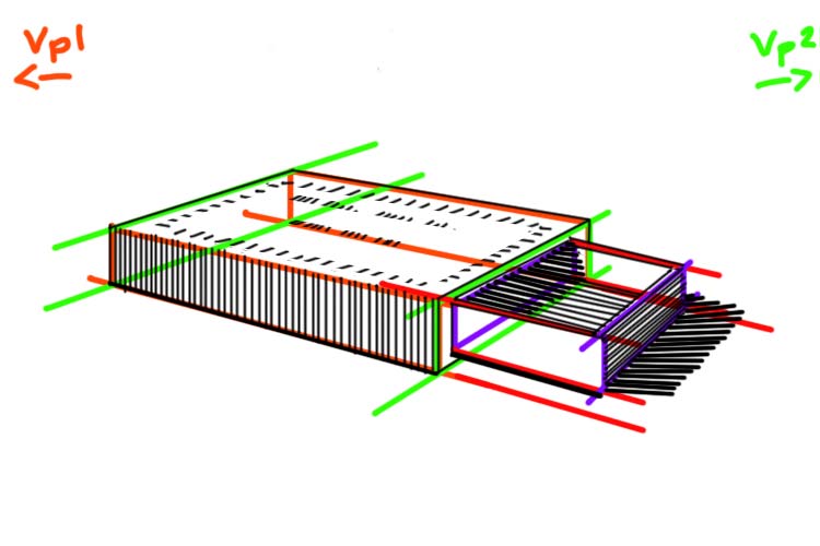
It’s useful to work from our darkest values to our lightest values. Let’s start with the front right side of the smaller box and the cast shadow. Make sure to note not only the value but the direction of the lines. The lines on the front right side of the box follow the perspective lines. The lines defining the cast shadow are right leaning diagonals.

Now add the value for the inside of the box. Again the lines follow the perspective lines that define the base of this box.

Drawing Matchbox courtney clinton drawing challenge
Crosshatching approach for darkest shadows

If you are using the cross hatching approach, add a series of vertical lines to the two darkest sections of the cast shadow and the inside of the box.

Next, let’s add a series of vertical lines on the front left side of the main box. Make sure that these lines have more space between themselves than the darker section.

Finally we can add the detail to the top side of the main box. Make sure these small dash lines follow the perspective lines of the main box. To help guide you, draw guidelines in perspective where you will be making the dashes.

Drawing Challenge: Building Blocks

Remember being a kid playing with building blocks? Remember that rush you got when you realised you could stack and build out your blocks? We can do the same thing on our sheet of paper. The same way this kind of play teaches kids valuable cognitive skills, we can use this exercise to develop our drawing skills.

This week’s challenge

For this week’s challenge we are going to expand on last week’s challenge and start to build in 3D space. I recommend that you work through last week’s lesson before you start the one from this week.

For this week’s challenge you will need two coloured pens and a slightly thicker marker. I would recommend a blue and a red ballpoint pen and a sharpie marker.

We are going to use a couple photos as reference for this week’s lesson. You will find the photos below.

Start with cube
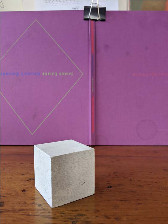
In two point perspective the only parallel lines are the vertical height lines. The width and length lines of our cubes will recede towards two vanishing points (Vp1, Vp2).

Our first step is to draw a horizon line. When we look at the cube we can see a lot of its top side. This tells us that the horizon line is significantly above our cube.

Step 2: vanishing points

To find our two vanishing points we are going to take the angle of the front two bottom edges of our cube. Line a pencil up against the bottom right edge. Now imagine that your pen extended all the way until it met the horizon line. Where would that point be?

Do the same thing with the bottom left edge.

In both cases that point where the line extending from the bottom line and the horizon line meet is outside our picture plane (the rectangle that defines our drawing).

Above is an image that shows our two vanishing points. Look how far vanishing point two is. This is a pretty typical case. It’s very rare that your vanishing points will be close to your picture plane. So we have to get used to imagining where they are and making construction lines that suggest or estimate that point. Our aim is not exactness, our goal is to make images that feel like they are in perspective.

One thing that can help is to draw a thumbnail in the corner of your page that shows the relationship between the vanishing points and the picture plane. In our case it’s important to note that the vanishing point on the left is much closer to the picture plane than the right vanishing point.

Step 2: Base
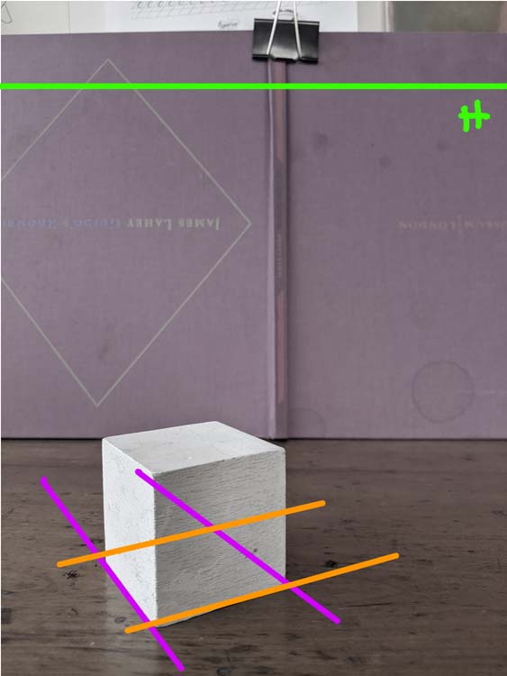
To start, let’s draw a square in two point perspective.

Mark a point near the bottom left of your page. This will represent the front corner of our square.

Let’s start from the right side. The length lines that define the right side will all originate from the right vanishing point (Vp2). We know that this point is a long ways away. This tells us something about the slope of the line. Because it will take longer to reach the vanishing point we know that the slope of this line will be less steep. Measure the bottom right edge of the cube in the photo to get the exact slope.

Repeat the same process on the left side. The length lines that define the left side will be much steeper. We know the vanishing point on the left is much closer to the picture plane. To ensure that the left length lines meet the horizon more quickly we need a line that is closer to a vertical.

Now let’s indicate the invisible lines that define the back edges of our square. We can’t see these lines because our cube is opaque. We are going to use the information we have to estimate these lines.

Let’s start with the back left line. This line is opposite to the right front line. In theory these two lines are parallel. In perspective any lines that are parallel will converge towards a shared vanishing point. So the left back line will recede towards the right vanishing point. We want to draw a line that is very similar to our front right edge. But it should slope slightly towards that first line.

For the right back line, the same principles apply. In this case, the back right line is moving towards the left vanishing point. It will look very similar to the left front edge but again it should slope slightly towards the front line.

Getting the base correct will make all the difference as you move through the drawing. So spend all the time you need to get it right.

Step 3: Build out your cube
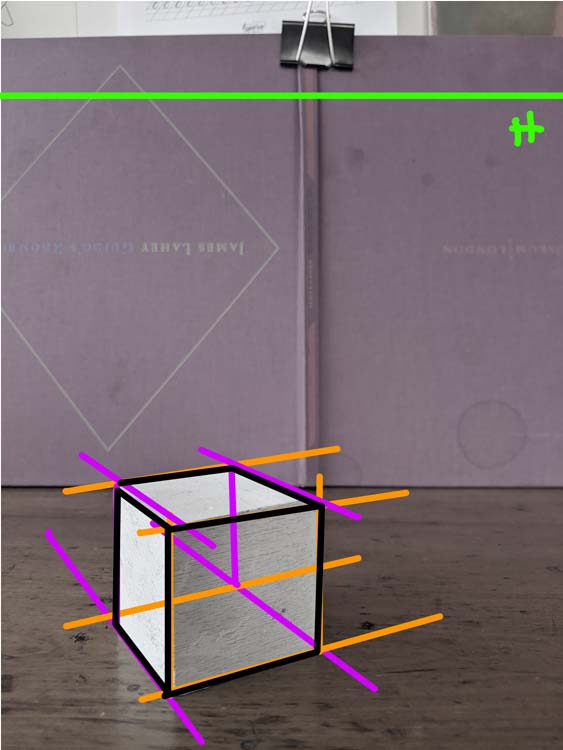
Build out the rest of your cube starting with the two front sides and then the top of your cube. Think like a builder and work from bottom to top. As you make new lines, think about their relationship to the vanishing points.

To get a step by step guide to building your cube check out last week’s blog.

Add a Cone
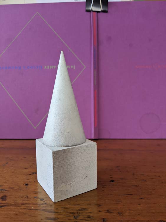
Ok now that we have a base cube, let’s have some fun! Let’s add a cone to our drawing!

We don’t know how to build a cone yet. But we do know how to build a cube or a box. So let’s start with what we know.

Step 1: Draw a box
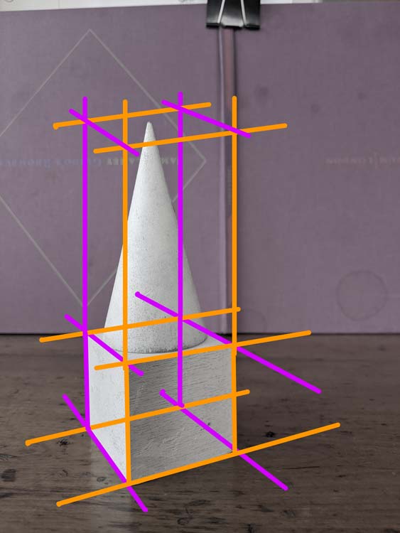
If we measure our cone we can see that it’s approximately two cubes high. So let’s build a box measuring two cubes on top of our original cube.

To build this next cube we need a base. Well lucky us we already have our base. The top of our original cube is also the base of our cone.

To build side walls around our base we stretch out our four vertical lines. Go ahead and stretch them just past your top measurement.

For the top plane we need to use our imagined vanishing points. The front left edge and the back right edge will both move towards our left vanishing point. Our right front edge and our back left edge will move towards our right vanishing point.

Look at how the cone sits inside our cube.

Step 2: Ellipse base
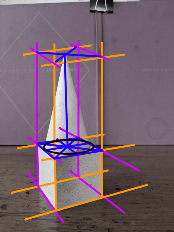
Now let’s think about what makes our cone different from our cube. Let’s start with our base (we always start at the bottom). The base of our cone is defined by a circle in perspective (we call this an ellipse).

To draw that ellipse we first find the centre point of our base square. Draw an X starting at the four corners of the square. The point where the two diagonal lines meet is the centre of your square. Knowing where the centre is we can draw two more lines that run through the centre of this square. These should make a kind of cross in perspective.

When we draw a circle in a cube we see that the circle hits the square at these centre points of the length lines. These points mark the four crests of the circle’s curved line. We can use this information to help guide us as we draw our ellipse to represent the base of our cone.

Step 4: Top
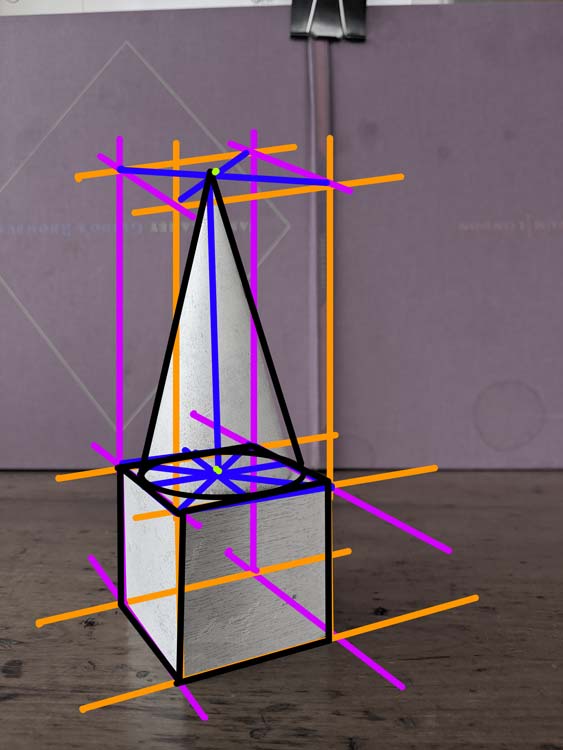
The top of the cone is quite unlike its base. The top is not flat or round, it is defined by a point. But how do we decide where that point is? Rationally, we know that the point is above the centre point of our base. If we draw a vertical line starting from the centre of our base up towards the top of our new box, we can find our point. This line represents the centre line of our cone.

To complete our cube draw two diagonal lines. First, from the centre of the right front edge of the cone base to the top point. Next from the middle of the left back edge to the top point of the cone.

Add Cylinder
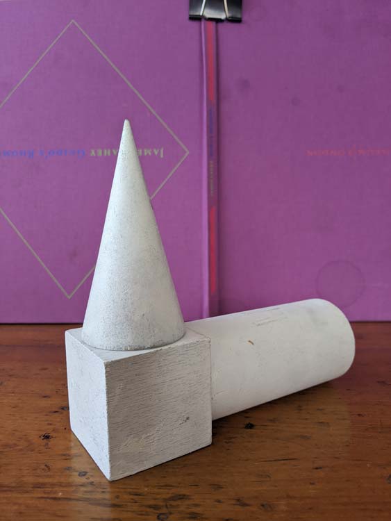
In the same way that we built on top of our cube, we can also build out from our cube. Let’s add a cylinder to the back left side of our cube.

In the same way we build a cone inside a box, we can build our cylinder inside a box that comes off our original cube.

Step 1: Base
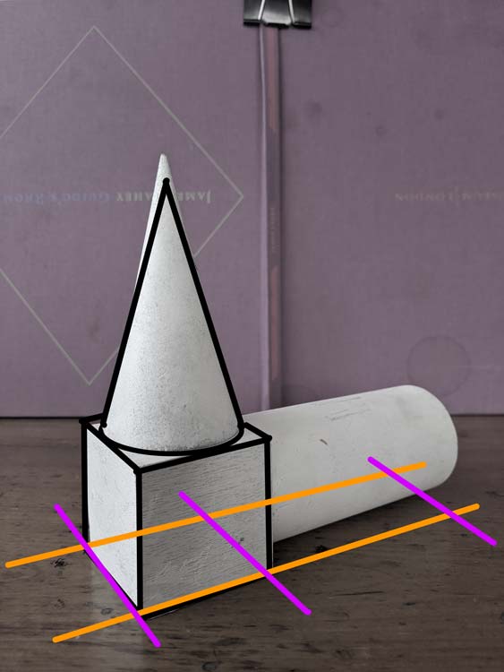
To start building this new box, we start with our base. Always start with the base. It’s boring but it makes drawing so much easier!

This part is really fun, because we get to be really lazy. In the same way that we extended our cube’s vertical lines to build the walls of our cone’s box, we can extend the length lines of our cube’s base to make our new base!! Magic.

Step 2: Build out a box
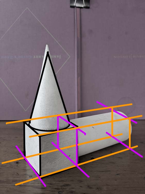
Let’s start with the front right edge. Our new box measures about the same as the total length of our cube (both sides). So let’s pull the front right edge of our cube about that length to the right. Now we can extend the back left edge the same distance to the right. Mark a point on the front right edge that represents the right front corner of our new box. Starting from this point, we can extend a line towards our left vanishing point. This line will represent our back right edge. Now we have the base of our cube.

Using the construction lines from the top of our original cube. We can build out the rest of this new box.

Step 2: Cylinder in box
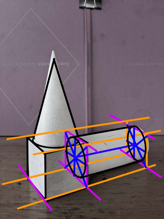
To build our cylinder we are going to start with the two sides that are defined by an ellipse. We are going to divide the squares that hold these ellipses in the same way we did for the cone.

To draw that ellipse we first find the centre point of our squares. Draw an X starting at the four corners of the square. The point where the two diagonal lines meet is the centre of your square. Knowing where the centre is we can draw two more lines that run through the centre of this square. These should make a kind of cross in perspective.

When we draw a circle in a cube we see that the circle hits the square at these centre points of the length lines. These points mark the four crests of the circle’s curved line. We can use this information to help guide us as we draw our ellipses that make the two sides of our cylinder.

Now all we need to do is define the top and bottom edge of our cylinder. The lines for the top edge should be just left of the vertical centre line of the side squares. We want it to feel like the line is extending from the ellipse. Or that the ellipse is turning into this top edge. Same principal for the bottom edge. The line should start somewhere on the right side of that centre vertical line of the side squares.

Finishing up the drawing
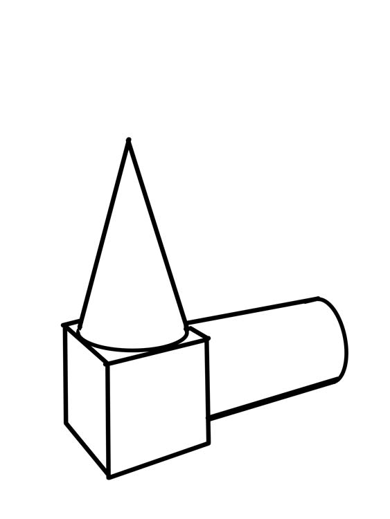
To give our drawing a clean feel. We can go over our main lines with a darker or thicker pen. We don’t want to draw all of our construction lines. Only lines that define the edges that we can see. Take your time on this step and try and clean up any loose lines and improve your curves.
In Dialogue with a Curator

I’m blown away by the different online initiatives that are being offered by local arts organizations to keep serving our community!

Durham Art Gallery Initiative

Yesterday I took part in a Virtual Studio Visit with the curator Jaclyn Quaresma of the Durham Art Gallery. The initiative gives emerging artists the opportunity to dialogue with curatorial professionals to discuss recent projects! What an opportunity!!!

It was incredible to talk through my current #DrawingChallenge project with Quaresma. She was incredibly generous with her time and gave me some great feedback. .

Pitching my project

pitching my project courtney clinton

We discussed my engagement with a 19th century drawing course (part of the Rokeby Museum archive) and the different ways that I can activate this material for a contemporary audience.

As I described the project, I talked a lot about issues of accessibility for rural artists. I was thinking about the story of Rachael Elmer who took this course while living in rural Vermont in the 1890s.

The Durham Art Gallery’s mission is to bring art to a rural region in Ontario. Discussing my ideas with Quaresma, I realised that I don’t really have an authentic connection to the issues that face rural artists.

Developing my idea

My connection to Elmer’s story is not the specifics of being a rural artist but our shared experience of learning to draw. As we learned our craft both were in situations of isolation and art became our community.

As a realist I often feel outside the main cultural community of Montreal. My own experience with correspondence education was about finding community with other students, teachers and the art.

So the guiding idea of this project is this relationship between knowledge and connectivity (and what that can mean in times of isolation). When I discovered Rachael’s story, I felt an instant kinship. Despite time and place she became a friend. What allows for this seemingly impossible friendship is our shared visual language.

Drawing Challenge: Rotating a Cube

We are back! A central theme for the drawing challenge is control. With every exercise, I ask you guys to work with intention. Our aim is to think about every line that we put down on the page.

So why am I such a control freak? Isn’t art about self expression and creativity!

Absolutely, but there are different ways to achieve that creative freedom. We can achieve freedom by blowing up the system and taking a no rules approach. There is some amazing art that has come from this kind of approach.

But we can also achieve creative freedom by mastering the language of drawing. Great poems and plays are created by writers who have a mastery over written language. They know how to use vocabulary and grammar to create and bring to life imaginary scenes and characters.

Beyond the fine arts, architects, fashion designers and industrial designers all use drawing to create something brand new. For me this is the ultimate power of realist art: the ability to create new recognizable worlds.

This week’s challenge

For this week’s challenge we are going to start to think about how we can change and manipulate our subject. We are going to start off simple but this first step on a journey to learn how to draw from imagination.

For this week’s challenge you will need two coloured pens and a slightly thicker marker. I would recommend a blue and a red ballpoint pen and a sharpie marker.

For an object, we are going to use the cube. From a cube we can draw almost any object in perspective. Our challenge is to rotate a cube from a front facing position to a two sided position.

How to draw a front facing cube

A front facing cube is also known as a cube in 1 point perspective. We see two sides of the cube. The front side and the top side. The front side is defined by two horizontal lines and two vertical lines. These lines are parallel to the edges of our page. The top side is defined by two sets of lines. The horizontal lines that define the top and bottom edge are parallel to the horizontal lines of our front side. What gives the cube a sense of space, are the two length lines recede towards a central point on the horizon line.
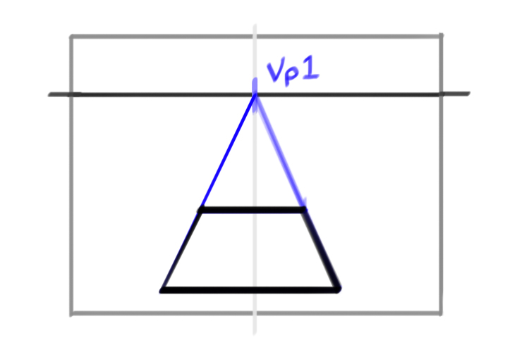
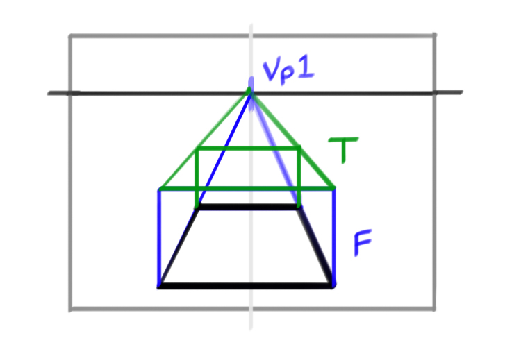
Step 1: Horizon line

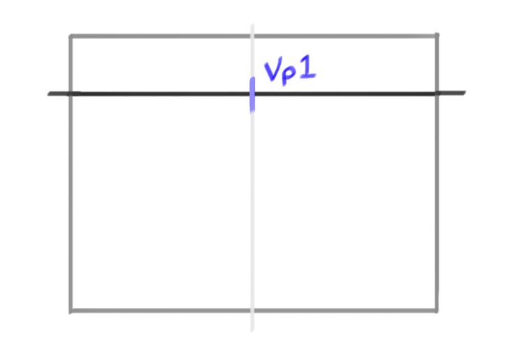
Draw a large box (6 x 8 inches) that will represent our page. Near the top of the box draw a horizontal line. This line will represent our horizon line. The horizon line represents the eye level of the artist.

Next mark a vertical line down the centre of the box. In a new colour mark a small line where the horizon line and the vertical centre line intersect. This will be our vanishing point (Vp1).

Step 2: Base

First step is to draw a square in one point perspective. This square will act as the base for our cube.

When we draw an object in perspective we always start from the bottom and build up our object. We can think of ourselves like construction workers – you would never start with the roof.

Near the bottom of the page mark two horizontal lines. These will represent the front and back edge of our square. To find the length lines of our square we draw two lines that start from the corners of our front edge and recede towards our vanishing point.

Step 3: Front side

Now let’s indicate the front side. Start by drawing two vertical lines that represent the two side edges of our cube. Indicate the height of the front side by drawing a horizontal line joining the two top corners of the two vertical lines.

Step 4: Top side

Still thinking like a builder, before we build that top side we need to first build the back wall of our cube. At the back edge of our base square, draw two vertical lines . Don’t worry too much about their height. Just make them high enough that they could support our top side.

To determine their true height we are going to pull two diagonal lines. The lines start at the vanishing point and come all the way to the two corners of the top horizontal of our front side. On their way from the vanishing point to those front corners, the lines will cross through our back vertical lines. This point of intersection marks the top of our back side.

Draw a horizontal line joining the two back vertical lines.

To really indicate your cube draw over the main lines using a thicker marker.

Rotating the cube to see two sides

Ok now we are going to rotate our cube. Right now we can see two sides: a front and a top. To make a more dynamic image we are going to rotate this cube so that we can see three sides: top and a left and right side.

In two point perspective the only parallel lines are the vertical height lines. The width and length lines of our cubes will recede towards two vanishing points (Vp1, Vp2).

Step 1: Horizon line

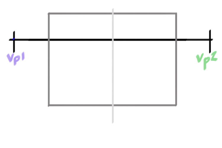
Draw a large box (6 x 8 inches) that will represent our page. Near the top of the box draw a horizontal line. This line will represent our horizon line.

Next mark a vertical line down the centre of the box.

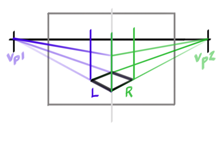
Mark two points on the outer edges of your horizon line (Vp1, Vp2), make sure that these points are outside of your main box. These two points will represent our two vanishing points.

To draw an object properly in two point perspective, it’s important to keep the vanishing points outside of our drawing page. If the vanishing points get too close the object starts to look warped.

NOTE: with one point the vanishing point is on the centre line of the page. For two points the vanishing points are outside of the picture. 

Step 2: Base (two vanishing points)

Just like Drake, we will always start from the bottom and build our way to the top. ;D

So let’s draw a square in two point perspective.

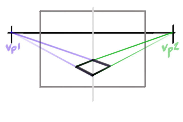
Mark two points near the bottom of your box on the vertical central line. These two points will represent the front and back corner of our square.

Let’s start from the left side. The length lines that define the left side will all originate from the left vanishing point (Vp1). Draw two diagonal lines starting from the left vanishing point (Vp1) and ending at the two points representing the front and back corner of our square.

Repeat the same process on the right side. The length lines that define the right side will all originate from the right vanishing point (Vp2). Draw two diagonal lines starting from the right vanishing (Vp2) point and ending at the two points representing the front and back corner of our square.

The lines from the left and right vanishings points will cross at four points. These four points represent the four corners of our square. Use a thicker marker to trace over the lines of our base square.

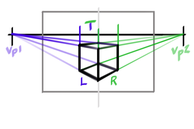
Step 3: Left side

Now let’s build our first side wall. Let’s start with the left side.

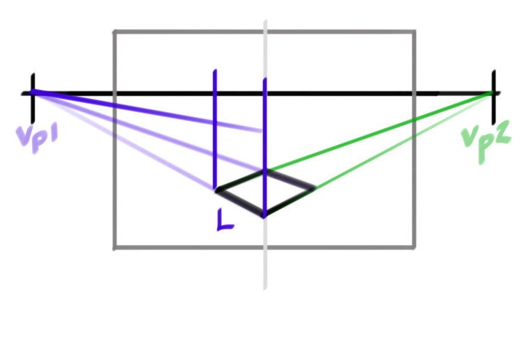
First draw two vertical lines representing the squares centre edge and the left edge of our cube. Again, don’t worry too much about the height. Better to make them too long than too short.

To determine the height of our cube mark a point on the centre edge (which is also the vertical centre line of our box). To find the top edge of this left side, draw a line from the left vanishing point (vp1) to the point you just marked on the centre edge.

Step 4: Right Side

Now let’s build our next side wall: the right side.

First draw two vertical lines representing the squares centre edge and the left edge of our cube.

The centre edge is shared by both the right and left sides. So the height of our right side has already been determined by the height of our left side.

To find the top edge of this right side, draw a line from the right vanishing point (vp2) to the top of the centre edge.

Step 5: Top Side

This last stage mimics the process we used to build the base of our square. We already have the two front edges of our top side. Now we need to draw the two back edges.

Let’s start with the back left edge. Intuitively we might think we should start from the left vanishing point (left edge = left vanishing point). But look at your bottom base square. That back left edge is defined by a line coming from the right vanishing point.

If we think about it, the back left edge mirrors the front right line. So it makes sense that these two lines originate from the same vanishing point.

So to draw that back left edge of our top square we draw a line from the right vanishing point and pull it all the way to the top of the left vertical edge of our cube.

To find the back right edge we follow the same process. In this case we draw a line from the left vanishing point and pull it all the way to the top of the right vertical edge of our cube.

We have a lot of construction lines. To see our cube more clearly let’s draw over the main lines with a thicker black marker.

Selfie: #Neutral

This painting is called #neutral. The aim was to address a conceptual limitation in the series of Selfie paintings I have been making.

Context

#Study (WIP), Selfie, 2020, graphite on paper

In this painting I portray myself like a marble sculpture. So much of the tradition of realist art references Roman and Greek sculpture. This kind of sculpture is what we call ideal art. It presents an essential idea of the human form. It’s not meant to represent a specific person but an idea of the average person. When artists want to express a universal message they will use this kind of “generalized” figure to say this is everyone’s story. For a long time these generalised figures have been presented as white. In both fine art and pop culture we’ve treated white culture as neutral or most relatable.

There is a lot of great art right now that is challenging this idea. I think of Kent Monkman or Kehinde Wiley who make ideal art not only with different bodies but also with a different intended audience.

Acknowledging bias

With my own Selfie series, I’m asking my viewers to look beyond the subject (me) and think about the history and process of image making. I’m asking them not to think about me as an individual. In this way I’m treating myself as a neutral subject. .

To paint this I used both a neutral and a red paint. By expressing the color of my skin, I want to acknowledge that there is no such thing as a neutral figure. We all have an identity and that informs our understanding of the world. It’s scary to admit our own shortsightedness. But I think in our divisive culture, it’s the only way forward.