As part of my art exhibition Post-Monument, I will be giving two artist talks this month!
Imprimerie Centre D’artistes
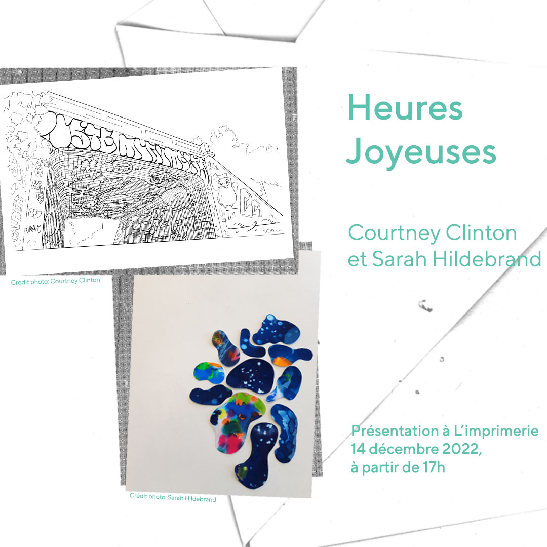
Join me for an artist talk Imprimerie Centre d’Artistes as part of their Heures Joyeuse series on December 14th at 5PM (en français)!
Together with Marven Clerveau we will discuss the show Post-Monumental, a mail art project. We will be sharing stories from our visits to the 12 monuments illustrated on the postcards and the creative responses these visits inspired.
Thanks to a grant from the Canada Arts Council I spent 6 months visiting and sketching different monuments and sites around the city as research for the project. These visits helped me understand the monuments not just as markers of history but as shared spaces that define our present culture.
As part of his creative research Clerveau visited and photographed the different monuments. He used these images of the monuments and their surroundings to create a series of collage responses that go beyond the physical landscape and give each monument an emotional state.
BBAM! Gallery
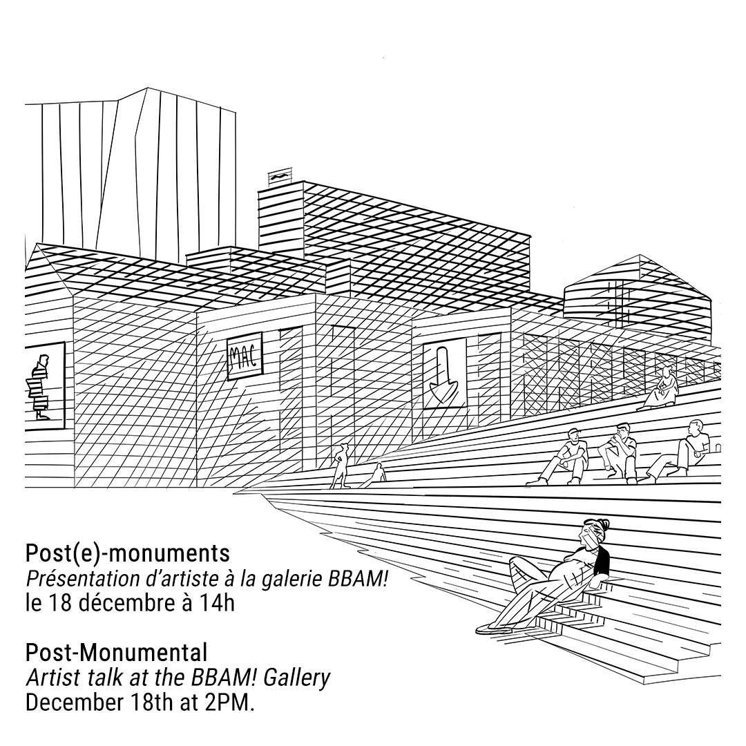
On Sunday December 18th at 2pm, I will be joined by six of the twenty-four artists at the BBAM! Gallery to discuss our favorite postcards and the project.
Talk will be moderated by the journalist Justine Smith !
Artists panel:
Asia Mason – Often drawing from inspiration from her family history migrating from the Caribbean, she focuses on stories about time, female lineage and inheritance of memories.
Colette Campbell-Moscrop – trained as an architect and is a practicing artist. Her artwork mixes everyday observations and imagination.
Daniel Jervis – is and animator and illustrator. His work explores South American folklore and pre columbian, focusing on a peaceful coexistence among humans and nature.
Kaia’tanó:ron Dumoulin Bush – has a BFA in Indigenous Visual Culture from OCAD University . As an illustrator she loves to collaborate with clients who seek to enrich Indigenous communities and empower Indigenous youth.
Kyle Williams – is a painter and illustrator best known for his large scale paintings of gigantic concrete structures that have a strange resonance for the artist, between the destruction of landscape and the pride of Ironworkers of the Mohawk community.
Reihan Ebrahimi – is an Iranian-born ceramic artist. Her work is a reflection on notions of cultural identity, memory and displacement.
Post Monumental: Modern Montreal Postal Art Project Launches
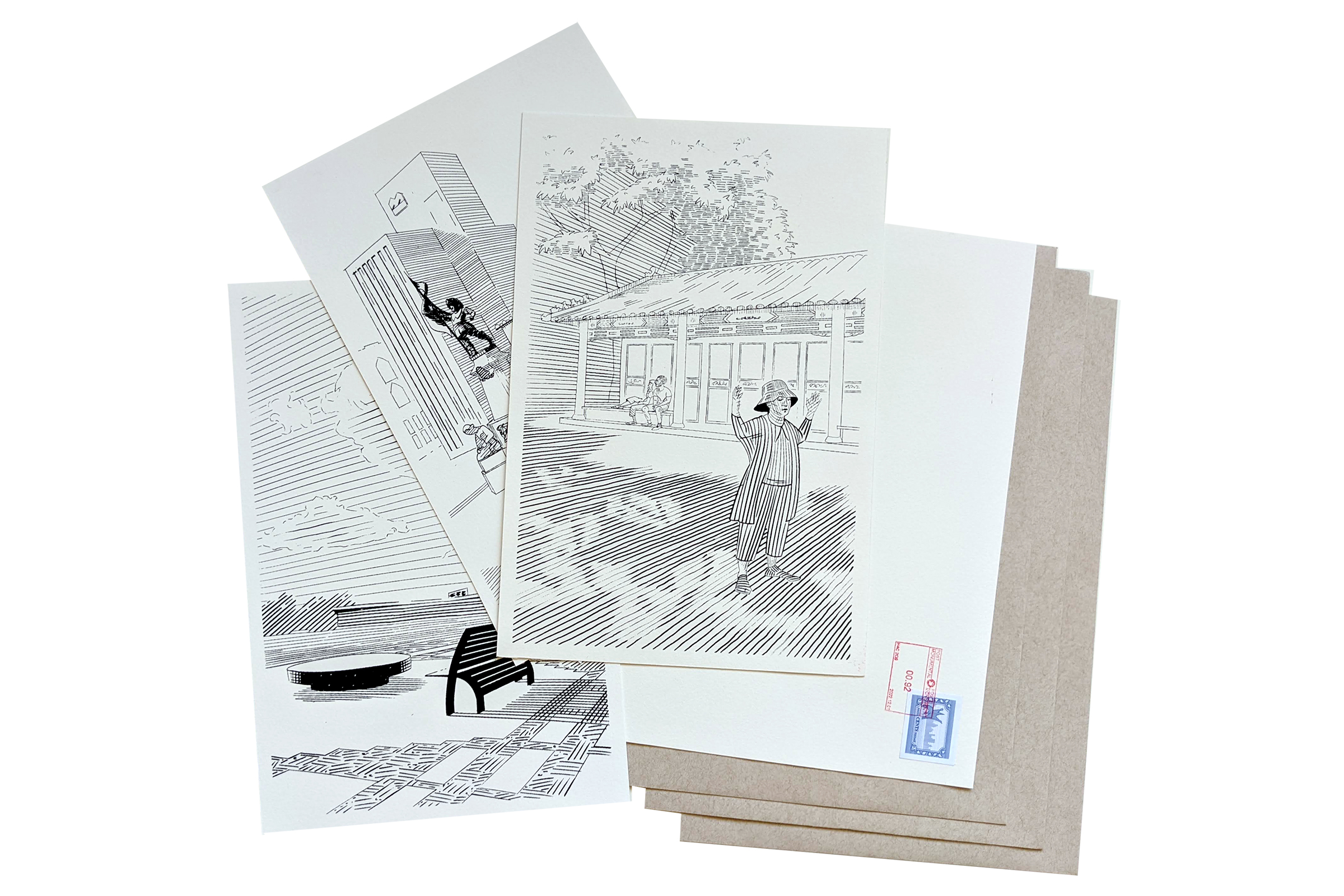
MONTREAL – 16 AUGUST, 2022: Today marks the launch of an innovative new Postal Art project by the voices and the monuments of Tiohtià:ke/Montreal. Led by local artist, Courtney Clinton, Post Monumental is an interactive artistic project inviting a variety of artists and voices from around Montreal to “write” on the landscape of our city. Over the course of 12 weeks, 24 participating artists will receive one postcard per week with an image of a Montreal monument illustrated by Clinton. On the back of the postcard, artists will respond to the image with their own creative production. The 288 cards will all come together as an installation piece in an exhibition at BBAM! Gallery in December 2022.
Post-Monumental postcards by Courtney Clinton.
About Post Monumental
In cities around the world, perception of monuments has shifted from markers of shared history to flash points of social division and disputed historical narratives. With Post Monumental, Clinton pushes the definition of what constitutes a monument. Her selection of Montreal sites ranges from the Monument aux Patriotes (marking the Rebellion of 1837-38), to Place de l’Espoir (commemorating the killing of Fredy Villanueva), and from the Ville Marie Highway (and the paving over of much of Little Burgundy’s Black community) to the Sir George-Étienne Cartier sculpture (site of Tam-Tams and the #CancelCanadaDay protests).
Each postcard invites artists to reflect on the historical and contemporary community and personal significances of these shared spaces in their own medium, style, and voice. The final exhibition of the project will be an installation piece where the voices, styles, and histories come together in a collective work.
About the Participating Artists
Just as Montreal is a multitude of languages, cultures, and artistic practices, so too is the group of participating artists in Post Monumental. The languages represented include: Kanien’kéha, French, English, Spanish, Cantonese, Russian, Italian, Portuguese and Persian (Farsi). The artistic practices include: word art, calligraphy, creative writing, collage, photography, urban sketching, illustration, watercolour, cartooning, bead art, and textile art. (Click here to consult the biographies of the 24 artists).
Amongst the participating artists are KyleKaientó:ton Williams who brings his vision of urban megstrauctures as a testament to the skillful work of the Mohawk ironworkers; Marven Clerveau, the illustrator and painter who is best known for his Visions Hip-Hop exhibition which brought to the foreground the faces and voices of the Quebec hip hop scene; Caroline Fortin, who is a writer and editor and chief of the Éditions Continuité, whose mission is to promote and safeguard Quebec’s cultural heritage; Agathe Desseaux whose textile work has taken her from France to Spain to Montreal to explore, subvert, and perpetuate matriarchal traditions; and Hadi Jamali whose research encompasses interactive installation, video, and photography, and will be bringing his skill in Persian calligraphy to the project.
See below for a complete list of participating artists.
About Courtney Clinton
Courtney Clinton is an artist working primarily in illustration and painting. She shares her time between Montreal and St Hyacinth, QC. With this project, Clinton continues her work on the themes of peace, community, and identity. For the elaboration of Post Monumental, Courtney was artist and resident at the Rokeby Museum, Vermont, and the Montreal artist run center Imprimerie. She received funding from the Canada Council for the Arts and Conseil de la Culture de Saint-Hyacinthe.
Her work has shown across North America. Most recently it was selected as part of the TD Wealth – Thor Wealth Management Art Prize and the Bombay Sapphire Artisan Series and the Salt Spring National Arts Prize. She completed 4 years of study at the private art school, Syn Studio, in 2017.
About BBAM! Gallery
Established in 2012, BBAM! is a contemporary concept gallery presenting a unique blend of emerging and mid-career figurative, conceptual and visionary artists. At the crossroads of fine art and alternative cultures, co-founders Alison Rogers and Ralph Alfonso champion socially engaged works promoting underrepresented voices particularly women artists and LGBTQ communities.
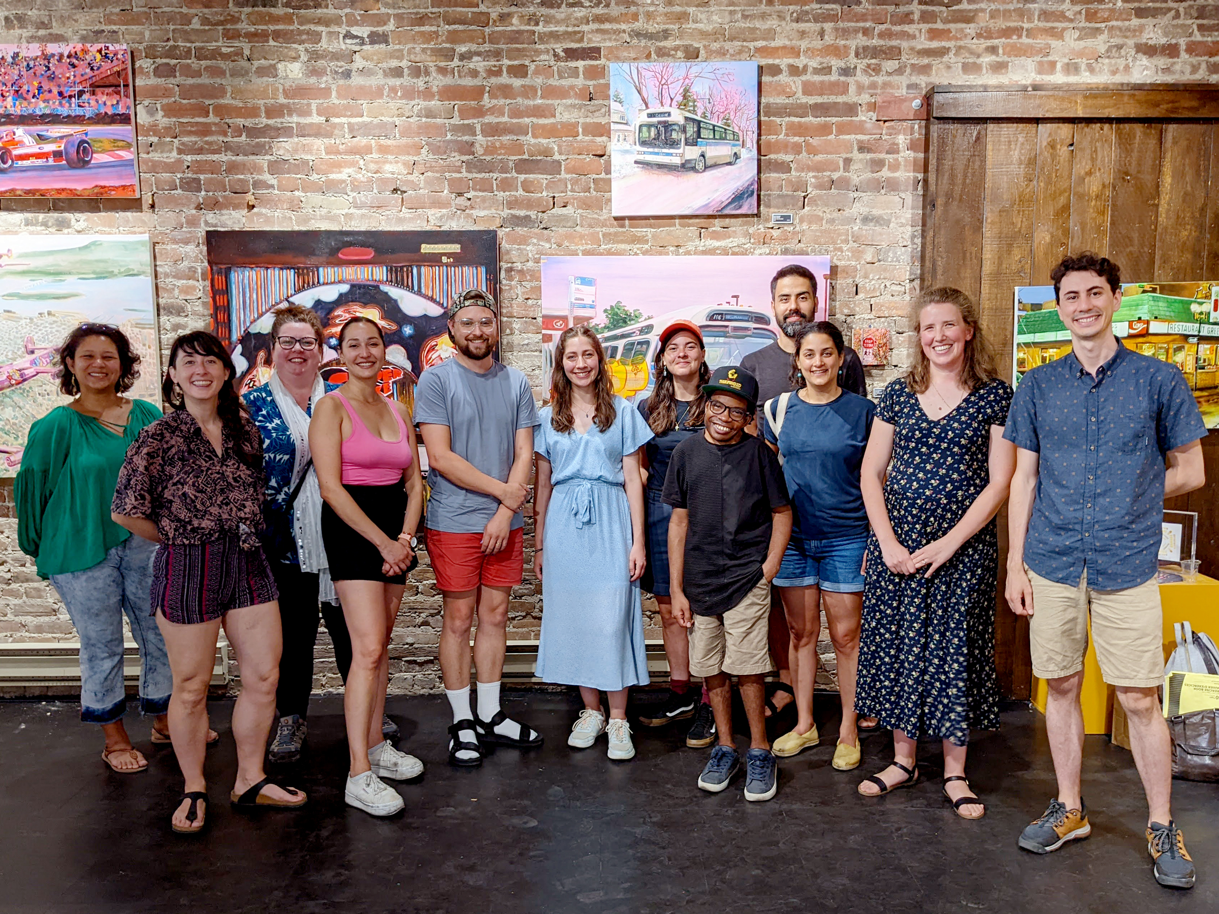
First in-person gathering of some of the participating artists. Left to right: Tatiana tung, Maya Jarvis, Colette Campbell Moscrop, Carla Gina Rubeo, Jacob le Gallais, Marguerite Marion Reyes, Sarah Haddad, Marven Clerveau, Hadi Jamali, Reihan Ebrahimi, Courtney Clinton, Daniel Jervis
Complete List of Participating Artists
Agathe Dessaux (textile), Asia Mason(photography collage), Aysha White (writing, collage), Carla Gina Rubeo (map making, mixed media), Caroline Fortin (creative writing), Catherine Barnabe (curator, art writing, collage), Colette Campbell Moscrop (illustration), Crystal Chan (creative writing, Chinese calligraphy), Cynthia Van Frank (landscape painting), Daniel Jervis (animation, illustration), Danyelle Orwick (comic art, bead art), Hadi Jamali (calligraphy), Jacob le Gallais (collage), Kaia’tanó:ron Dumoulin Bush (illustration), Kayla Breaker (landscape painting), Kyle Williams (landscape painting), Marguerite Marion Reyes (drawing), Marven Clerveau (portrait painting, collage), Maude Tapin (landscape painter), Oxana Solovyeva (storytelling), Reihan Ebrahimi (drawing), Sarah Haddad (photography, collage), Tatiana Tung (watercolour), Tong Shen (illustration, mixed media)
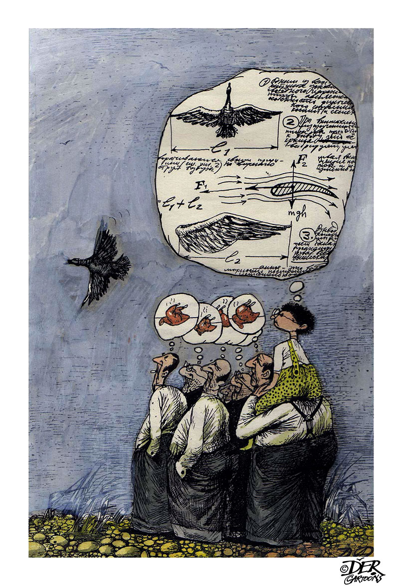
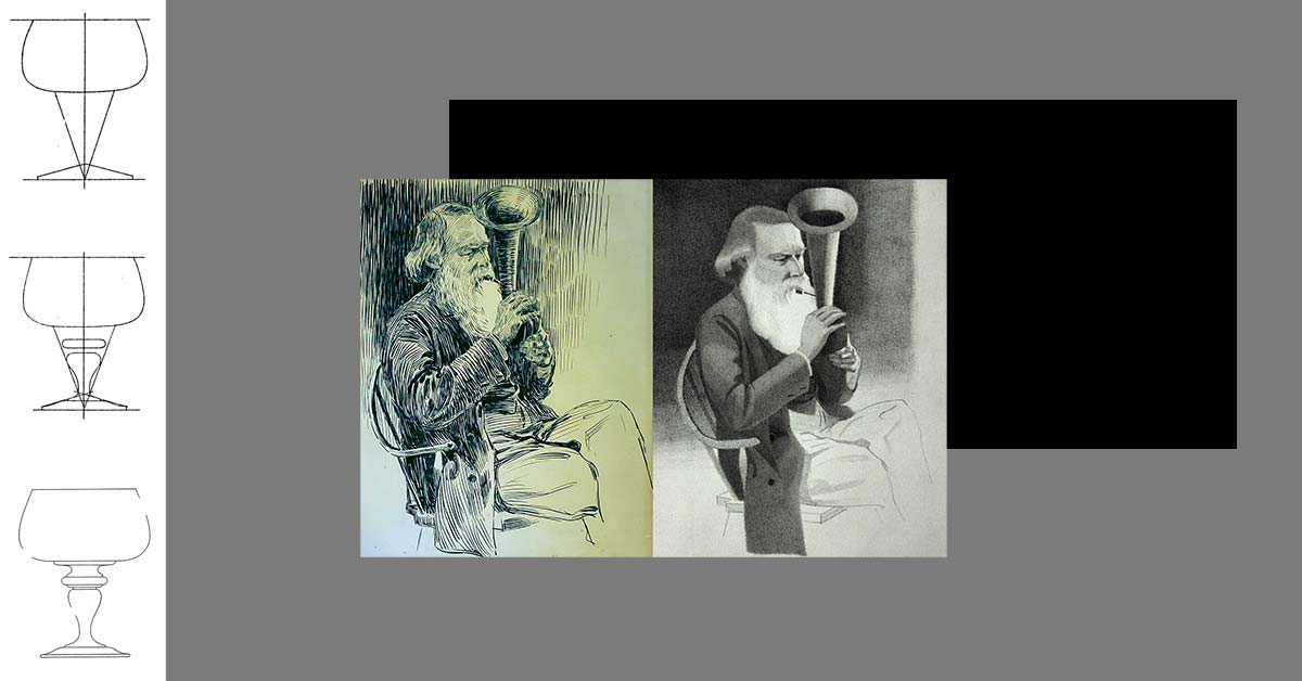
I chose this image by the Canadian-Ukrainian artist Oleg Dergachov because it speaks to a constructive attitude that defines my own art practice. I’m a realist painter because I want my art to say something.
Modernism took force in North America under a growing anti-communist and anti-Russia sentiment. The American government sponsored and promoted the movement in opposition to socialist-realism. Clement Greenberg’s seminal text, the Avant-Gard and Kitsch, makes the cold war politics that co-opted the movement explicit.
A side effect, American social realism (like Ashcan school) fell out of favour. If we look back at post-war American art, its focus is aesthetic. There is very little art that comments on America’s involvement in War, issues of civil rights or labour issues.
It’s only recently with a return to realism have artists like Kehinde Wiley or Kent Monkman have brought social politics back to art.
I worry that current rhetoric around war is focused around retaliation and not resolution. We have spent the better half of a century with a retaliation mindset and we are still fighting the same war.
I stand with all those people who have directly suffered from these ongoing wars and I am asking my government and my society to try a new approach. I don’t want tough leaders, I want strong leaders who have the courage to believe and work towards peace.
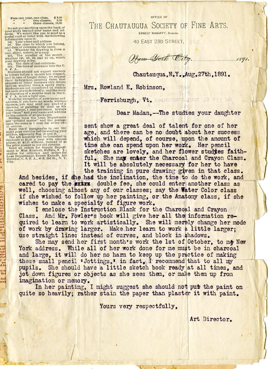
Get ready for a total art history nerd post! The Rokeby Museum has given me access to their archive and I have been digging through the letters and images of Rachael Robinson (a 19th century illustrator).
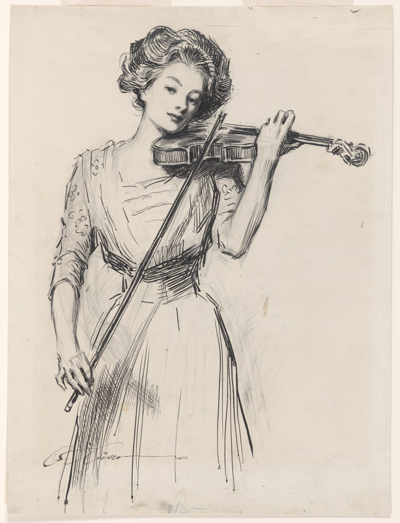
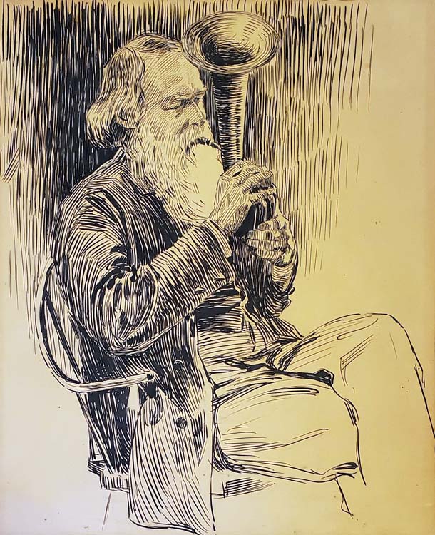
The Sweetest Story Ever Told, C. 1910, Charles Dana Gibson, Public Domain Image from Library of Congress Prints and Photographs Division Washington, D.C.
As a teenager Rachael studied drawing in New York with her teacher Ernest Knaufft. In one of her letters back home she writes about seeing an exhibition of work by Charles Dana Gibson (image 2). From her letter we know that his work had a big impact on her art!
There is a new exhibition of Gibson’s pen drawing a little way from Mr. Knaufft. I have been twice, they are grand. I wish thee could have seen them. Some of them sell for $2.00. They are very large. Some 3 by 2 feet. I should think he is a young man yet. Some of his lines, on faces especially, are so fine you can scarcely see them. They have to be sent to Paris to be reproduced.
— Rachael Robinson Elmer to Robinson Family, March 5, 1893
Gibson was famous for his images of ‘modern womanhood’. At the turn of the century American women had better access to education and work possibilities than they had in the past. The role of the woman was changing and Gibson captured this evolution in his art.
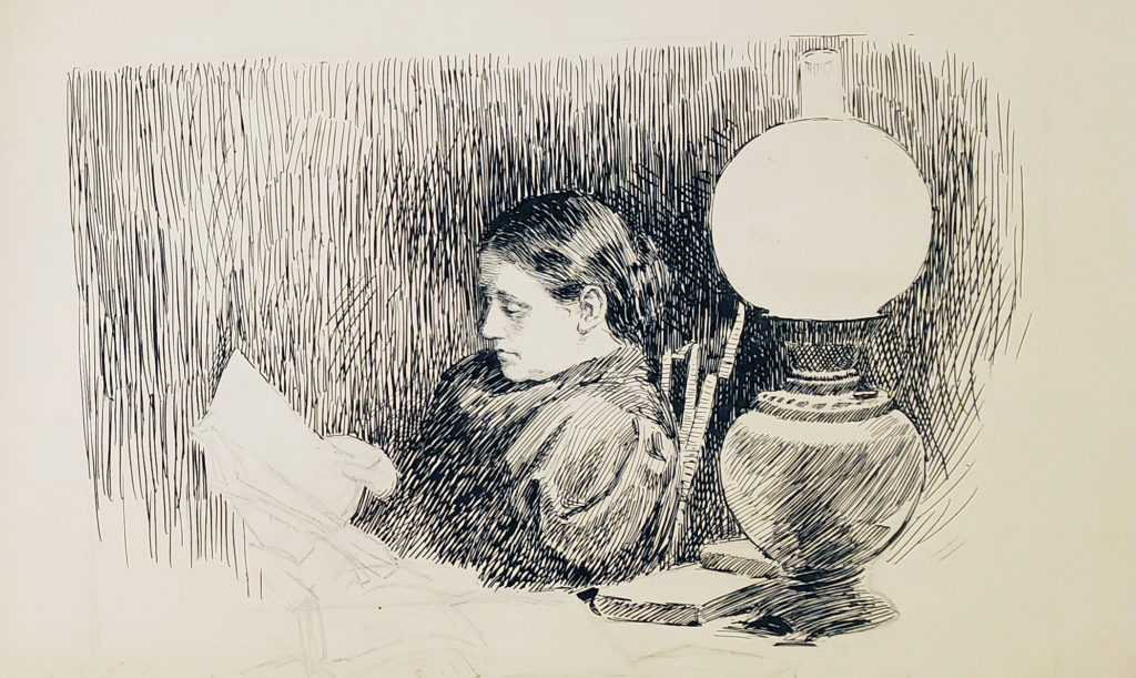
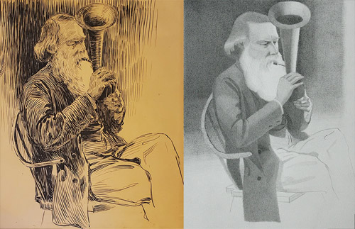
Portrait of Ann Stevens Robinson Reading, c. 1891–1900, Pen and Ink, Rachael Robinson Elmer (1878–1919)
As an art student Elmer student and drew sketches of her relatives. The above image shows her mother Ann reading the pages of her father’s manuscript. Her author father was nearly blind at this point and her mother played a central role in his writing process. She corrected and re-transcribed his writing and corresponded with his editors.
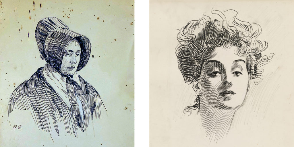
L to R: Portrait of Rachel Byrd Stevens, c. 1893–1903, Rachael Robinson Elmer (1878–1919), Box 19, Image 3357; Head of a Girl, c. 1882–1935, Charles Dana Gibson, Public Domain Image from Library of Congress
In a sense both artists recorded a modern image of womanhood. Yet they couldn’t feel more different. Elmer’s women feel old fashion compared to the “Gibson Girls”. But given a little context, her image of Ann is a much truer example of a woman at work.
Gibson’s depiction of 20th century womanhood isn’t necessarily wrong, but it’s limited. He depicts the women he saw and knew in his affluent New York circle. Elmer’s art helps broaden our understanding of what social change meant for a different part of the country. Of course neither artist tells us much about the condition of BIPOC from this period. For me this comparison highlights the importance of seeking out new voices from history.
How did a young woman from a rural town become an important book illustrator at the beginning of the 20th century? Join me as I chart Rachael’s artistic journey and share a drawing exercise from the course she took in the 1890s. The Rokeby Distance Drawing Course is available now on the Rokeby Museum Website.
In this week’s lesson I invite students to make a copy of a drawing by Rachael, a portrait of her father, Rowland. Through archival material from the museum’s collection we also explore Rachael’s relationship with her father- a prominent illustrator and author.
Rowland was a major influence on Rachael’s professional career. An active author he would often get Rachael to illustrate his articles and books. Before the age of 18 Rachael had a dozen published illustrations thanks to this collaboration.
Understanding Rowland’s role in Rachael’s story, forces us to think more critically about the role of distance education in Rachael’s success. Rachael studied art with an important New York illustrator through a correspondence course. Having access to this education gave Rachael the tools to pursue her career. But seeing how hands on her father (and mother) were in her education and her early career reminds us that access doesn’t equal success. Rachael was able to take advantage of distance education because she had a stable and supportive home life.
By sharing Rachael’s story I want to pull back the curtain on the modern conception of an artist as a genius. Generally when an artist has early success it is because there is a support system around them.
I don’t think you need an author father to get your start as an illustrator. But I think it suggests that beyond education, artists need to think about finding some kind of apprenticeship to learn the business side of their trade.
Bill Reid was my first engagement with art. I can still remember seeing his Raven and the First Men sculpture and the sense of awe that I felt. The launch of the new toonie with his design brought me back to those memories.
It’s interesting to think about Reid’s work and my own practice all these years later. What stands out to me now when I look at his work is the quality of his craft and the narrative clarity.
Looking at a Reid sculpture, I have the same “how did a person make that” response that I did all those years ago. His work is beautiful. The composition, the detail and his carving technique are all incredible.
As a kid I remember getting pulled into the story of Raven. In a single still image we understand the story that Reid is trying to communicate.
As an artist I strive for these same artistic qualities. I want my art to be beautiful and I want it to communicate clearly.
Reid might not seem like an obvious influence on my work. We are working in different cultural traditions. For me what connects our work is craft. Reid apparently rejected the title of artist and called himself a ‘maker of things’. I get that. Like him it’s this process of making that drives and defines my practice.
My knowledge of craft acts as an entry point for me to engage with different fine art traditions. When I look at something like sculpture (which I don’t do myself). I look for clues to how the artist made the object. When I start to understand their process the intention of the artist starts to reveal itself organically. There is always a connection between how something is made and what it is trying to communicate.
In my first #RokebyDistanceDrawing lesson I invite students to start a sketchbook and develop a practice of engaged observation. Don’t worry this doesn’t require any deep breathing. 😉
Through this exercise I want to challenge the idea of art as a kind of creative expression and instead present art as a kind of visual research.
Most young artists assume that because they know the world around them they also understand it. When asked to put pen to paper and draw something as simple as a tree most flounder and draw a 🌲 not an actual tree. Many assume that this means they don’t have any artistic talent. With first lesson my aim is to throw out this idea of talent and get students to start thinking about the connection between observation and drawing.
Learning to draw is about training your eye. It means sitting in front of your subject for a sustained period and working out it’s structure and mechanics. Of course the ultimate aim of art is expression but this research into observation will allow a young artist to better articulate and inform their ideas.
For the lion’s share of this course we will focus on training our ability to see. Near the end of the course we will shift our attention to creative expression. I can’t wait for you to see how all of this time spent looking will fuel your creativity!
Lessons are free and materials are kept simple (paper and pencil). Each lesson comes with step by step instructions! The course is hosted on the Rokeby Museum website!
I’m so thrilled to announce the launch of a new project, The Rokeby Distance Drawing Course! At once a digital exposition and an interactive piece, the project plays with rather than fights against the limitations of interactive artistic creation in the age of COVID-19.
As Artist and Residence at the Rokeby Museum, I am developing a new series of work that explores, activates, and shares the letters from a 19th century drawing course and the artistic journey of its student – a young woman who went on to become a pioneering female illustrator. The work is a meditation on knowledge and sharing as driving forces for connectivity and overcoming isolation.
In September, 2019, I was invited to the Rokeby Museum to engage with their archive as part of a four day artist lab. From 1793 to 1961, Rokeby was home to four generations of the Robinson Family.
In the museum’s archive of the family’s letters and artifacts I discovered the original letters (dated 1891-93) from a correspondence drawing course that one of the daughters, Rachael Robsinson Elmer, took as an adolescent.
In March and April of 2020, I ran a series of instructional drawing demos from my Instagram Live as a way to test and think through different ways of using technology to present this historic material to a contemporary audience.
Research Residency:
As part of the research phase, the Rokeby Museum is supporting my work through digital access residency that is taking place over the summer.
Following COVID-19 guidelines, the residence takes place remotely. Collaborating with their Education Fellow, Allison Gregory (who lives on the property) I have access to the archives (art and letters of my main subject, Elmer). Gregory and I have a weekly meeting to ensure my access to the archive. In a lot of ways our collaboration mimics the form of the historic correspondence course that inspired the project.
Sharing my research:
Catherine Brooks, the Rokeby Director, and I agreed that making this drawing course available now, during the COVID-19 crisis, will serve a real community need. We intend to share this archival drawing course freely on the museum’s website.
From July 27 to October 5, 2020, we will post a new lesson on the website every two weeks.
To make the material more accessible to a contemporary audience, I will supplement the historic material with images. As a Quebec artist, I am conscious of issues of language and accessibility. Adding visual guides to this material is also a way to make the material more accessible to a non-anglophone audience and expand the reach of this project.
How to participate:
The course is meant for self directed learning. Students can join at any time and they can work through the exercises at their own speed. Starting July 27th until October 5th we will publish a new lesson every other week. For students looking for a little extra incentive we encourage them to treat it like a 12 week drawing challenge!
Each lesson includes a little history on the life of Rachael Robinson Elmer. We hope students will take inspiration from her artistic journey. To help students work through the exercise there are step by step drawing examples and a written explanation.
Materials:
To participate you will need a basic drawing kit.
6B, 2B and HB pencil. Recommended brand Mars Lumograph
Kneaded eraser
Pencil sharpener or exacto knife
A pad of 18” x 24” drawing paper. Recommended brand Strathmore
Drawing board
Course Level:
The course is open to anyone curious about learning to draw but is ideal for kids 15 to 17 interested in getting into an animation, illustration or game art program. I have experience working as an admissions advisor for a video game art program and have designed the exercises in a way that these drawings could be used for an art school portfolio.
There is an interesting debate that runs throughout the art tradition. Many argue that what makes an image truthful is a kind of authenticity – artist who copies directly from nature. There is a second school of thought that argues that truth comes from the representation of experience not material.
This means that an artist who imposes a certain amount of imagination onto their subject (or their idea of the world) actual creates a more truthful image than the artist who operates like a camera and merely captures reality.
There is no fixed answer, artists have gone back and forth on their approach throughout history. So it’s worth learning strategies for both approaches. For most of this challenge we have focused on understanding and replicating the structure of our subject.
This week we are going to switch gears and think about composition. In studying composition we learn tools and strategies for unlocking our imagination and adding our own ideas to art.
This week’s challenge
This week we are going to think about value as a tool for composition and design. Last week we used value to create a sense of light and shade and to give an object a feeling of form.
This week we are going to switch gears completely. We are going to build on what we learned in week 3 when we talked about placement and the thumbnail approach. We are going to use the same thumbnail approach to explore how we can create patterns using value.
The thumbnail approach allows us to make lots of quick studies before we start our final drawing. To learn more about this approach I encourage you to check out our challenge Composition.
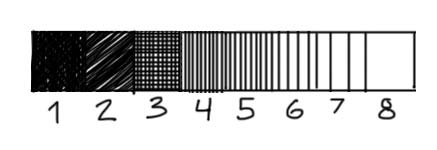
Start with a value scale
Whenever we are working with value it is helpful to create a value scale. Let’s start with a full value scale of eight values.
Start by drawing a long rectangle and dividing the rectangle into 8 smaller boxes. Each box will represent a box on the scale.
To make an accurate value scale it is helpful to start with the darkest and lightest value (1 and 8). Notice that value 1 is almost (but not completely pure black). It’s always good to keep a few dots of white in your darkest value – this gives the value a lighter feel. Pure black suggests a total absence of light and there are very few instances of this in nature.
Next indicate your two middle values (4 and 5). Try and create values that feel like they are halfway between your darkest and lightest value.
Next put down a value for your second darkest value (2). This can be scribbled in. Allow some of the white of the page to peek through. Next put down a value for number 3. I used cross hatching to make this value. First I put down a series of very close vertical lines and then on top a series of horizontal lines.
Finally you can put down your lights. Space your vertical lines apart to lighten the value of these two values.
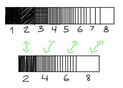
Thumbnail studies
When we are thinking about design and making thumbnail studies we work in simplified terms. This means that we don’t take into account detail or shading in our thumbnail drawings. It also means that we simplify our values. To do this we reduce our value scale from eight steps to four steps.
Make a second four step value scale. For your four values use steps 2, 4, 6, 8.
Value Plan
We can use value to create a kind of pattern in our drawings (and eventually paintings). To understand this idea, it is useful to read Andrew Loomis’ chapter on value in his book Creative Illustration. In his book he introduces the idea of a value plan.
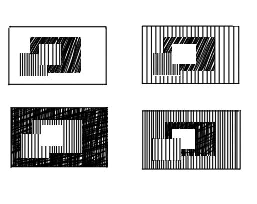
A value plan is a way of distributing and ordering value in a drawing. He argues that there are four basic value plans and describes these plans with a series of abstract images of squares. Obviously there are other ways and strategies of designing you composition. But learning Loomis’ approach is a way to start thinking strategically about composition.
For the value plan he uses the same four values that we defined on our 4 point scale. In each of the four plans he alternates the placement of the value.
Looking at these drawings might not make any sense. But I promise you, that copying these four seemingly simple drawings will revolutionize your understanding of art (this is not an overstatement).
Creating Value Composition
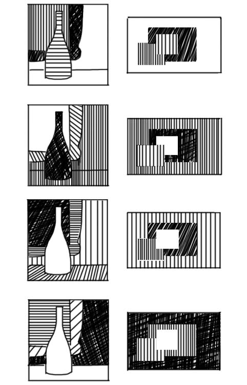
Above is an example of how we can use these four plans in an original compositions. Each drawing uses one of the Loomis value plans as inspiration for the placement of values.
Again copy these sketches to really understand how they work.
Notice how I play around with shapes. I often combine objects to create a larger more interesting value shape. Sometimes I treat the wall and the tabletop as one shape (1,2) and sometimes I treat them as two shapes. In the forth example I treat the wine bottle and the table as one shape. When I do my finished drawing I can use outline and a more nuanced treatment of value to distinguish between my combined shapes. In the design stage I let myself think in abstract terms.
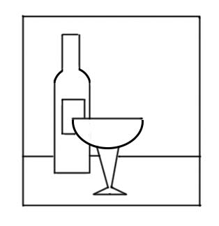
This exercise is all about creativity. So now I encourage you to do your own designs. Use the below drawing as your basic composition and come up with four different value compositions. Use the Loomis value plans to guide you!
Light and shade is pretty exciting. We use light and shadow to communicate form, atmosphere and texture. For a lot of young artists it’s tempting to skip over some of the fundamentals and go right to light and shade.
What I hope to show with this week’s challenge is just how important those fundamentals are to our understanding of light and shade.
This week’s challenge
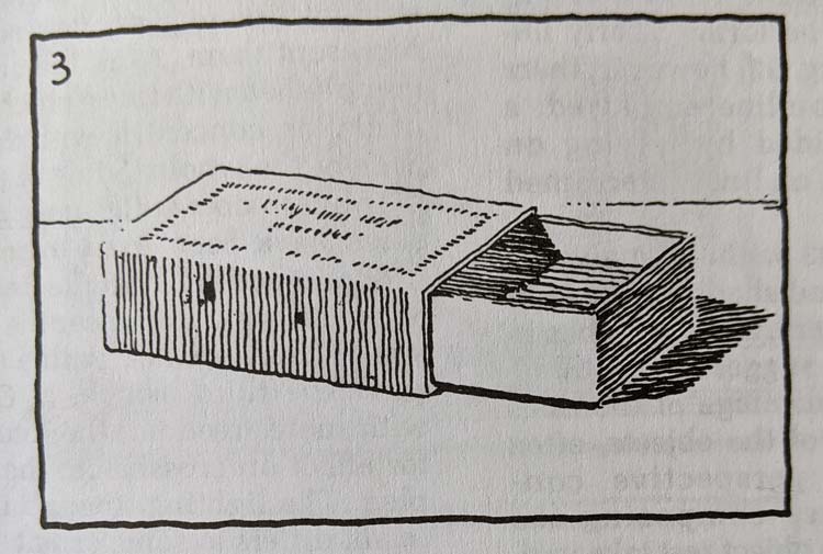
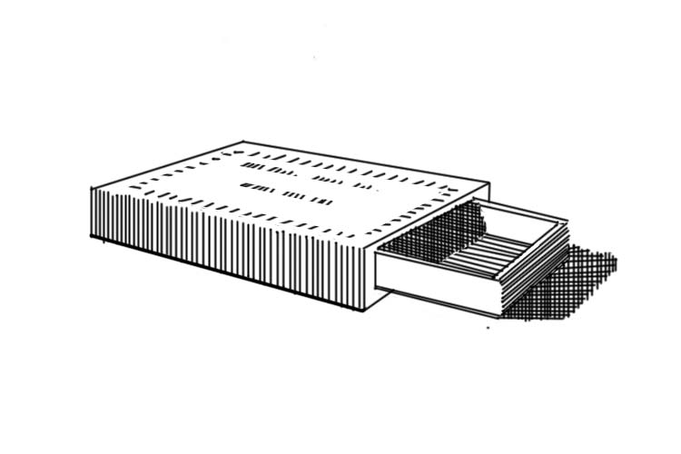
Pen and Ink Drawing, Arthur Guptill, Rendering In Pen and Ink
For this week’s challenge we are going to explore light and shade. To do this we are going to build on last week’s challenge. I recommend that you work through last week’s lesson before you start the one from this week.
For this week’s challenge you will need two colored pens and a slightly thicker marker. I would recommend a blue and a red ballpoint pen and a sharpie marker. If you also have a thin black felt pen that’s great (but not essential).
We are going to use a drawing by the artist and teacher Arthur L. Guptill. He wrote an excellent book called Rendering In Pen and Ink. I highly recommend his book to anyone looking to deepen their knowledge.
Start with a box
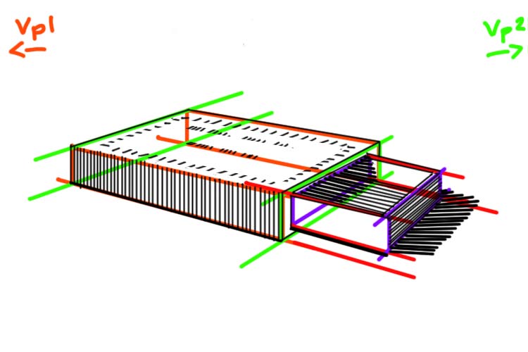
Before we even think about light and shade we need to understand the structure of our matchbox. If we had to describe our matchbox in simple geometric terms what would those be?
I see two thin boxes. The first box represents the main structure of our matchbox. The second box is slightly smaller. It comes out the right side of our main box.
Now that we have simplified our shapes we can start our drawing using our knowledge from the last challenge.
Draw the main box in perspective
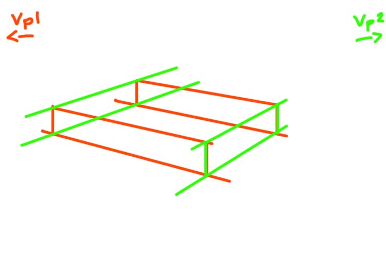
Our first step is drawing the main box in two point perspective.
In two point perspective the only parallel lines are the vertical height lines. The width and length lines of our box will recede towards two vanishing points (Vp1, Vp2).
Our first step is to draw a horizon line. When we look at the box we can see a lot of its top side. This tells us that the horizon line is significantly above our box. Let’s imagine a horizon line just beyond our picture plane.
To find our two vanishing points we are going to take the angle of the front two bottom edges of our box. Line a pencil up against the bottom right edge. Now imagine that your pen extended all the way until it met the horizon line. Where would that point be?
Do the same thing with the bottom left edge. In both cases that point where the line extending from the bottom line and the horizon line meet is outside our picture plane (the rectangle that defines our drawing). If it’s helpful draw a thumbnail version of your box with the horizon line and the vanishing points.
In our case it’s important to note that the vanishing point on the right is much closer to the picture plane than the left vanishing point.
Using your knowledge of perspective draw a box that represents the main section that makes our matchbox.
If you need a refresher on how to build your box check out our challenge rotating a cube.
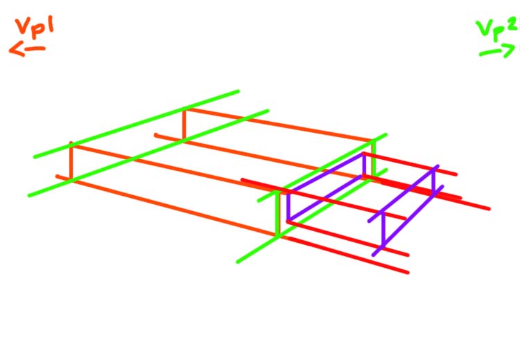
Build a second box
The matchbox provides a really excellent metaphor for how we can use perspective to build complex objects. Think about the mechanics of our matchbox. There is a main box and inside that box is a slightly smaller box that can be pulled out. In this drawing we see the second box pulled halfway out of the main box.
To start drawing this second box we need to think about its relationship to our main box. Using the right front side of our main box let’s define the main proportions of our second box.
On that front right side draw a slightly smaller rectangle (in perspective) that fits into this main box (purple lines). This new rectangle tells us the height and length of our smaller second box.
Using this information let’s draw the base of our new box. The length lines that define this second box must recede to the same vanishing points that defined our main box. Once you have your base, build out the rest of your smaller box.
Again for a more detailed description of this process, check out the step 2 of the “Add a Cylinder” section of the Building Blocks challenge.
An important stage
Before we move on, take a moment to consider how much time we spent on that first step of thinking through the structure of our drawing. This first stage is so essential to making a good drawing. Make you sure you give this first stage the time it deserves.
Light and shade
Now we can move on to the fun part: adding a sense of light and shade!
Value Scale
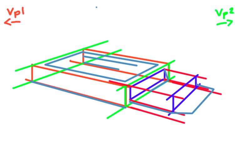
When we start a line drawing we always start by analyzing our shapes and proportions. In the same way, the first step in a light and shade drawing is to define and think about our shadow shapes.
First block out your shadow shapes. I see four shadow shapes
The front left side of our matchbox
The inside of smaller box
The right front side of the smaller box
The cast shadow of our match box on the right side
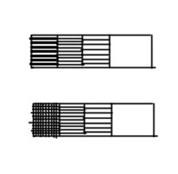
Now let’s rank the values of these four shadow shapes.
Let’s start with the darkest shape. The darkest shadow shape is the cast shadow. The artist has used thick lines that are very close together to define this shape. In a small box let’s mimic this same approach.
These same thick close lines are used in the left part of the shadow that makes up the inside smaller box.
If you only have one black pen. Another way to represent this darkest value is with cross hatching. Instead of using a thicker pen we will use two sets of lines (horizontal and vertical).
To the right of the tick lines inside the smaller box we see a value that is described by thin lines that are close together. We see this same pattern on the right front side of the smaller box.
Let’s expand our value scale by adding a second box. In the second box lay down a series of lines that mimic this approach.
Finally on the front left side of our main box we see a value that is represented by a series of vertical lines that are slightly more spaced apart.
Let’s expand our value scale by adding a third box. In the third box lay down a series of lines that mimic this approach.
Add a fourth and final box to your scale. Leave this one blank to represent the lightest value in our drawing : the whites.
Before you start any drawing with light and shade. It is useful to make this kind of value scale.
Adding value
Ok now we can start to ink our drawing. Let’s start by indicating our outlines. In some sections the artist has omitted the outline (look at the top edge of the front left side of our main box). This is an artistic choice – and should be noted). Try and be really exact and copy exactly the lines that the artist has used.
Once we have drawn the outline we can start adding the shade.
It’s useful to work from our darkest values to our lightest values. Let’s start with the front right side of the smaller box and the cast shadow. Make sure to note not only the value but the direction of the lines. The lines on the front right side of the box follow the perspective lines. The lines defining the cast shadow are right leaning diagonals.
Now add the value for the inside of the box. Again the lines follow the perspective lines that define the base of this box.
Crosshatching approach for darkest shadows
If you are using the cross hatching approach, add a series of vertical lines to the two darkest sections of the cast shadow and the inside of the box.
Next, let’s add a series of vertical lines on the front left side of the main box. Make sure that these lines have more space between themselves than the darker section.
Finally we can add the detail to the top side of the main box. Make sure these small dash lines follow the perspective lines of the main box. To help guide you, draw guidelines in perspective where you will be making the dashes.