There is an interesting debate that runs throughout the art tradition. Many argue that what makes an image truthful is a kind of authenticity – artist who copies directly from nature. There is a second school of thought that argues that truth comes from the representation of experience not material.
This means that an artist who imposes a certain amount of imagination onto their subject (or their idea of the world) actual creates a more truthful image than the artist who operates like a camera and merely captures reality.
There is no fixed answer, artists have gone back and forth on their approach throughout history. So it’s worth learning strategies for both approaches. For most of this challenge we have focused on understanding and replicating the structure of our subject.
This week we are going to switch gears and think about composition. In studying composition we learn tools and strategies for unlocking our imagination and adding our own ideas to art.
This week’s challenge
This week we are going to think about value as a tool for composition and design. Last week we used value to create a sense of light and shade and to give an object a feeling of form.
This week we are going to switch gears completely. We are going to build on what we learned in week 3 when we talked about placement and the thumbnail approach. We are going to use the same thumbnail approach to explore how we can create patterns using value.
The thumbnail approach allows us to make lots of quick studies before we start our final drawing. To learn more about this approach I encourage you to check out our challenge Composition.
Start with a value scale
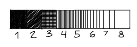
Whenever we are working with value it is helpful to create a value scale. Let’s start with a full value scale of eight values.
Start by drawing a long rectangle and dividing the rectangle into 8 smaller boxes. Each box will represent a box on the scale.
To make an accurate value scale it is helpful to start with the darkest and lightest value (1 and 8). Notice that value 1 is almost (but not completely pure black). It’s always good to keep a few dots of white in your darkest value – this gives the value a lighter feel. Pure black suggests a total absence of light and there are very few instances of this in nature.
Next indicate your two middle values (4 and 5). Try and create values that feel like they are halfway between your darkest and lightest value.
Next put down a value for your second darkest value (2). This can be scribbled in. Allow some of the white of the page to peek through. Next put down a value for number 3. I used cross hatching to make this value. First I put down a series of very close vertical lines and then on top a series of horizontal lines.
Finally you can put down your lights. Space your vertical lines apart to lighten the value of these two values.
Thumbnail studies
When we are thinking about design and making thumbnail studies we work in simplified terms. This means that we don’t take into account detail or shading in our thumbnail drawings. It also means that we simplify our values. To do this we reduce our value scale from eight steps to four steps.
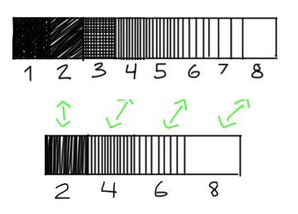
Make a second four step value scale. For your four values use steps 2, 4, 6, 8.
Value Plan
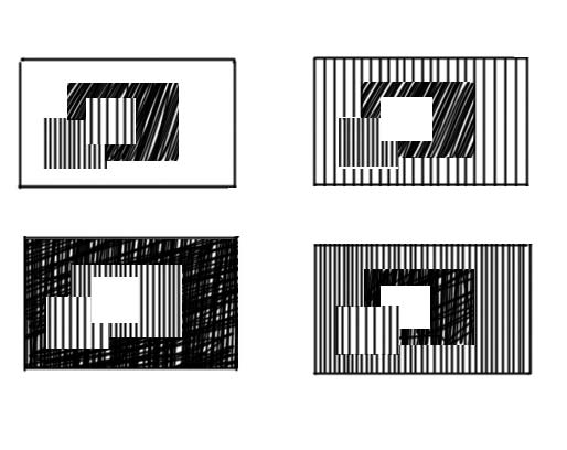
We can use value to create a kind of pattern in our drawings (and eventually paintings). To understand this idea, it is useful to read Andrew Loomis’ chapter on value in his book Creative Illustration. In his book he introduces the idea of a value plan.
A value plan is a way of distributing and ordering value in a drawing. He argues that there are four basic value plans and describes these plans with a series of abstract images of squares. Obviously there are other ways and strategies of designing you composition. But learning Loomis’ approach is a way to start thinking strategically about composition.
For the value plan he uses the same four values that we defined on our 4 point scale. In each of the four plans he alternates the placement of the value.
Looking at these drawings might not make any sense. But I promise you, that copying these four seemingly simple drawings will revolutionize your understanding of art (this is not an overstatement).
Creating Value Composition
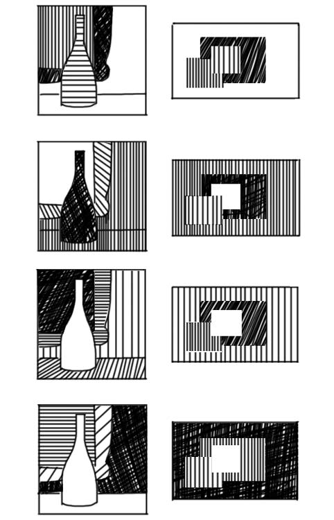
Above is an example of how we can use these four plans in an original compositions. Each drawing uses one of the Loomis value plans as inspiration for the placement of values.
Again copy these sketches to really understand how they work.
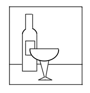
Notice how I play around with shapes. I often combine objects to create a larger more interesting value shape. Sometimes I treat the wall and the tabletop as one shape (1,2) and sometimes I treat them as two shapes. In the forth example I treat the wine bottle and the table as one shape. When I do my finished drawing I can use outline and a more nuanced treatment of value to distinguish between my combined shapes. In the design stage I let myself think in abstract terms.
This exercise is all about creativity. So now I encourage you to do your own designs. Use the below drawing as your basic composition and come up with four different value compositions. Use the Loomis value plans to guide you!