We are back! This week we are doing another drawing from life challenge! Working from life is where we really test our ability to analyse visual information.
We are doing a very similar drawing to last week’s exercise but don’t be discouraged if this feels a lot more challenging. When we copy a photo or another drawing the information has already been flattened. When we work from life we have to translate 3D space into a 2D pictorial language.
So why bother? Why not just work from photos or drawings? Working form life teaches the artist to think about the form of an object. Learning to decode the structure of objects teaches us not only how to copy but also how to construct reality. For any artists looking to create imaginary images, characters and worlds this ability to draw constructively is essential.
This week’s challenge
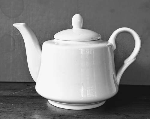
For this week’s challenge you will need to find a teapot. Don’t worry too much if your teapot looks different to mine.
My aim is to teach you a process not to teach you how to draw my teapot. Read through the instructions below and use them as a guide for drawing your teapot. Don’t copy exactly my lines and shapes.
If you are feeling really intimidated, do two drawings. First do a drawing from my photo of a teapot and use my sketches as your guide.
Now do your own drawing from your teapot and try and recreate the three steps that I demonstrate but using the shapes that define your teapot!
How to start the drawing
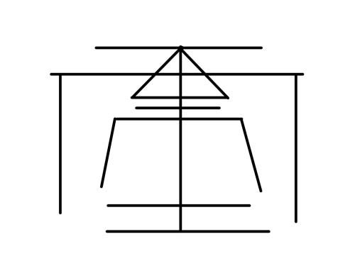
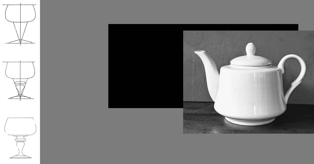
To start our drawing we are going to block-in the teapot by reducing its parts to basic flat shapes. Start by blocking in the general height and width of the teapot with 4 lines. For now the two verticals lines will represent the furthest edge of the handle and the spout. Next draw a vertical centre line.
The body of our teapot looks like the bottom half of a triangle. The two sides slope inward. We can imagine that these two lines would eventually meet at a point. Already we understand what is being represented. The lid of our teapot can be represented with a triangle. We don’t need to show any of the detail – we just want to show the overall space that the lid will take up.
Even though we have only used a couple lines and flat shapes we can already imagine our teapot.
Top and bottom side
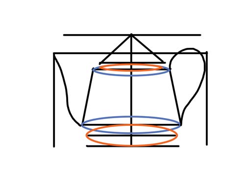
To give our teapot a sense of structure – to translate it from a 2D to a 3D drawing we need to indicate the base and the top side. Take your time and compare the length of your top side to the length of the body of your teapot. A common mistake is to make that top side too narrow. Sp measure twice.
For my teapot the top and bottom side are a circle shape. Because we are seeing these shapes in perspective we don’t see a circle we see an ellipse or a squashed circle.
Even though we can’t see the whole ellipse it’s important to indicate even the back side that is invisible to our eye. Again our goal with this drawing isn’t just to represent what we see but to understand the structure of our teapot.
To help us draw our ellipse we first draw a centre line and mark off the length and width of our ellipse. With all of this information we can now draw our ellipse. My teapot has four ellipses. One for the top and bottom side of my teapots body (blue). One for the base of my lid (orange). And one for the bottom side of my teapot base.
Finally, let’s indicate the outer edge of the teapots spout and the handle.
How to clean up your lines
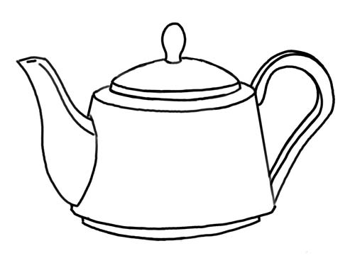
Now you have enough information to add the details that make the drawing interesting and dynamic. Take your time adding these last shapes.
When you are satisfied with your drawing, you can take a darker or thicker pen to draw over your lines. Make sure to take your time on this final step. Keep looking at your teapot. It’s easy to fall into automatic mode here and lose some of the subtlety of your lines.