Remember being a kid playing with building blocks? Remember that rush you got when you realised you could stack and build out your blocks? We can do the same thing on our sheet of paper. The same way this kind of play teaches kids valuable cognitive skills, we can use this exercise to develop our drawing skills.
This week’s challenge
For this week’s challenge we are going to expand on last week’s challenge and start to build in 3D space. I recommend that you work through last week’s lesson before you start the one from this week.
For this week’s challenge you will need two coloured pens and a slightly thicker marker. I would recommend a blue and a red ballpoint pen and a sharpie marker.
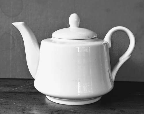
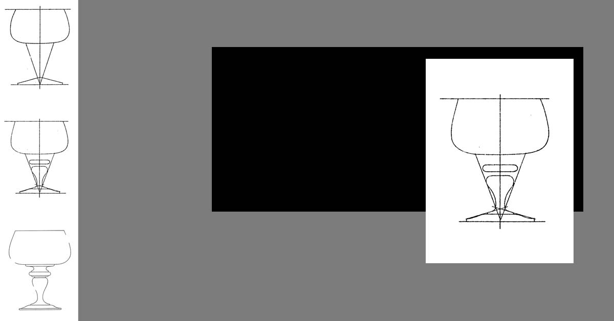
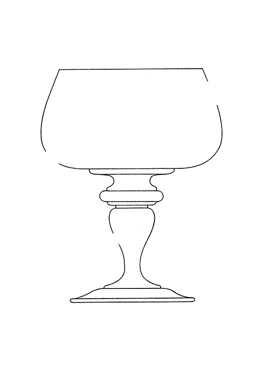
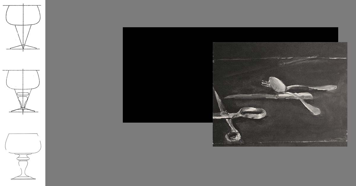
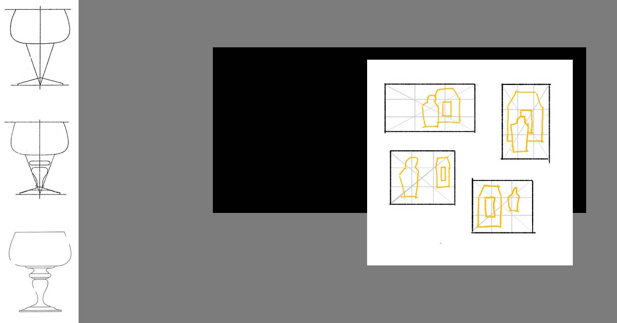
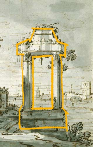
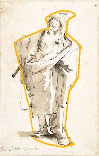
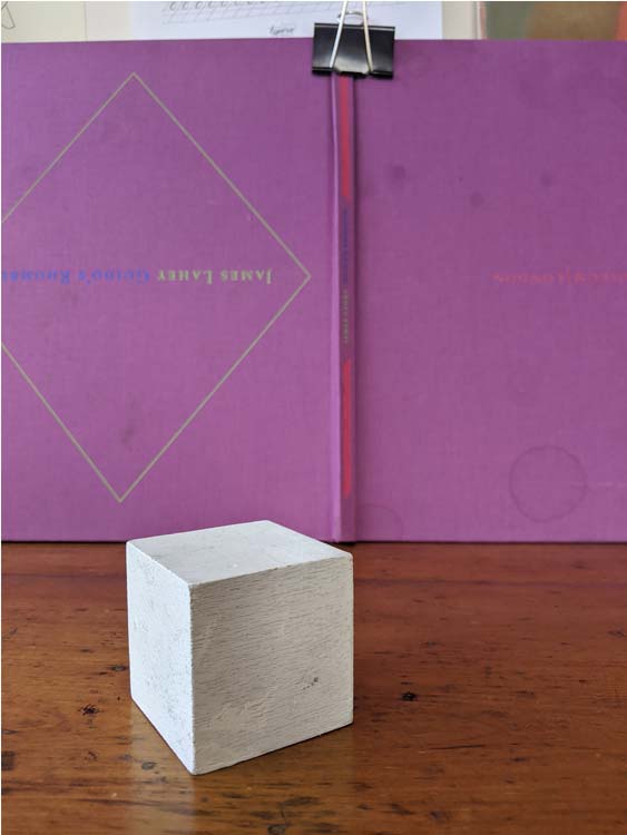
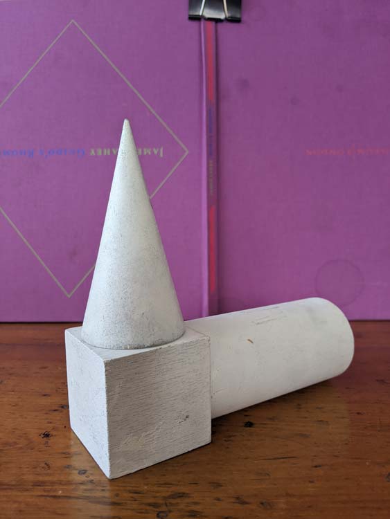
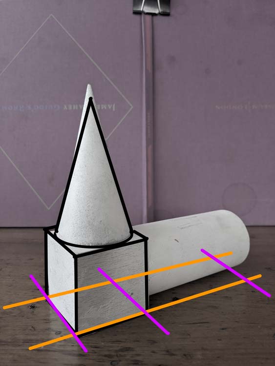
We are going to use a couple photos as reference for this week’s lesson. You will find the photos below.
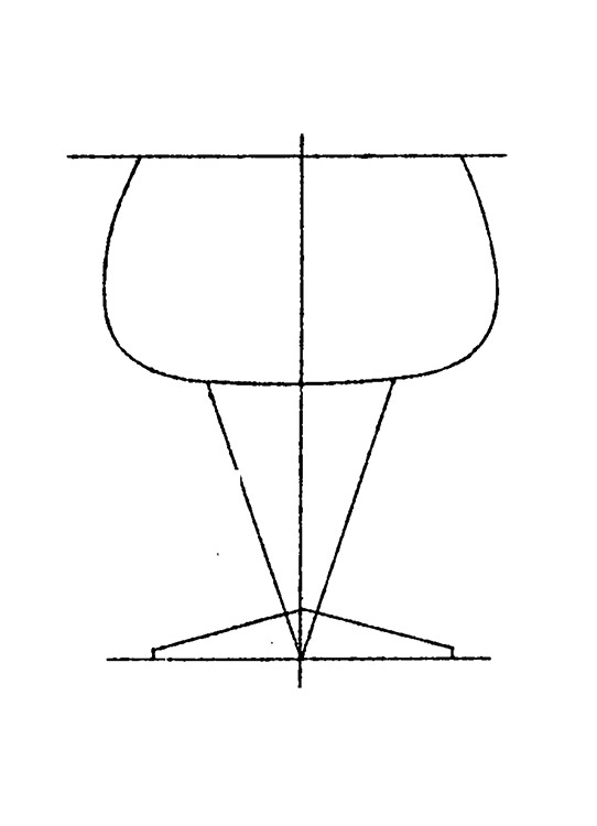
Start with cube
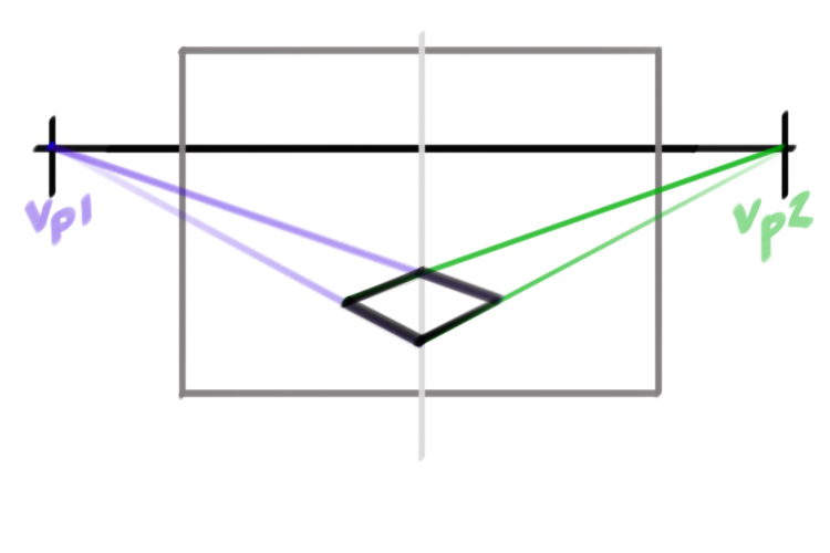
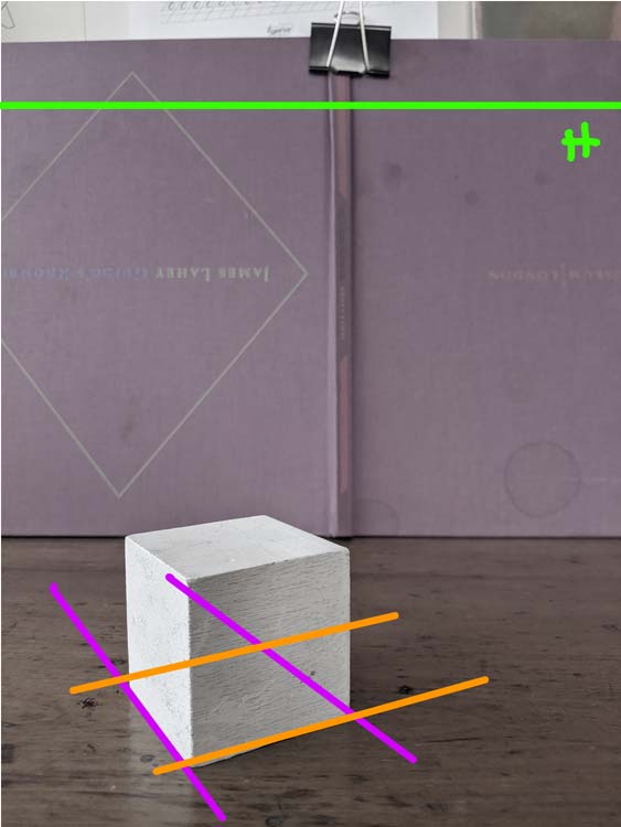
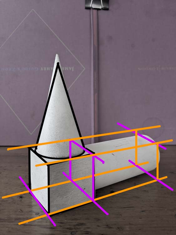
In two point perspective the only parallel lines are the vertical height lines. The width and length lines of our cubes will recede towards two vanishing points (Vp1, Vp2).
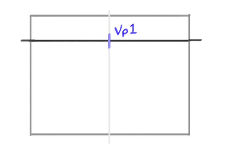
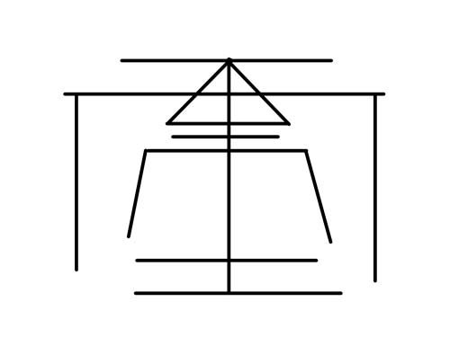
Our first step is to draw a horizon line. When we look at the cube we can see a lot of its top side. This tells us that the horizon line is significantly above our cube.
Step 2: vanishing points
To find our two vanishing points we are going to take the angle of the front two bottom edges of our cube. Line a pencil up against the bottom right edge. Now imagine that your pen extended all the way until it met the horizon line. Where would that point be?
Do the same thing with the bottom left edge.
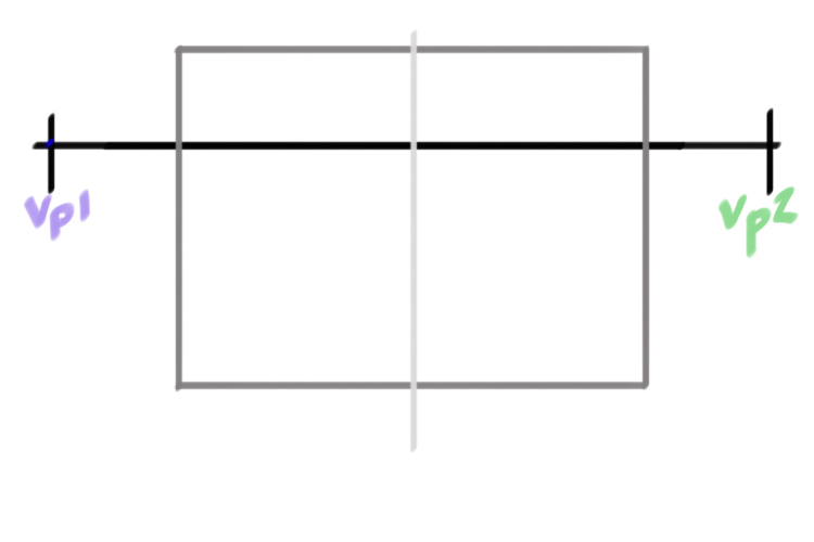
In both cases that point where the line extending from the bottom line and the horizon line meet is outside our picture plane (the rectangle that defines our drawing).
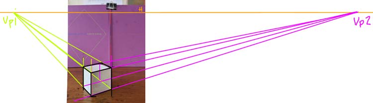
Above is an image that shows our two vanishing points. Look how far vanishing point two is. This is a pretty typical case. It’s very rare that your vanishing points will be close to your picture plane. So we have to get used to imagining where they are and making construction lines that suggest or estimate that point. Our aim is not exactness, our goal is to make images that feel like they are in perspective.
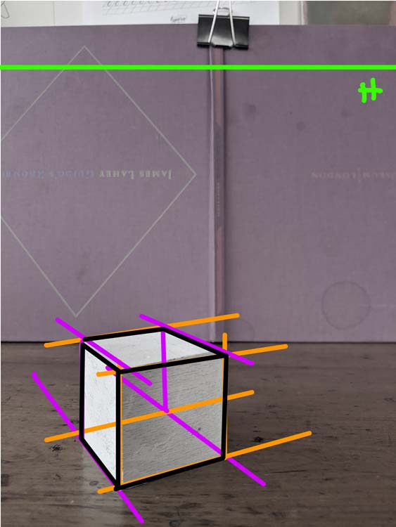
One thing that can help is to draw a thumbnail in the corner of your page that shows the relationship between the vanishing points and the picture plane. In our case it’s important to note that the vanishing point on the left is much closer to the picture plane than the right vanishing point.
Step 2: Base
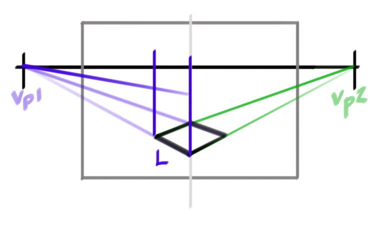
To start, let’s draw a square in two point perspective.
Mark a point near the bottom left of your page. This will represent the front corner of our square.
Let’s start from the right side. The length lines that define the right side will all originate from the right vanishing point (Vp2). We know that this point is a long ways away. This tells us something about the slope of the line. Because it will take longer to reach the vanishing point we know that the slope of this line will be less steep. Measure the bottom right edge of the cube in the photo to get the exact slope.
Repeat the same process on the left side. The length lines that define the left side will be much steeper. We know the vanishing point on the left is much closer to the picture plane. To ensure that the left length lines meet the horizon more quickly we need a line that is closer to a vertical.
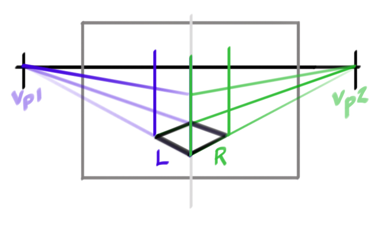
Now let’s indicate the invisible lines that define the back edges of our square. We can’t see these lines because our cube is opaque. We are going to use the information we have to estimate these lines.
Let’s start with the back left line. This line is opposite to the right front line. In theory these two lines are parallel. In perspective any lines that are parallel will converge towards a shared vanishing point. So the left back line will recede towards the right vanishing point. We want to draw a line that is very similar to our front right edge. But it should slope slightly towards that first line.
For the right back line, the same principles apply. In this case, the back right line is moving towards the left vanishing point. It will look very similar to the left front edge but again it should slope slightly towards the front line.
Getting the base correct will make all the difference as you move through the drawing. So spend all the time you need to get it right.
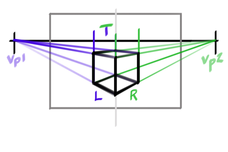
Step 3: Build out your cube
Build out the rest of your cube starting with the two front sides and then the top of your cube. Think like a builder and work from bottom to top. As you make new lines, think about their relationship to the vanishing points.
To get a step by step guide to building your cube check out last week’s blog.
Add a Cone
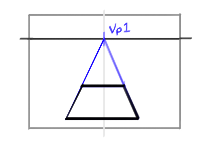
Ok now that we have a base cube, let’s have some fun! Let’s add a cone to our drawing!
We don’t know how to build a cone yet. But we do know how to build a cube or a box. So let’s start with what we know.
Step 1: Draw a box
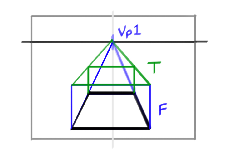
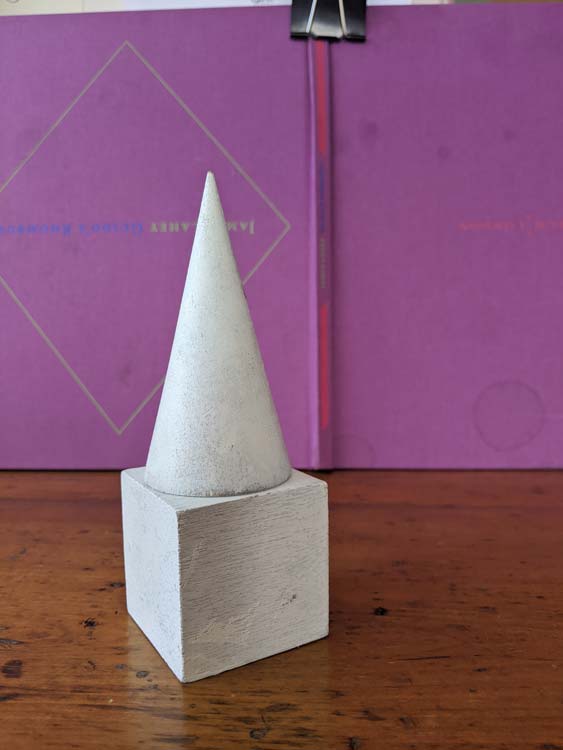
If we measure our cone we can see that it’s approximately two cubes high. So let’s build a box measuring two cubes on top of our original cube.
To build this next cube we need a base. Well lucky us we already have our base. The top of our original cube is also the base of our cone.
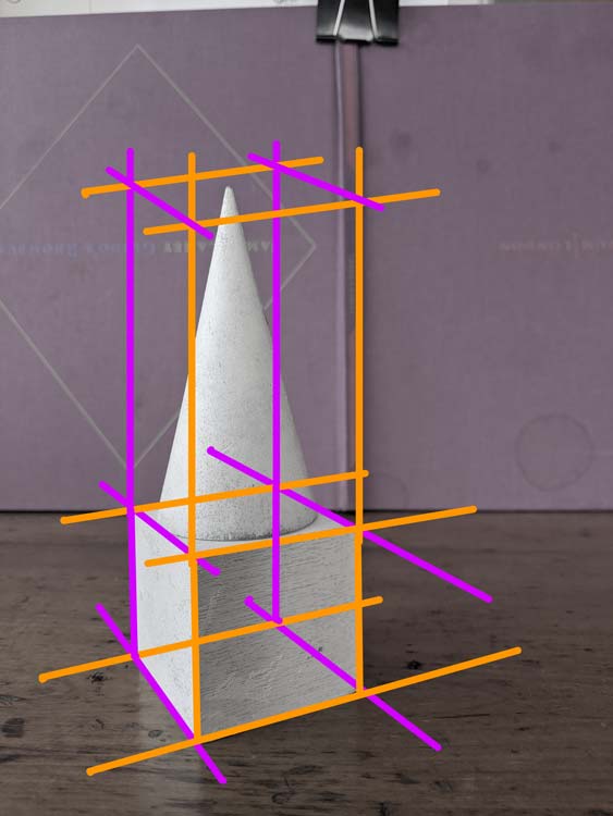
To build side walls around our base we stretch out our four vertical lines. Go ahead and stretch them just past your top measurement.
For the top plane we need to use our imagined vanishing points. The front left edge and the back right edge will both move towards our left vanishing point. Our right front edge and our back left edge will move towards our right vanishing point.
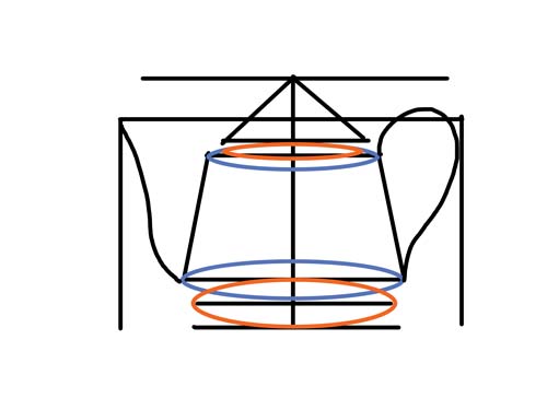
Look at how the cone sits inside our cube.
Step 2: Ellipse base
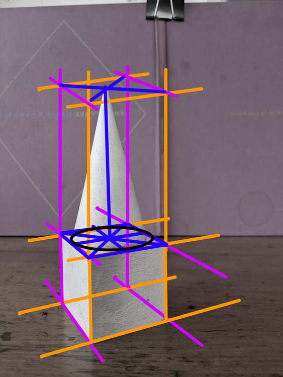
Now let’s think about what makes our cone different from our cube. Let’s start with our base (we always start at the bottom). The base of our cone is defined by a circle in perspective (we call this an ellipse).
To draw that ellipse we first find the centre point of our base square. Draw an X starting at the four corners of the square. The point where the two diagonal lines meet is the centre of your square. Knowing where the centre is we can draw two more lines that run through the centre of this square. These should make a kind of cross in perspective.
When we draw a circle in a cube we see that the circle hits the square at these centre points of the length lines. These points mark the four crests of the circle’s curved line. We can use this information to help guide us as we draw our ellipse to represent the base of our cone.
Step 4: Top
The top of the cone is quite unlike its base. The top is not flat or round, it is defined by a point. But how do we decide where that point is? Rationally, we know that the point is above the centre point of our base. If we draw a vertical line starting from the centre of our base up towards the top of our new box, we can find our point. This line represents the centre line of our cone.
To complete our cube draw two diagonal lines. First, from the centre of the right front edge of the cone base to the top point. Next from the middle of the left back edge to the top point of the cone.
Add Cylinder
In the same way that we built on top of our cube, we can also build out from our cube. Let’s add a cylinder to the back left side of our cube.
In the same way we build a cone inside a box, we can build our cylinder inside a box that comes off our original cube.
Step 1: Base
To start building this new box, we start with our base. Always start with the base. It’s boring but it makes drawing so much easier!
This part is really fun, because we get to be really lazy. In the same way that we extended our cube’s vertical lines to build the walls of our cone’s box, we can extend the length lines of our cube’s base to make our new base!! Magic.
Step 2: Build out a box
Let’s start with the front right edge. Our new box measures about the same as the total length of our cube (both sides). So let’s pull the front right edge of our cube about that length to the right. Now we can extend the back left edge the same distance to the right. Mark a point on the front right edge that represents the right front corner of our new box. Starting from this point, we can extend a line towards our left vanishing point. This line will represent our back right edge. Now we have the base of our cube.
Using the construction lines from the top of our original cube. We can build out the rest of this new box.
Step 2: Cylinder in box
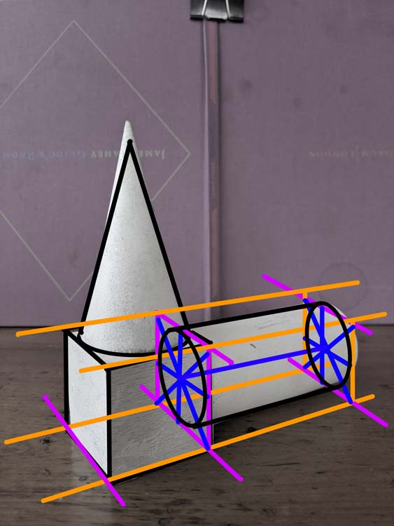
To build our cylinder we are going to start with the two sides that are defined by an ellipse. We are going to divide the squares that hold these ellipses in the same way we did for the cone.
To draw that ellipse we first find the centre point of our squares. Draw an X starting at the four corners of the square. The point where the two diagonal lines meet is the centre of your square. Knowing where the centre is we can draw two more lines that run through the centre of this square. These should make a kind of cross in perspective.
When we draw a circle in a cube we see that the circle hits the square at these centre points of the length lines. These points mark the four crests of the circle’s curved line. We can use this information to help guide us as we draw our ellipses that make the two sides of our cylinder.
Now all we need to do is define the top and bottom edge of our cylinder. The lines for the top edge should be just left of the vertical centre line of the side squares. We want it to feel like the line is extending from the ellipse. Or that the ellipse is turning into this top edge. Same principal for the bottom edge. The line should start somewhere on the right side of that centre vertical line of the side squares.
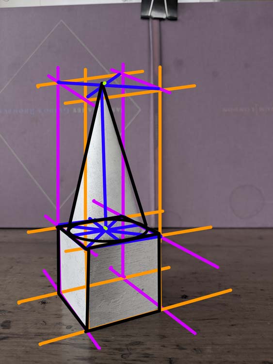
Finishing up the drawing
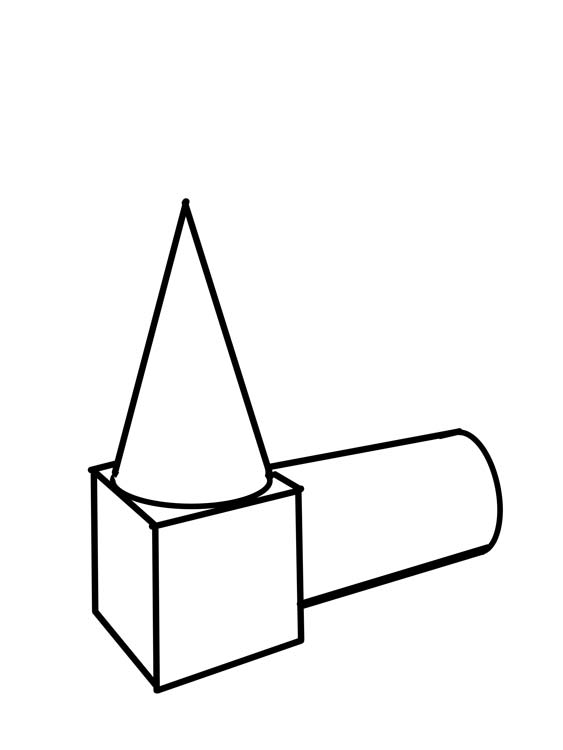
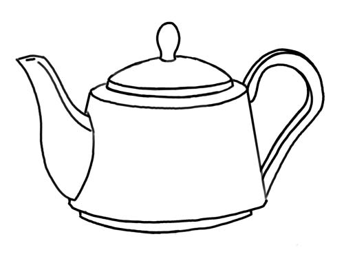
To give our drawing a clean feel. We can go over our main lines with a darker or thicker pen. We don’t want to draw all of our construction lines. Only lines that define the edges that we can see. Take your time on this step and try and clean up any loose lines and improve your curves.
.jpg)