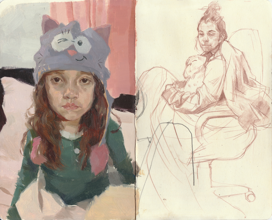
One of my favorite contemporary painters right now is Nicolas Uribe.
For me he’s a great example of an artist who really pushes the limits of colour and caricature but maintains a really solid sense of drawing and structure. His work feels like a continuation of the tradition built up by artists like Rembrandt Harmenszoon van Rijn, John Singer Sargent and Norman Rockwell.
Making Art for Instagram
Beyond aesthetic, I also find him interesting because of the business model he is developing. We hear a lot about the art market struggles, yet this is an example of a small actor who is developing a new economic model.
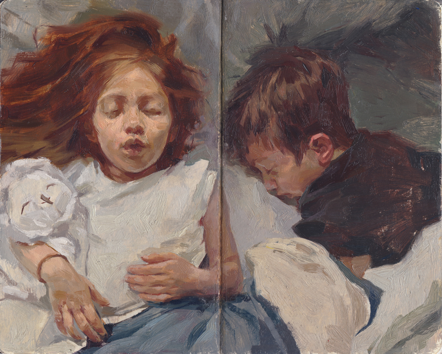
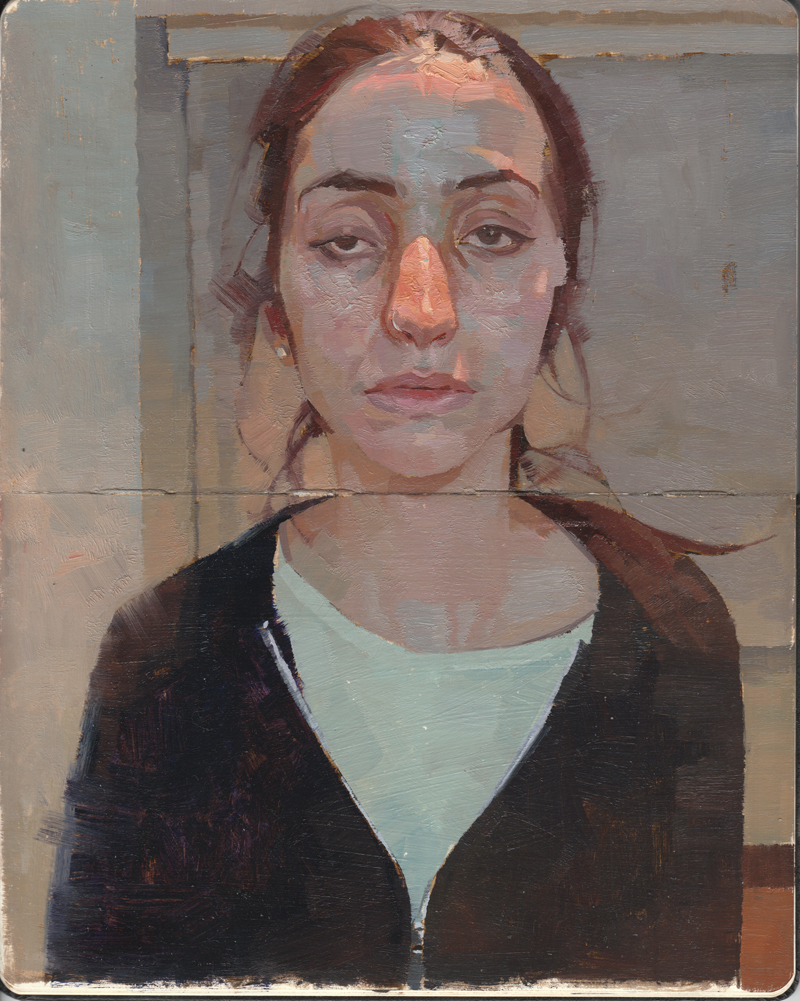
With a substantial instagram following Uribe has started making work that is meant almost exclusively for the small screen. Over the past couple of years he developed a series of small scale sketchbook paintings called Our Painted Lives : A Sketchbook-Life Experience. Throughout the process he shared the images to his instagram.
When asked by James Gurney about the experience of creating art for instagram Uribe said, ” it’s a very direct channel for visual communication. In theory there are many other live channels, like youtube, twitch, or facebook, but the artist community is very active in Instagram. I also find that the default ephemeral quality of the live videos (they’re only up for 24 hrs), emphasizes the fact that you feel you have to be there when something is being painted. That same presence, that same sense of urgency is the one I feel when I have to execute a painting in two or three, one hour sessions.”
Instead of courting a gallery show, Uribe set up an Indiegogo campaign to have the series printed as a book. Followers were invited to support the campaign by per-ordering a book. For a higher fee you could also get an original drawing or a painting.
New Online Economy
I purchased a book and I am very excited to hear that they are now being shipped. In the email announcing the shipment Uribe unveiled he is starting a new online video education program.
Again all the content will be shared for free online and there will be a way for fans to financially support the project – if they want.
For me it’s a really interesting example of this new ‘pay what you can’ economy that is developing online. It’s exciting because the model makes culture more accessible – anyone can see his work online. But it’s also exciting because it seems to be viable. For his indiegogo campaing the artist raised 300% of his intended target.
For anyone trying to figure out how technology will impact the art market this is an artist to watch.
Velazquez, Rembrandt, Vemeer: Parallel Vision at the Museo Del Prado is my top pick for a museum show in 2019. Man I would do anything to go see this show!
For those of us not able to jet over to Madrid for a weekend there is a great interview with the show’s curator Alejandro Vergara on the Art Newspaper podcast. The show challenges the popular narrative around nationalism and art and invites the viewer to reflect on the shared traits of 16th and 17th c. Dutch and Spanish art.
What is especially interesting about the argument is that during this period the two regions were at war. Starting in 1568 now Holland and Belgium (then part of Spain) revolted against the Spanish monarch. The result was an 80 year conflict that ended with the creation of the two new nations.
Art history tends to celebrate Hollands independence by fixating on what made their art unique and “Dutch”.
Shared Style in Dutch and Spanish Art
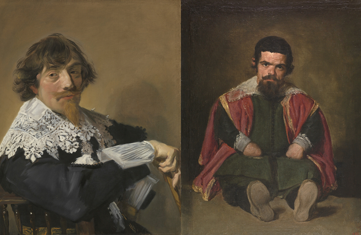
Izquierda: Portrait of a Man, Frans Hall, Oil on Canvas, c. 1635 ; Derecha: The Buffoon el Primo, Diego Velazquez, Oil on Canvas, 1644 (Image Credit Museo del Prado)
This show challenges the national flavour of both the Dutch and Spanish school. Instead it tells how both were influenced by 16th c. Venetian art.
It argues that artists like Rembrandt and Velazquez interpreted this shared legacy in a similar fashion and simultaneous developed a new artistic aesthetic that departed from the idealism of the renaissance creating a humanistic realist style.
What I love about this argument is it reminds us of the universal nature of knowledge. Something as personal as artistic style is not limited to a nation or an individual. Given access to past knowledge we are all capable of artistic breakthrough.
Brushy Art in Russia and United States
Portrait of Vernon Lee, John Singer Sargent, Oil on Canvas, 1881 (Image Credit Tate)
A fantasy curation project: I think it would be a real hoot to build on the thesis of the Museo del Prado show and explore the shared traits of other national schools of painting.
A pretty epic example is the portrait art of the late 19th c. in the United States and Russia. American artists like John Singer Sargent and Cecilia Beaux both painted in a brushy modern aesthetic that parallels the work of Russian artists like Ilia Repin and Valentin Serov.
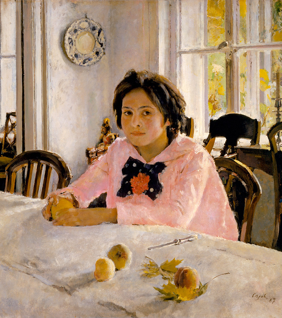
Girl with Peaches, Valentin Serov, Oil on Canvas, 1881
These artists were all heavily influenced by French art – both the academic system and the impressionist style. Interestingly you can also see a lot of Rembrandt and Velazquez in their loose brushy approach to painting.
Sita et Sarita, Cecilia Beaux, Oil on Canvas, 1881 (Image Credit Musee d’Orsay)
Conceptually their work brought ideas of modern psychology into portrait art. These portraits are oozing with attitude and feeling. I find this image by Beaux particularly radical. She juxtaposes innocence (the white doll like costume and the cat) with the girls cool self confidant expression and pose.
Throughout art history we can find countless examples of overlap and cross pollination between different national schools. The message over and over seems to be that we can achieve more collectively than we can in isolation.
May is an exciting month for Canadian Art! At the end of the month is spring auction week in Toronto! Several of the top Canadian auction houses will be hosting live auctions of Canadian art.
About a week before, they open their doors to the public showcasing the work that will go up for auction. I love going to these previews because you get to see a lot of amazing Canadian art that isn’t on display in the museums. It’s a great way to get to know artists outside the the regular cannon.
Laura Muntz
One piece I’m particularly excited to see this year is a lovely portrait, Lady in White, by Laura Muntz, up for sale at Waddinton’s Auction House. Muntz is considered part of the Canadian Impressionist movement. I would nuance that and describe her as a Tonalist and place her with artists like Andres Zorn, John Singer Sarger or Cecilia Beaux. Like these artists Muntz is showy with her brush work.
The portrait on view is a great example of this. There is an intriguing debate in the catalogue about the name of the sitter. Apparently the work was sold to the last owners as an official portrait of a Mrs. Reid. But the auction house argues that their is evidence in a book by the renowned scholar Joan Murray that the portrait was actually a former roommate of the artist.
In my own research I came across a secound painting of a woman in the same dress, called ‘Woman Reading’. This would suggest the later story is true as it would be odd that the painter would supply the dress for a formal portrait.
More importantly the repetition of the dress tells us something about the artists focus. This isn’t a portrait this is a fabric study. The dress of the sitter is a playground for the artist to make subtle temperature shifts and bold brush strokes! She’s showing off her technique! I couldn’t help recall the beautiful fabric studies of Leonardo di Vinci.
Helen McNicoll: Girl in the Field
Another top pick is Girl in the Field by Helen Galloway McNicoll on view at the Heffel Fine Art Auction House. McNicoll is a turn of the century artist who is classified as part of the Canadian impressionist group. Like the other artist she studied in Europe and her work explores colour and brush work.
She paints women and children outdoors and it would be easy to group her with other ‘women artists’ like Berthe Morisot who painted a similar subject. I believe McNicoll would have wanted us to look beyond subject. I think she painted women and kids because that’s what was respectable for a woman of her time to paint. But I’m going to be bold and argue that she wasn’t really thinking about the kids.
Seeing her work I couldn’t help but think about her in terms of the Group of Seven. Their subject is Northern Ontario but that’s not what the work is about. It’s all about style and self expression.
McNicoll is a bold painter. She plays a lot with strong contrasts of light and dark and cool and warm. In this painting she has her main subject in a cool shadow. Our eye is drawn to the girls face which matches the tree in tone but is set apart with it’s orange hue (she’s playing with the blue-orange complimentary). The larger shadow shape sits on the bright sunlit background. Her master stroke is the girls white headscarf. Although it sits within the large shadow it is about half a step lighter than anything else. It breaks the girl from the tree so that we can read her silhouette more clearly.
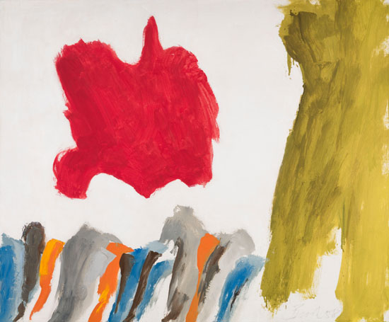
Jack Bush: Red Vision
Jumping ahead to post-war abstract art, Heffel has an intriguing Jack Bush titled Red Vision from 1958 on view. I love this piece because it shows us the artists thinking process.
This work represents the period right before he found his groove. In a work like this he is trying to think abstract. Bush was trained as an illustrator and had his own illustration studio. When he first started painting abstract works he would pencil in his shapes before painting them in.
When the American art critic Clement Greenberg saw his work he told him to lose the pencil. This first generation of Abstract Expressionism was all about the automatic process. No planning just make a mark and than respond with another (and another). It seems easy. But it’s really hard to get yourself into a headspace where you are not planning!
I love the red blob because we can see how he massed it in. He probably started with a mark and than scrubbed his brush outwards to build this organic shape. Look at how the outline of the shape is frayed. These imperfect lines carry over into his later work. It gives his minimalist style a sense of energy and a human touch. This work is all about experimentation!
It is so easy to stick to what you already know. I have such admiration for artists like Jack Bush who spent their whole career pushing beyond their comfort zone and redefining their art.
Frederick Loveroff: Farm Scene
Visiting the auction preview at Consignor Canadian Fine Arts, I was introduced to the work of Frederick Nicholas Loveroff. I was quite taken by this lovely landscape called Farm Scene.
A contemporary of the Group of Seven, Loveroff was a Western Canadian artist with family roots in Russia. His paint handling and colour is similar to the Group of Seven artists but his composition is completely different.
Look how high the horizon line is! Two-thirds of the canvas is white snow! It’s bold and radically different to the Group of Seven approach that favoured a silhouette composition. Artists like Tom Thomson are best known for works like the iconic Jack Pine where the design of the work centers on a dark foreground set on a light background.
What’s so interesting about comparing these two works is that we can see how the landscape has guided the artists design choices. The prairies are defined by a sense that you can see the flat landscape for miles. By keeping the horizon high Loveroff gives his painting that expansive feel of the prairies. A region like Algonquin (where the Group of Seven famously painted) is a thick forest set against a large bright body of water. The comparison reminds us how much our environment influences our ideas!
Key Dates
This years live auction sessions will be held in Toronto on the following days:
Waddington’s Live Auction: Monday, May 27, 7PM, 275 King Street East, 2nd Floor
Consignor Live Auction: Tuesday, May 28, 7PM, 111 Queens Park
Heffel Live Auction: Wednesday, May 29, 4 PM Post-War & Contemporary Art, 7 PM Canadian Impressionist & Modern Art , Design Exchange, Toronto
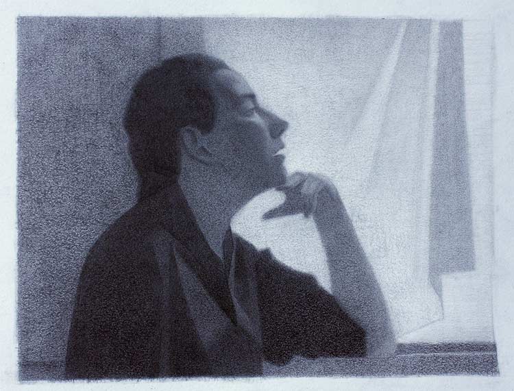
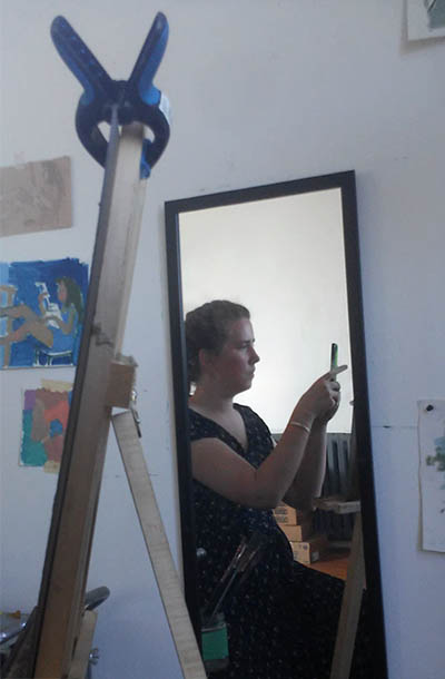
This is the preliminary sketch for my next Selfie. I wanted to push myself and create composed image with a character, costume, scene and mood. I wanted to push beyond mere likeness of a sitter on a static background.
Body: The Profile and the Public Self
For this picture I wanted to create a dialogue with the historic practice of the profile portrait from the early Renaissance . The profile was the preferred mode for representing a Nobel Lady (to read more on this you can read Understanding Madame X). Because she looks away from the viewer we don’t get a sense of her internal world and any judgement of her is base slowly on appearance. Representing the wrong expression was risky because it could call into question the sitters virtue. Best to avoid the lady’s thoughts all together.
The profile also suggests her nobel lineage. From this angle we can most easily read her facial features and , for example, recognize her nose that resembles that of some important Duke. Underscoring her nobility, she would be dressed in her finest and positioned by a window overlooking the land her family owns.
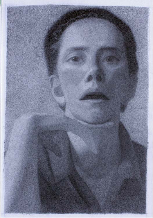
#Body, 2019, Graphite on Paper
What got me excited in all of this was this idea of presenting a public self. What is my identity within the society? I’m sort of tempted to leave it at that. I spent a lot of time thinking about the pose for this image and hopefully that expresses how I see my role as an artist.
Another key element in this drawing was expressing a sense of light. In those early profile portraits the treatment was flat or graphic. Although the subject was often in front of a window they were shown in full light. For my profile I wanted to signal our evolution as a society by showing my subject in natural light. This meant showing the sitter in shadow set against the bright light of the window.
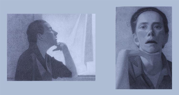
Mind: A Secound Image in the Mirror
To do draw yourself in profile you need two mirrors. You face the first mirror in profile and you angle the secound so that you look into it to see the reflection of the first mirror. Looking into that secound mirror you also see yourself looking directly into the mirror. Working on #Body I couldn’t stop noticing the secound image of myself in the mirror. I was struck by how utterly different it was to the carefully construction of public persona I was trying to capture with #Body.
#Mind, 2019, Graphite on Paper
In the secound image #Mind the sitter looks directly at the viewer. It’s extremely psychological. You can’t help but try and guess her thoughts. The open mouth, that gives the first image a sense of naturalism, comes off as a provocation. Is she about to say something? Even the composition feels more intimate. In the first image the sitter is seen from across the room. Our main attention goes to the ‘thinker’ pose. The secound image crops into the face, positioning the viewer only inches from the sitter. All of this intimacy invites the viewer into the sitter’s internal world.
Two Drawings About Truth
#Body #Mind are two completely different images. Yet they capture the exact same person, in the exact same pose, at the exact same time. With this drawing I invite the viewer to consider the complexity of truth. In #Body I build up a very composed image filled with references to art history. In #Mind I present a more candid and psychological image that seems to call into question the authenticity of the more composed image.
My aim isn’t to make the viewer takes sides (#TeamBody or #TeamMind). Instead, I invite the viewer to view the work as an expression of an external and internal self.
Because we all have an internal and external self, I think it’s easier to understand these two conflicting ideas as true. But I challenge my audience to take this idea a step forward. We talk a lot about fake news and how technology allows for the manipulation of images. What I’d like to suggest is that truth is a bug concept that is hard to pin down in any one image. We should always consume images critically. We don’t have to write everything off as fake but we should always be considering how the image could look from a different perspective.
I’ve been told so many times that art technique doesn’t matter. It’s all about ideas. I would like to argue that ideas can come from the knowledge acquired in art training. An interesting case study for this hypothesis is the work of the 19th century artist Charles Bargues.
Bargues’ Drawing Course
Bargues is best known as the print artist who did the images for the Drawing Course. The idea of the book is that you copy a series of about 100 drawings by master artists. The book is brilliant in that each drawing introduces a new concept building on ideas presented in the one before.
Bargues did not do the initial drawings but he copied them to make lithograph prints. He’s considered the first student of the course.
How Bargues Art Changed
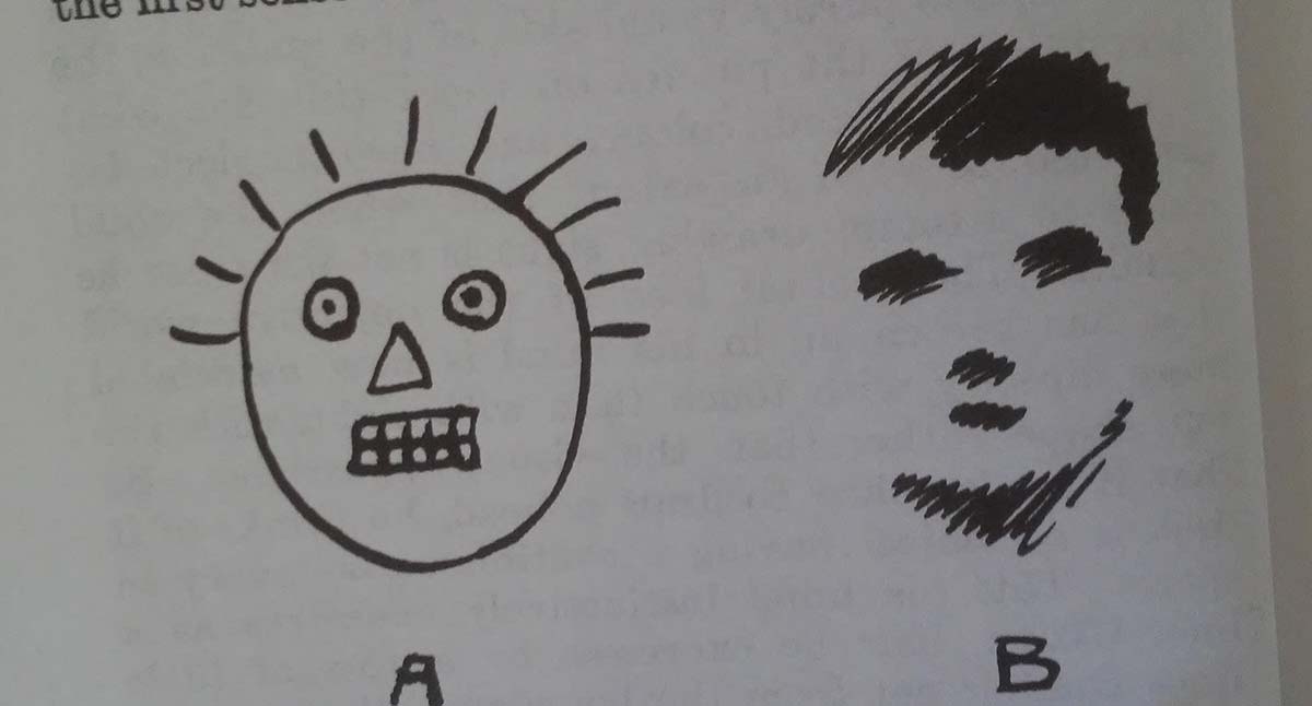
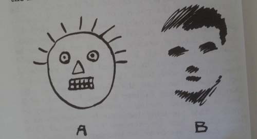
The image above is from the Harold Speed book, The Practice and Science of Drawing. It illustrates drawing what we know (A) verses what we see (B). Beginner artists always struggle to let go of their conceptual understanding of the world and to actually look at the subject.
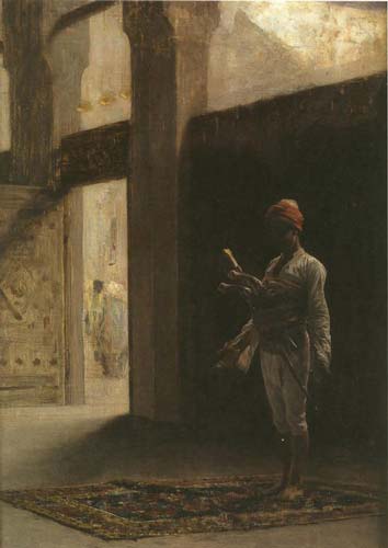
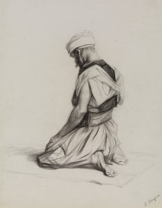
If we look at Bargues’ early work we see an artist who is producing the worst kind of orientalist art (large sense). Here is a First Nations women clearly not drawn from life presented as object of desire.
She is an idea, or a crude fantasy. After completing the Drawing Course project (which took over a year). The artist’s work changed dramatically.
Not only is his work technically more interesting but he’s now presenting a much more complex image of beauty and other cultures. Unlike his fantasy girl these images are done from life. He has seen a Mosque and seen men in the act of praying. From this lived experience he gives us a beautiful image of a spiritual moment.
Art’s biggest lesson is that we are naturally bad at observing. So much of how we see the world is based on preconceived ideas. Art forces us to challenge those ideas by really looking at the world.
CBC Arts is doing a great series called Art 101! The series tries to breakdown some basic ideas about art! In their most recent article by Lise Hosein, Why is this Art?, they explain the value of Abstract Expressionism (AbEx).
In the spirit of debate I do want to push back on some of the ideas Hosein presents. Her argument centres on an idea that AbEx is the pictorial embodiment of freedom of expression. I would argue that we should push back against this ideological reading of the movement and instead look to the canvas to understand the value of the work.
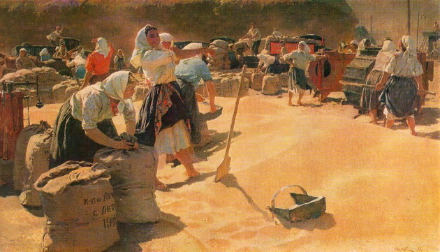
Art and the Cold War
Tetiana Yablonska: Bread (1949)
She rightly points out that the movement developed during the cold war at the same time as the Socialist Realist movement in Russia. The Russian movement was heavily monitored by the state and artists had little freedom over what they could paint.
What the article does not address is that AbEx was also a state sponsored movement. The American government sponsored exhibitions and the production of abstract art. What’s nefarious about the actions of the American government is that they didn’t tell anyone (including the artists). So there is this false belief that the abstract movement developed organically.
Just like in world politics I get really worried when we talk about something as complicated as art in black and white terms : AbEx good, Realism bad.
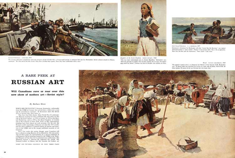
There was actually an exhibition of Socialist Realism here in Montreal in 1960. Maclean’s magazine has the original article up on their online archive. If you actually look at the art it’s fascinating. Despite all of the constraints these artists managed to make something beautiful and meaningful (examining ideas around community and work).
Celebrating abstract art as the art of Freedom of Expression is also problematic because it ignores that AbEx has alway been fairly aggressive in its attack on realism. You have to choose – ‘you are either with us or against us’. Case in point, Canadian critics and curators (all proponents of abstraction) refused to engage with the the Russian work when it visited Montreal.
With US-Chinese trade tensions we are entering into a new cold war. Recognizing that our rejection of realism is linked to cold war politics is important because it reminds us of what we stand to loose if we don’t listening to outside views!
AbEx and the Painting of Jack Bush
What I love about AbEx is that if you separate it from it’s ideology the work holds up.
To understand Abstract art I want to discuss the work of the Toronto painter Jack Bush. He’s arguably Canada’s most important AbEx painter.
The first thing I would say is like any artist you really need to look at their body of work to understand the works value. If you just look at one of Bush’s colour fields it’s reasonable to write off as simple. But if you start to look at a period of an artist work (I’ve chosen his work from the 1960s), you start to understand the artists language and artistic ideas.
In this period, I see the artist using colour shapes and pattern to create a sense of movement or interruption.
Little Yelow, Jack Bush, C. 1960s
In this first image the dominant shape is a flat yellow rectangle. To the right, this wash of yellow is interrupted by a rainbow pattern of colour. The artist is contrasting both colour and pattern to create a sense of vibration between the two parts.
Green Thrust, Jack Bush
In image two we have a a strip of raw canvas running across the dark patterned background. Not quite making it across the canvas the strip feels like it is in motion racing across the canvas. Using a completely abstract language the artist has created a sense of movement (this series was called ‘thrust’).
Purple Thrust, Jack Bush, 1974
In this final example a blue vertical line is invading the horizontal rainbow pattern. We have a similar feeling of contrast (like we did in image one) but this time he is using line direction to create that tension.
Jack Bush was also a prominent illustrator with a good understanding of traditional technique. I can’t help but read his work as a kind of narrative abstraction. His work avoids all references to reality (space, light, form) yet his use of colour and shape still manages to tell a story!
I came to Richard Thomson’s Art of the Actual looking to explore a theory. As a figurative artist, I’m fascinated by the 20th century rivalry between Modernism and classical realism.
I’m somewhat obsessed by Clement Greenberg’s manifesto, The Avant-Garde and Kitsch, because it reveals an important political link between the two schools central to his thesis. In his essay Greenberg defines the Avant-Garde as Modern art that emerges under Pablo Picasso and Kitsch as the art of communism developed under Ilya Repin.
In my rereading of his text I was struck by an idea. How would his argument change if we redefined Kitsch not as the art of the Russian Wanderers but that of the French Naturalists?
The Naturalists and the Wanderers are two 19th century artistic movements that have much in common. Both are offshoots of the French Academy and both were influenced by French impressionism and plein air painting. Moreover, both emerged during a time of social upheaval. The Wanderers emerged after the Emancipation Reforms of 1861 that effectively abolished serfdom throughout the Russian Empire. The Naturalists came to prominence under France’s Third Republic in the 1880’s which established a stable democratic republic. With this context both schools explore themes of equality, folk culture, and national fraternity.
What separates the two movements is the link between the Wanderers and communism and the Russian movement’s place outside of “Western Culture.” By thinking about Modernism in relation to the Naturalist movement we remove the element of “otherness” that Greenberg attached to the Kitsch (or realist) art.
A Book About the Naturalist Movement
Thomson’s book is based off a series of lectures he did as Slade Professor of Fine Art at Oxford University. Focusing on French art during the 1880’s and 1890’s, the book’s assertion is that Naturalism (not Post-Impressionism) was the dominant art of this period. He argues that the movement flourished because it suited the ideology of the Third Republic in its drive to establish a collective, modern and centralized France.
Although his focus is the Naturalist movement, Thomson gives much attention to early Modernists or Avant-Garde of this period known as the Post-Impressionists. He builds on his thesis of the central importance of Naturalism (in this period) by arguing that the Post-Impressionists of this period were very much in conversation with the dominant movement either as offshoots or critics.
Defining Naturalist Art
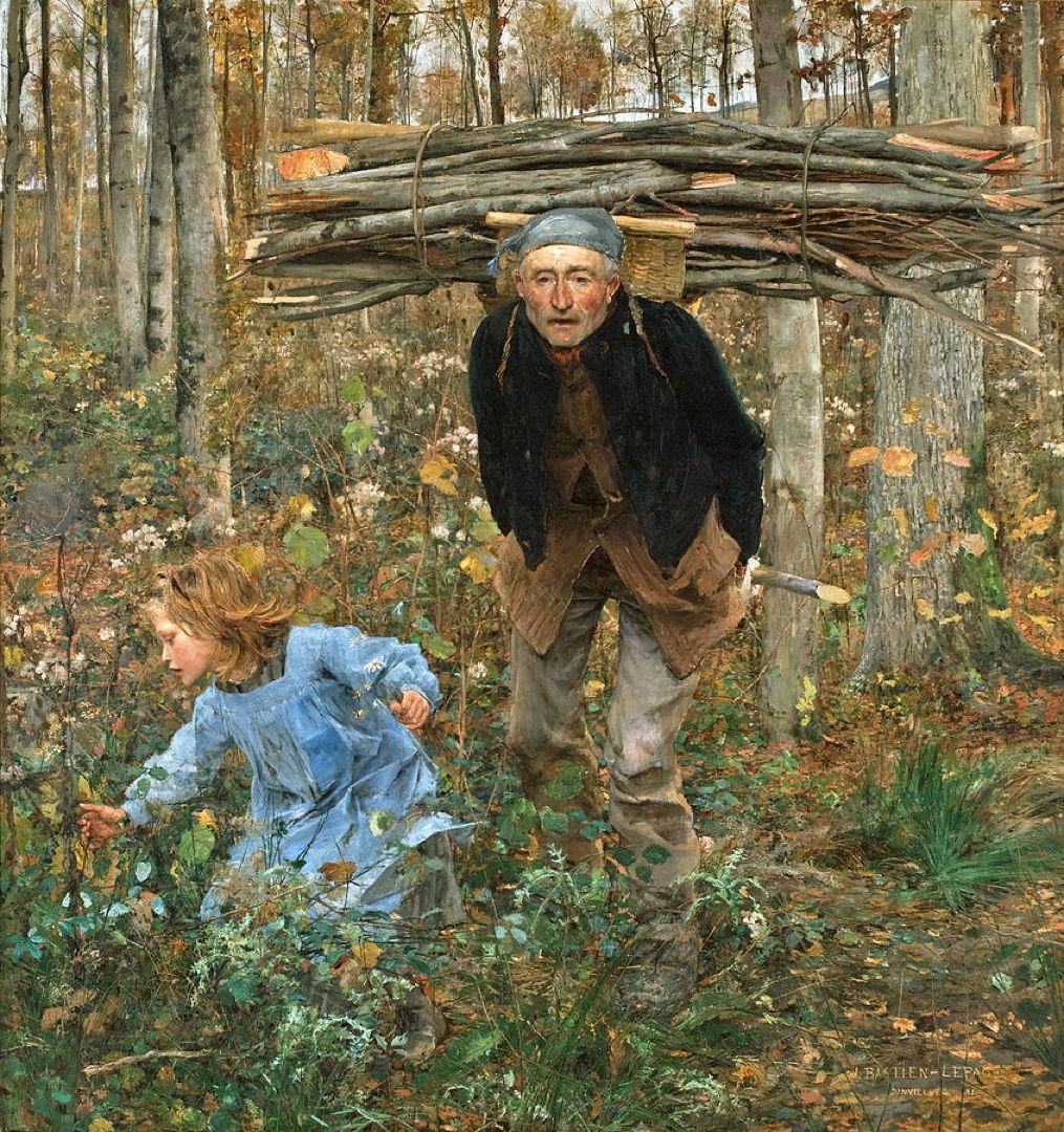
The Wood Gatherer (Father Jacques), 1881, Jules Bastien-Lepage
Thomson defines Naturalism as a kind of painting that sought to be clear, modern, descriptive and inclusive. Most of the Naturalist painters came from the French academic system, but distinguished themselves from the classical system by choosing to portray scenes of modern life. Their work celebrated anything from the labour of rural farmers to the latest advances in science.
Their choice and depiction of modern France was influenced by the state who sponsored the movement through commissions and concours for public art to decorate government buildings. In this way artists were not working directly for the state; however, given that the state was the largest purchaser of art at the time, artists did well to create art that would be met with approval by the government.
Avant-Garde Art
Throughout his exploration of the Avant-Garde, Thomson makes a compelling case that in many occasions the movement was actually aligned with the Naturalist aesthetic. He shows a plethora of works by Post-Impressionist artists which adhere to the conventions and subject of Naturalism. In so doing he suggests that the Post-Impressionism was not so much a radical break with the mainstream but a collection of divergent voices still within the culture.
Thomson explores how the Avant-Garde diverges from Naturalism over three chapters. He outlines how the Avant-Garde used caricature, popular culture and what he coins as “organicism” (ideas around flux) to disengage with the dominant movement.
I found his description of the Avant-Garde illuminating, but found myself wanting to group his argument differently. For me what seemed to surface again and again was the influence of “Café Théatre ” culture on Avant-Garde art.
Café Théatres were dinner theatres specializing in popular culture. As Thomson explains, by the 1880s these establishments had been professionalised and were extremely profitable. They became so popular that artists from more “serious” theatre were performing in these venues.
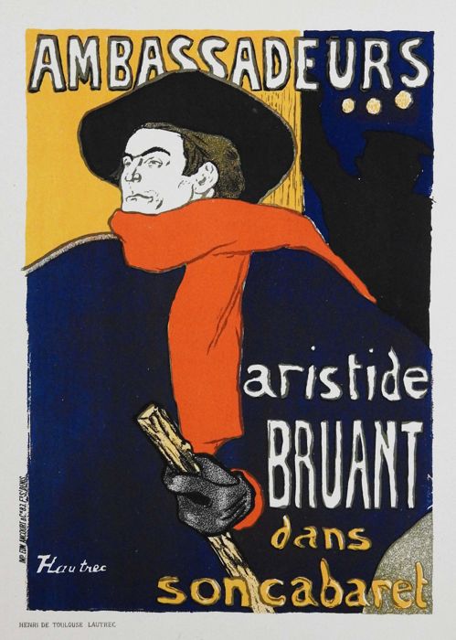
Avant-Garde art from this period uses the Café Théatre as its main subject. So much so that I remember being shocked the first time I saw the austere attire of a woman in a Henri Fantin-Latour painting. I realised, having grown up on Modern art, I had always kind of assumed that French women of the periode dressed in flamboyant colours with a generous décolleté. I’ve come to understand that the woman of a Toulouse-Lautrec painting is not your average French citizen but someone working in one of these Café Théatre.
Subject was not the only way in which the Avant-Garde was influenced by the Café Théatre. Beyond theatre, these venues contributed to visual culture through poster art (that is now considered fine art) and the publication of satirical revues which helped popularise caricature art.
Naturalism favoured exacting description over style. Unlike past movements like Rococo or Neo-Classicism, Naturalism did not have a distinctive style. Even in its time critics often lamented its photographic nature.
Thomson writes that one way the Avant-Garde could distance itself from Naturalism was through style. Although each artist strove to create a unique style, Thomson shows how the group took many ideas from caricature and popular culture of the time – which was part of the Café Théatre culture.
Adding my own interpretation to Thomson’s work, I would argue that their choice of stylistic influence was part of the Avant-Garde’s larger exploration of the Café Théatre culture.
Public vs. Private in Art
Interestingly, Café Théatres were a meeting place for both the proletariat and the bourgeois. A rare space in the society where the different social classes met on equal terms. These spaces embodied the values of the Republic, égalité, fraternité, liberté. While the Cafe Theatre does not challenge the state’s definition of itself, it shows a very different image of the culture.
Naturalism focused on the public or civic life of its citizens and showed a hopeful image of modern French culture: productive labour, technological progress and social progress. In contrast, the work by the Avant-Garde showed a kind of private life and depicts a more decadent scene: sex workers, drinking, and gambling.
For me, thinking about Naturalism and Modernism in terms of the Public and Private space is an important way to situate the two movements before embarking on the 20th century rivalry that would split the two movements. On a superficial level, Modernism seems to break with its predecessors on stylistic terms. I would argue that what really separates Modernism from previous generations is this shift in focus from public to private life.
Café Théatre was a space where every citizen (at least the male ones) could escape their social identity and ‘be themselves’.
Naturalist paintings reflect images that are representative of how the state wants civilians to look and what it wants them to see. Whereas Café Théatre is private not because people are in the shelter of their homes, but because they are acting in a way that gratifies their own desires – and not those of the state.
This represents a move away from arts traditional role of representing and speaking for the state (whether it be a democracy, a monarchy or theocracy).
Yet Thomson makes an important critique of this so called popular art. He notes that many of the artists adopting this popular style and subject matter were themselves from upper class society. So although the viewer is granted access to these socially open spaces, it is only from the vantage point of the upper class.
Russian Art compared to Naturalist Painting
Although the Wanderers and the Naturalists painted similar subjects, the work was conceptually very different.
Interestingly, the Wanderers were not supported by the state. In fact the group originally formed in protest of the state-sponsored academy, which they felt stifled artistic freedom. After the lifetime of the group, their art was adopted by the new communist government and their legacy was twisted to align with the values of the new ideology.
The group was supported by private collectors, mostly from the emerging industrial class. They sold their work through travelling exhibitions – hence their name.
Naturalism, aligned with state interests, worked to define a new archetype: the modern french citizen. Pastoral scenes of workers in the field were meant to highlight the idealised public contributions of every citizen working to build the third republic.
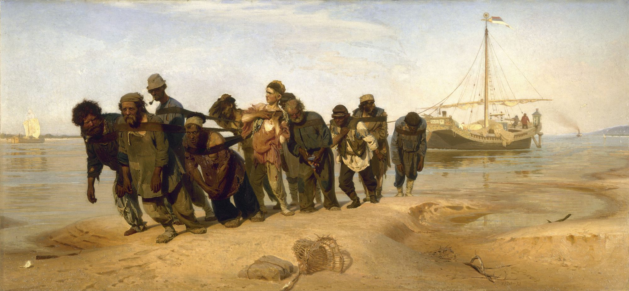
Especially in the beginning, the art of the Wanderers was less idealistic. Instead of presenting the working poor as a type, the Russian artists aimed for an authentic depiction of the individual life of their subject. The work celebrated the progressive change in the country but it could also be critical of the state, depicting the hardship of peasant life.
I would argue that 19th century Russian art, like early Modernism, was interested in the private concerns of the individual. Unlike the Modernists, several of the group’s members were from the same humble origins as their subjects.
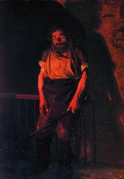
For the Wanderers this effort to show the internal world of the sitter was about humanizing the subject. Like Alexandrovich Yaroshenko who invites the viewer into the internal universe of his subject in The Stoker as a way to arouse compassion for oppressed people.
The Stoker, 1878, Mykola Yaroshenko
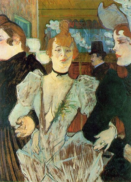
I’m not sure that I see the same kind of compassion for the subject in the work of the French Avant-Garde.
Toulouse-Lautrec , 1892, La Goulue arrivant au Moulin Rouge
Greenber’s Rejection of Russian Art
What frustrates me about the Greenberg essay is that it rejects Russian art without actually engaging with it.
In a footnote, added to Greenberg’s essay when it was reprinted as part of a book in 1961, the author notes that he misattributed a painting of a heroic war scene to Repin. He explains that only after printing the essay did he learn that Repin had never painted a battle scene. This error highlights the author’s lack of understanding of Russian art.
My aim is to point out that our original perception of art can be manipulated. The meaning of art is malleable depending on the context in which it is seen.
When we consider post-war art, it’s important to recognise the political alignment of different schools of art. In the same way that Naturalism and Social Realism were sponsored by the French and Russian state, Modernism was supported by the American government. When Norman Rockwell presented his Four Freedoms series to the American government he was initially turned down because it wasn’t in the Modern aesthetic. It makes sense, Modernism with its commitment to freedom of self expression suited the ideology of the American government – just like Naturalism aligned itself with France’s Liberté, Égalité, Fraternité.
My point isn’t to disparage the Avant-Garde. I think Thomson’s book does an excellent job of showing how Post-Impressionism was an important critical voice in the face of the hegemony of Naturalism.
Naturalism covered a vast array of subject matter in a highly detailed style. Seen in isolation, one would think it an encyclopedic portrait of France during the late 19th century. Post-Impressionism exposes the idealised nature of the work and challenges the communal vision it portrays. In turn the art of the Wanderers reveals the voyeuristic gaze of Modernism.
After reading Thomson and Greenberg, I’m left thinking about the importance of questioning the dominance of any one school of painting (or thought). No image can be a full account of truth. Looking at works of a similar subject across genre and culture is one way to expose bias and build an understanding of truth.
Sources:
Richard Thomson, Art of the Actual: Naturalism and Style in Early Third Republic France. (2012). Yale Books
Elizabeth Kridl Valkeiner, The Wanderers: Masters of Nineteenth-Century Russian Painting: An Exhibition from the Soviet Union. (1991). Dallas Museum of Art
Clement Greenber, Art and Culture: Critical Essays. Avant-Garde and Kitsch (1961) pg 1-33. Beacon Press Boston
The online satirical newspaper The Beaverton had a great headline a couple years back. The tag line read “Artist takes time out of their busy grant writing schedule to actually make art.” For any artists this can feel all too familiar. Over the last couple years I have written dozens of applications for grants, residencies and shows. When you’re lucky it works out but so much of that work never gets seen.
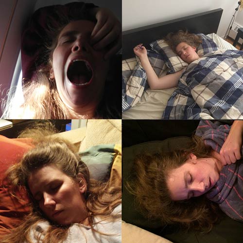
For this months blog I’ve decided to share a project proposal I wrote for the Banff Centre‘s Digital Promises residency. The inspiration for this project comes from a series of photos taken by my long term partner.
I mean when you are sitting on a conceptual gold-mind you just have to create!
Selfie Painting Series
#SleepingBeauty is part of my ongoing #Selfie series. The series is made up of self-portrait drawings and paintings. The final product will be a quadriptyque painting based on a series of voyeuristic digital images taken of me sleeping.
Throughout my #Selfie series my aim is to interrogate this relationship between image production and reception. Social media apps like instagram stress the importance of authenticity through their design: Instagram users can only upload photos through their personal phone. Despite this pretense of authentic reality, the selfie is criticized for depicting a ‘filtered’ or idealized version of the self.
A Look at Image Sharing Online
In #SleepingBeauty I will explore how this conversation around truth is further complicated when the image is shared without the authorization of its subject. So prevalent is the sharing of non-consensual images that it has now entered the criminal code. What makes these crimes so painful is that with digital technologies, private images circulate rapidly and widely from one Internet user to another.
The source images for this piece were taken by my long-term partner over a four year period. These images have become an inside joke and I consider them a sign of affection. When I look at these images I don’t see a representation of myself, I see my partners gaze. I can imagine my partner watching me sleep and I feel loved.
I’m interested in how easily these intimate tokens could be weaponized through non-consensual sharing online. What makes these images permissible is an underwritten understanding that they are not intended to be seen by anyone outside our couple.
In my painting, I will use repetition to visualise this shift from personal to public. The final work will be a quadriptyque painting made up of four equally sized square canvases each depicting one of the images of me sleeping. This echoing of subject suggests the general dissemination of such images.
The central focus of this work is this shift from private to public and how it changes the perceived meaning of the image. Once the consumption of this images expands to a wider audience its meaning changes. A larger audience, who doesn’t know the photos context, can’t know who is behind the camera. The focus of the image’s meaning shifts from its creator to its subject. All meaning and judgement is now placed on me, the subject.
My sleeping state highlights the power imbalance between subject and creator. In these images the subject has no control over their depiction. In contrast, the creator has what feels like total access to the subject.
The intimacy and access afforded to the viewer gives the images a sense of authenticity. To challenge this assumption of objective truth and to stress the manufactured nature of these images, I will give the work a grainy or pixelated quality – playing off the realist work of Gerhard Richter.
Sailors, 1966, Gerhard Richter
Knowing the work is unauthorised raises questions around the representation of self. If the subject is not an engaged participant in the image do they not become a mere object? While we are presented with the physical form of the subject, it is the implicit voice of the person behind the camera that narrates the scene. In this way the image carries as much bias as the idealized selfie.
Being an artist, for me, has always meant learning the craft of drawing. When I started my journey as artist I was sad to learn that institutions which taught classical drawing technique were disbanded throughout the 20th century. Classical technique is no longer taught at the secondary or post secondary level.
Unable to find the information I craved in the present, I looked to the past. Through my research I discovered that many artists have actually written manuals on the craft of drawing. In this post I share some of the books on art technique that have influenced my own development in drawing.
If you’re like me, and interested in the developing the technical skills to under-gird your creativity, this list is a great starting point.
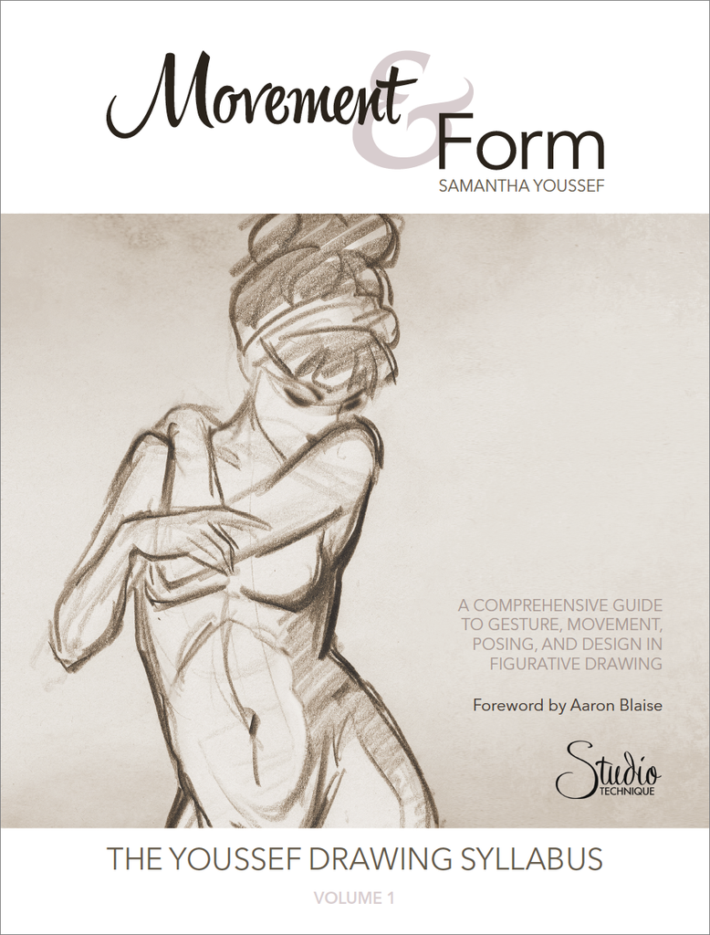
Movement and Form, By Samantha Youssef
Book Author: Youssef
Youssef is a former character animator for Walt Disney Animation, has directed at Ubisoft Digital Arts, and is an award winner at the Toronto International Film Festival for her animated short film La Fuga Grande.
Art Student Level
Like all good art books, this one has something for artists of all levels, but I would especially recommend this book for beginner students. Youssef goes over the fundamentals of how to hold a pencil, how to set up your easel and the proper arm (not wrist) motion for drawing.
Book Overview
The book is a comprehensive overview of gesture drawing. Youssef offers a five step process on how to sketch from a model. The book teaches the young artist how to think in the abstract. She stresses the importance of thinking in terms of line and shape when building a drawing. The book also gets the reader to think of drawing in terms of communication. Each line should communicate some information about the model’s pose. Youssef offers a very interesting overview of the art philosophy on straight versus curved line. Reading this book reminds the reader that sketching is a kind of note taking for the artist or a way to build an understanding of nature through observation.
How I used this book
The book is deceptively short. While you could easily read this book in one sitting, I recommend breaking up each chapter with a couple sessions of life drawing. In life drawing sessions I would force myself to follow Samantha’s process. Only once I was comfortable with a particular stage of her process would I keep reading.
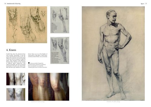
Fundamentals of Drawing, By V.A. Mogilevtsev
Book Author: Mogilevtsev
A. Mogilevtsev is a leading professor and a Head of the Department of Drawing at the Russian Academy of Arts (the Repin Art Institute), where he has taught senior students since 1995. In 2011, Professor Mogilevtsev received Gold and Silver Medals from the Academy for his teaching achievements and for his books Fundamentals of Drawing and Academic Drawings & Sketches.
Art Student Level
I would recommend this book to students with an intermediate level of drawing. The artist should already feel confident drawing lines and have experience drawing from a model. This is a great book for someone who wants to take on the challenge of longer poses and incorporate more detail into their art.
Book Overview
The book builds on the concepts covered by the Youssef book, discussing how to give a figure drawing a sense of structure and form. The book is set up as two demos: a portrait followed by a figure drawing. Like Youssef, Mogilevtsev stresses the importance of the gesture. The book teaches the artist to first lay down an overall impression of the portrait before zeroing in and developing each feature. Each step is illustrated with a sketch. This book invites the artist to think of form in terms of connected planes. Beside each sketch is an analytical drawing that shows the image in terms of its planar structure.
How I used this book
Like most art books, the best way to use this book is to copy the drawings. It can be tempting to copy only the final drawing from each demo but to fully understand the artist’s process I recommend building your drawing by following each illustrated step. I come back to this book to a lot. When I am working on a portrait I will often have the book beside my easel as a reference.
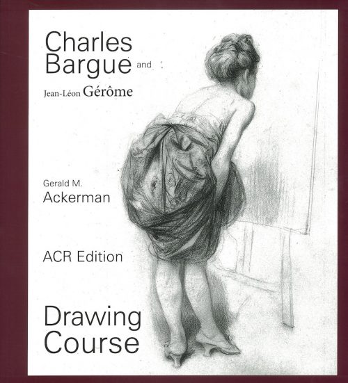
Drawing Course, By Gerald Ackerman
Book Author: Ackerman
Ackerman completed his studies at the University of California at Berkeley, then at the University of Munich and finally at Princeton, where he received his PhD. For twenty years, he was a professor of art history at Pomona College in California. He was a specialist of Gerome and published studies on other 19th century American and European artists, as well as on the theory of academic art.
Art Student Level
Originally this book was intended for young artists looking to be accepted at the French Academy. In many contemporary ateliers this book is taught at the beginning of the program as an introduction to drawing. I would argue that this book is best for intermediate and advanced artists. Before you start thinking about shadows and rendering you should already be comfortable with the fundamentals of structure that gesture drawing teaches. For the intermediate artist it is a great way to learn to see and articulate shadow shapes. For the more advanced artist the book is a great introduction to the art of edges.
Book Overview
The original book was a collaboration between the French lithographer and painter Charles Bargue and the French painter Jean-Leon Gerome. It was intended as a study manual for young artists. The art historian, Gerald Ackerman, reprinted the manual adding contextual and historical information on the artists, the original book, and the French academic system. The core of the book is a series of cast drawings. The drawings are broken down into steps. For anyone who has read Youssef and Mogilevtsev, the Bargue’s method will feel quite different. In the same way the two previous books focused on gesture, this book focuses on design. With this process the artist blocks out the general silhouette of the object using straight lines. Next, they divide the drawing into shadow shapes and light area. Only in the last step does the artist think about form. Form is expressed by laying down a graduated shadow between the light and dark areas.
How I used this book
I first came across this book when I started to investigate the atelier movement blossoming in the United States. At this stage I was still struggling to understand the relationship between shadow and form. I did about 20 copies from the plates and developed a good understanding of how to see and block in shadows. A couple years later I came back to the book. At this stage I was used to working slowly and committed myself to making more refined copies of the plates. In spending more time with the drawings I realised that the Bargue was treating his edges with incredible sophistication. I had been struggling with the concept of edges for a while and finally understood to think of edges as another way to communicate information about form.
Research on Teaching
Contemporary art puts a lot of emphasis on free expression, because of this there is a bias against teaching methods that prescribe a specific process. Through my research I’ve learned that no two artists work in the exact same way. To learn from another artist you need to give yourself over to their process. When working with these books commit to the process described by the artist. As you encounter more and new methods of working you will naturally pick and choose what you like from each artist and develop your own personal methods. Happy reading, and let me know which art books have helped you develop your craft!
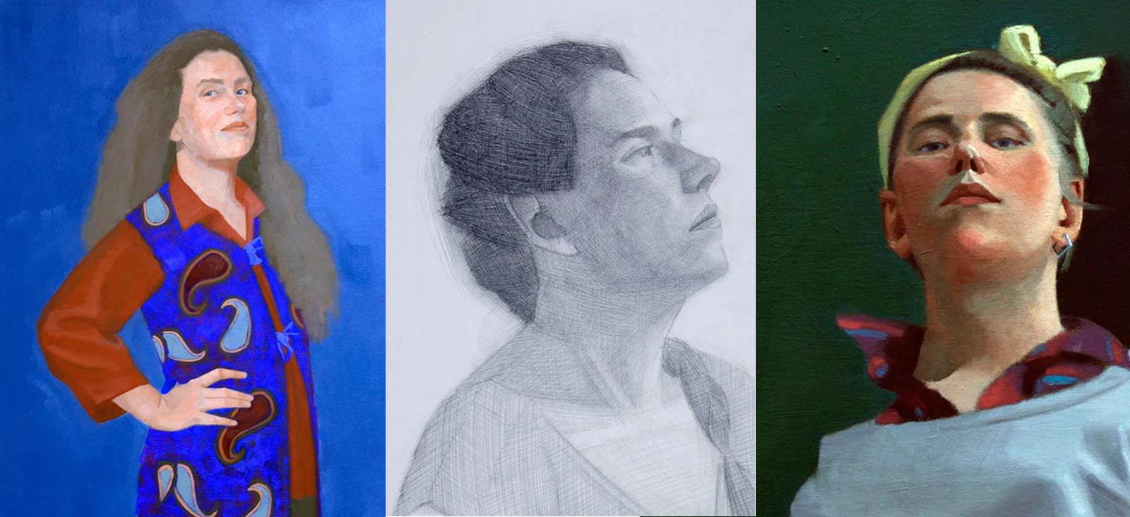
Selfie, is a series of self-portrait drawings and paintings. When completed, my series will include a combined sixteen drawings and paintings portraying themes of identity. In this work I will explore the tension between the authentic and the ideal in contemporary self-representation.
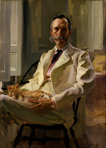
Working in a traditional style and media, I hope to show how our contemporary dialogue around selfie culture mirrors historic understanding of truth in representational art. Specifically, my work recalls 19th century Naturalism and the art of Cecilia Beaux, Elizabeth Jane Gardner and Ilya Repin. Influenced by both the Realist and Neoclassical schools of art, these artists’ works negotiate a visual and conceptual understanding of truth.
Man with Cat, Cecilia Beau, 1898
The era of smartphones has enabled the general population to capture almost every aspect of their lives and share them instantaneously with a global audience. A visual product of this evolution is the selfie, a self-portrait taken with an individual’s camera phone and shared to social media. Associated with “real life” and “live” access the selfie is praised for its authenticity.
Social media apps like instagram stress the importance of authenticity through their design: Instagram users can only upload photos through their personal phone. My own process reflects this devotion to the authentic.
Done in a traditional figurative style my art prioritizes accuracy and is done working directly from life using a mirror. This choice to work from life gives each work unique temporal boundaries. Throughout the series I explore the relationship between time and essence of being. Paintings with a looser brush handling were done in as little as one sitting and represent specific and fluid moments of being. In contrast those works that show more finished style were done over several weeks and reflect a more general and fixed state. In this way the work negotiates ideas of the subconscious and external selves.
Almalia Ulman’s critique of Selfie
Despite this sense of authentic reality the selfie is criticized for depicting an idealised version of oneself. Social media “influencers” are accused of composing and curating their identity to show a more perfect version of themselves. Amalia Ulman‘s Instagram series “Excellences & Perfections” highlights the performative nature of selfie culture. In her photo essay she satirises how femininity is often depicted on social media while simultaneously throwing into question the role of authenticity in selfie culture. By creating an alternative identity through her instagram account Ulman makes evident the staging that goes into a selfie. Her work highlights the imbalance between the time spent constructing an image and the sense of immediacy that the photographic medium suggests.
“Excellences & Perfections, Amalia Ulman, 2014
Like the selfies that Ulman critiques, my own work requires a certain amount of construction. To best express the central idea of each work I control my costume, pose and expression. What separates my work from Ulman and the selfie is my choice to employ a traditional time consuming method to capture my images. Working from life means that I face and stay with that staging for the longer time of creation. Spending anywhere from six hours to six weeks on a single image means that each selfie becomes a kind of authentic lived experience.
Exploration of Personal Style
The proliferation of selfie images was aided by the introduction of the reverse camera on cell phones. This reverse camera replicates the experience of looking into a mirror. My own selfies are done using a mirror (instead of a photo image). I’m interested in the association between mirrors and self discovery.
By limiting myself to a single subject composition, marks and material became the central focus of the work. In this way the series becomes a way to expand my artistic style. I push myself to experiment and try new approaches with each piece. As the series progressed I found myself carrying forward certain choices. These choices have slowly culminated into the emergence of a new style. By presenting the viewer with a series of impressions about my personality, this work actively demonstrates the progression, evolution, and establishment of my style and identity as a painter.
The time spent on the creation of each image provides a space for self exploration and development. I invite the viewer to look beyond the subject of the work and consider this series as an expression of experience opposed to a statement of identity.